Sandbox/GUI/Getting Started
So, it looks like I can't exclude this page/section from the search engine as I had hoped. I wanted to put this in a sandbox so that it wouldn't be published without some proper review.
Contents
Introduction
This guide is designed to help you get a simple Wesnoth GUI, implemented in lua, up and running while describing the basic building blocks along the way. It is written in a narrative format, where most examples build on previous examples, and therefore while not always necessary it may be desirable to read from start to finish. The reader, probably a UMC author, should have a basic knowledge of working with lua within Wesnoth.
Some would find creating a GUI in part or in full using WML simpler to follow, and those alternatives are available, for example LuaAPI/gui/example, but we're using lua here. If you find WML easier to follow, you can always convert the lua tables that define the GUIs to WML using wml.tostring, for example:
print(wml.tostring(dialogDefinition))
gui.show_lua_console()
In some examples, instead of defining the entire GUI at once, we'll break out some parts into separate variables. If you try to view one in WML and get an error from wml.tostring() about expecting a WML table and not a table, try passing your variable(/table) inside a table:
print(wml.tostring({listboxItem}))
gui.show_lua_console()
One distinct advantage of using WML to define your GUI layout is that you get better (any) validation. Invalid keys, and sometimes values, are often flagged in the log, unlike with lua where they are silently ignored. In the comments of our first GUI, below, is an example which loads a WML GUI configuration using wml.load(), validating against the GUI2 window schema.
What is GUI2?
Once upon a time, Wesnoth had a GUI system which is now commonly referred to as GUI1. As of 1.19, GUI1 has been almost completely replaced by GUI2. UMC authors will probably never encounter GUI1 and can simply use the terms GUI and GUI2 interchangeably, at least until GUI3 comes along.
Instead of spending a lot of time here giving an overview of what GUI2 is and what makes it great, and not so great, let's charge ahead so we can see it in action, and let readers who are interested look elsewhere(TODO: link) for a more formal definition. (TODO: is this the right approach for most readers?).
Getting Started
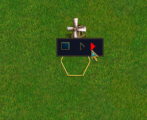
For example purposes, we'll create a directory in our campaign directory called lua containing a file called gui_tutorial.lua, and add a command in the prestart event for a scenario which will create a right-click menu option to invoke our new GUI. Of course there are other methods to invoke lua from WML, but this one will get us started. After all, we really just want to get something up on the screen ASAP, right?
A most basic GUI
| In our prestart event, we create a simple menu item, which executes a single line of lua which calls the lua function most_basic_gui() which is found in gui_tutorial.lua: |
[set_menu_item]
   id=most_basic_gui
   description="Our first GUI"
   [command]
       [lua]
           code=<<
                   wesnoth.require("~add-ons/<OUR_CAMPAIGN>/lua/gui_tutorial.lua").most_basic_gui()
                >>
       [/lua]
    [/command]
[/set_menu_item]
And create gui_tutorial.lua:
| The WML equivalent of dialogDefinition | |
|---|---|
local function most_basic_gui()
    local dialogDefinition = {
        --click_dismiss = true, -- allow user to close dialog with click of a button
        wml.tag.tooltip { id = "tooltip_large" },  -- required
        wml.tag.helptip { id = "tooltip_large" },  -- required
        wml.tag.grid {   -- our most basic gui
            wml.tag.row {  -- a grid must include at least one row
                wml.tag.column {  -- a row needs a column
                    wml.tag.image {  -- a column includes exactly one widget
                        label = "units/trolls/grunt.png"
                    }
                }
            }
        }
    }

    local function preshow(dialog)
        print(wml.tostring(dialogDefinition))
            gui.show_lua_console()
        end
        gui.show_dialog(dialogDefinition,preshow)

        -- Or, if you want to define the gui in WML, something like:
        -- local dialog_wml = wml.load("~add-ons/GUI_Tutorial/most_basic_gui.cfg",
        --     true, "schema/gui_window.cfg")
        -- gui.show_dialog(wml.get_child(dialog_wml, 'resolution'))
end
return { most_basic_gui = most_basic_gui}
|
[tooltip]
    id="tooltip_large"
[/tooltip]
[helptip]
    id="tooltip_large"
[/helptip]
[grid]
    [row]
        [column]
            [image]
                label="units/trolls/grunt.png"
            [/image]
        [/column]
    [/row]
[/grid]
|
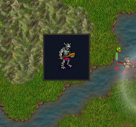
In the above file, we have just the single function to create our GUI, followed by a return command which makes our function most_basic_gui() available to the wesnoth.require() function as most_basic_gui().
Our function creates a table containing the definition of a "dialog", and then passes that to gui.show_dialog(). It should be noted that gui.show_dialog does not provide synchronization, so if your GUI makes changes to the game state, you'll need to jump through some hoops or you'll break replays and multiplayer, but that's not something we need to care about at this point, so just be aware that you may need to deal with it in the future.
Our dialog definition at this point includes three parts. The first two are a tooltip and a helptip, which are required and define how tooltips (use id = "tooltip_large" or id = "tooltip" or id = "tooltip_transparent"), and helptips (rarely used, but must be included here, and yes their definitions are "tooltip" not "helptip") will look (as we will see later, this really should be definition = "tooltip", but in this case it's id = "tooltip"). The third part is a grid, which is basically a table, like in HTML or MySQL, with rows and columns. A grid always contains at least one row. A row contains at least one column (note that a column does NOT span rows, it is completely contained within a row). Inside a column is exactly one item, a cell which contains a widget, in this case we'll use an image (later we'll see what else we can put in a cell). Note that we don't actually define a cell in our code, it's just a term used to refer to the contents of a column.
The preshow function is optional. If included in the call to gui.show_dialog(), it is run before the GUI is displayed. In this case, we include it to display the dialog we created with lua in WML format. Near the end, in comments, we show how you would call gui.show_dialog() if you chose to define your dialog using WML. Note that what is shown here is the WML equivalent of our lua dialogDefinition, and not the complete WML you would need to use if you were to configure your GUI layout in WML.
Note: if you should try out the above, you'll have to hit escape or enter to close the GUI. Uncomment the "click_dismiss" line, and the user will be able to close the GUI with a mouse click.
Adding a little flavor
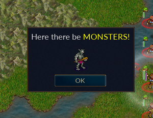
| You may have noticed our GUI is missing a header and a way to close it when we're done admiring our work. Here we add a new first row to our grid, while demonstrating a couple formatting options: a border to put some distance between our grid cell and its neighbor, and the "use_markup = true" option to enable Pango support in our text.
Our third row adds an OK button at the bottom. You can associate actions with buttons to do all kinds of things, but here we just exploit the default behaviour to close the GUI. Of course, we'll also have to modify our return to support the new function, and update our menu item(s) accordingly. |
local function most_basic_gui2()
    local dialogDefinition = {
        wml.tag.tooltip { id = "tooltip_large" },
        wml.tag.helptip { id = "helptip_large" },
        wml.tag.grid {
            wml.tag.row {  -- A header
                wml.tag.column {
                    border = "bottom",
                    border_size = 10,
                    wml.tag.label {
                        use_markup = true,
                        label = "<span size='large'>" .. _"Here there be " ..
                        "<span color='yellow'>" ..
                        _"MONSTERS!" .. "</span></span>"
                    }
                }
            },
            wml.tag.row {  -- The body of our GUI
                wml.tag.column {
                    wml.tag.image {
                        label = "units/trolls/grunt.png"
                    }
                }
            },
            wml.tag.row {
                wml.tag.column {  -- An "OK" button, with no action assigned for now,
                                  -- but it will close the GUI
                    wml.tag.button {
                        id = "ok",
                        label = _"OK"
                    },
                }
            }
        }
    }
    gui.show_dialog(dialogDefinition)
end
return { most_basic_gui = most_basic_gui, most_basic_gui2 = most_basic_gui2 }
And a bit more
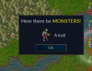
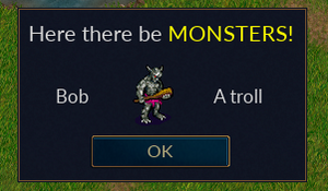
| And now a minor, but important change. We want to add a new text field next to the image in the body of our GUI. Obviously, we want to add a new column, but this is more difficult than when we added new rows in the previous example. The problem is that all rows (at a given level) in a grid must contain the same number of columns. We can't have two columns in the row that constitutes the body of our GUI, but only one in the header and one in the footer. To solve this problem, we replace our image widget with a new grid, which can use as many columns as we like (as long as they are the same within each row of our new grid). This new grid contains a row with two columns, but that is okay because the new grid itself is placed in a single column, which matches our single column header and footer (ok button), keeping the rows balanced. |
local function most_basic_gui3()
    local dialogDefinition = {
        wml.tag.tooltip { id = "tooltip_large" },
        wml.tag.helptip { id = "helptip_large" },
        wml.tag.grid {
            wml.tag.row {  -- A header
                wml.tag.column {
                    border = "bottom",
                    border_size = 10,
                    wml.tag.label {
                        use_markup = true,
                        label = "<span size='large'>" .. _"Here there be " ..
                        "<span color='yellow'>" ..
                        _"MONSTERS!" .. "</span></span>"
                    }
                }
            },
            wml.tag.row {  -- The body of our GUI
                wml.tag.column {  -- This is the only column in this row,
                                  -- to match the number of columns in
                                  -- the rows of our header and footer
                    wml.tag.grid {  -- A new grid, so we can use a different
                                    -- number of columns
                        wml.tag.row {
                            wml.tag.column {
                                wml.tag.image {
                                    label = "units/trolls/grunt.png"
                                }
                            },
                        wml.tag.column {
                            wml.tag.label {
                                label = "A troll"
                            }
                        }
                    }
                }
            }
        },
        wml.tag.row {  -- A footer
            wml.tag.column {  -- An "OK" button, with no action assigned for now,
                              -- but it will close the GUI
                wml.tag.button {
                        id = "ok",
                        label = "Ok"
                    }
                }
            }
        }
    }
    gui.show_dialog(dialogDefinition)
end
While we see here just the simplest of examples, you can many levels of grids in grids, rows with multiple columns some of which containing grids, etc, to build complicated dialogs to your liking.
Containers
Stacked Widget
TODO
Listbox
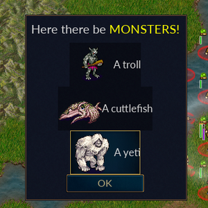
| Now we'd like to add some more monsters. Obviously, we could just add more rows, but what if we won't know until runtime how many and which ones? We could break up the definition of our dialog and add new rows dynamically, it's just a table after all, but fortunately we have a widget which handles this for us, a listbox. A listbox is kind of like an array, a collection of similar objects where the number of items can vary. We will tell the GUI where we want the box, and what each entry in the box will look like, and then at runtime we can add entries to the box.
Note that listbox items are added from top to bottom. Another container, the horizontal_listbox, works just like a listbox except the items are added from left to right. With a grid listbox, items are added horizontally with the list wrapping to a new line as necessary. | ||||||||||||||||||||||||||||||
local function gui_with_listbox()
    local monsters = {
        { image = "units/trolls/grunt.png",
          string = "A troll" },
        { image = "units/monsters/cuttlefish.png",
          string = "A cuttlefish" },
        { image = "units/monsters/yeti.png",
          string = "A yeti" }
    }

    local listbox_id = "monsters"

    local listboxItem = wml.tag.grid {
        wml.tag.row {
            wml.tag.column {
                wml.tag.image {
                    id = "monster_image"
                }
            },
            wml.tag.column {
                wml.tag.label {
                    id = "monster_label"
                }
            }
        }
    }

    local listboxDefinition = wml.tag.listbox { id = listbox_id,
        wml.tag.list_definition {
            wml.tag.row {
                wml.tag.column {
                    wml.tag.toggle_panel {
                        listboxItem
                    }
                }
            }
        }
    }

    local dialogDefinition = {
        wml.tag.tooltip { id = "tooltip_large" },
        wml.tag.helptip { id = "tooltip_large" },
        wml.tag.grid {
            wml.tag.row {  -- A header
                wml.tag.column {
                    border = "bottom",
                    border_size = 10,
                        wml.tag.label {
                            use_markup = true,
                            label = "<span size='large'>" .. _"Here there be " ..
                                "<span color='yellow'>" ..
                                _"MONSTERS!" .. "</span></span>"
                        }
                    }
                },
            wml.tag.row {  -- The body of our GUI
                wml.tag.column {
                    listboxDefinition
                }
            },
            wml.tag.row {
                wml.tag.button {
                    id = "ok",
                    label = _"OK"
                }
            }
        }
    }
    local function preshow(dialog)  -- Prepare the GUI before display
        local listbox = dialog[listbox_id]
            for i, monster in ipairs(monsters) do
                listbox[i].monster_image.label = monster.image
                listbox[i].monster_label.label = monster.string
            end
    end
    gui.show_dialog(dialogDefinition,preshow)
end
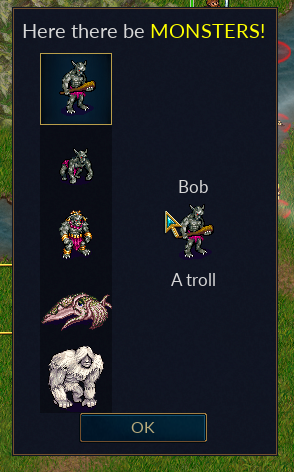
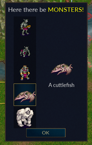
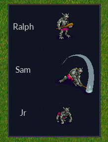
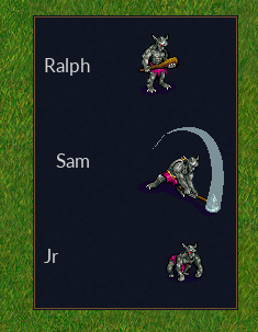
We begin by creating a simple table which represents the data which will be presented in our listbox. In most cases, we probably wouldn't create that monster table here, but we need it for our example. The variable listbox_id gives us an identifier for our listbox so we can reference it when we need to. We don't really need to use a variable here, it's just convenient. We define the structure for the elements in our listbox, stored in listboxItem. Note that we've replaced the actual data with identifiers (e.g. 'units/trolls/grunt.png' becomes 'id = "monster_image"), since each element may have different data. We define the listbox itself, specifying the identifier, and the definition of our listbox element (which looks a lot like a grid). The cell inside the column contains a variable which is just the listbox element definition we created above; it's not necessary to do this, we could have used one big table, but it's easier to read this way (IMO). We replace the hardcoded data in our GUI body with our new listbox definition, again using a variable to make it easier to read. We create a function, often called preshow(), which will be called for us as part of the drawing the GUI (see the new optional argument in gui.show_dialog() -- there's also an optional postshow(), but we don't need it here). This is where we pull the data from our example table into the listbox. We create a listbox variable associated with the listbox, identified by the listbox_id we assigned earlier, inside the dialog which gui.show_dialog() passes to preshow(). Then we iterate through our data table, using each entry from that table to populate a listbox item. Let's look at that last action a little more closely using an example. listbox[i].monster_image.label = monster.image
Which we can read as "In listbox element i of our listbox, for the image with identifier monster_image which we defined in our listboxItem, use the data from the corresponding index i in our example data table" (you don't see the index i for the monsters table here, but remember we're iterating using ipairs, we could have just as easily used listbox[i].monster_image.label = monsters[i].image). If you were to step through all of the variable substitutions, you'd see that for i=1, our dialogDefinition is basically the same thing as it was in the earlier examples, just supplied from a table instead of hardcoded (note that you can hardcode entries in a listbox in your dialog definition using the [list_data] tag, aka wml.tag.list_data, which we do not demonstrate here). You will probably notice that our data does not line up nicely in the GUI. We will fix that later. We'll also demonstrate how the user can select an item in a listbox, and how you can identify which item that was using the selected_index variable of the listbox. Tree ViewSimple Tree View
  1local function basic_tree_view()
  2    local monsters = {
  3        { image = "units/trolls/grunt.png",
  4            label = "A troll", name = _"Bob",
  5            type = "Trolls" },
  6        { image = "units/trolls/whelp.png",
  7            label = "A troll whelp", name = "Junior",
  8            type = "Trolls" },
  9        { image = "units/trolls/shaman.png",
 10            label = "A troll shaman", name = _"Alice",
 11            type = "Trolls" },
 12        { image = "units/monsters/cuttlefish.png",
 13            label = "A cuttlefish", type = "Seamonsters" },
 14        { image = "units/monsters/yeti.png", label = "A yeti",
 15            type = "Coolers" }
 16    }
 17
 18    local tree_view = wml.tag.tree_view {
 19        id = "monsters_tv",
 20        wml.tag.node {
 21            id = "trolls_node",
 22            wml.tag.node_definition {
 23                wml.tag.row {
 24                    wml.tag.column {
 25                        wml.tag.label {
 26                            id = "monster_name",
 27                            linked_group = "monster_name"
 28                        }
 29                    },
 30                    wml.tag.column {
 31                        wml.tag.image {
 32                            id = "monster_image",
 33                            linked_group = "monster_image"
 34                        }
 35                    },
 36                    wml.tag.column {
 37                        wml.tag.label {
 38                            id = "monster_label",
 39                            linked_group = "monster_label"
 40                        }
 41                    }
 42                }
 43            }
 44        },
 45        wml.tag.node {
 46            id = "nottrolls_node",
 47            wml.tag.node_definition {
 48                wml.tag.row {
 49                    wml.tag.column {
 50                        wml.tag.image {
 51                            id = "monster_image",
 52                            linked_group = "monster_image"
 53                        }
 54                    },
 55                    wml.tag.column {
 56                        wml.tag.label {
 57                            id = "monster_label",
 58                            linked_group = "monster_label"
 59                        }
 60                    }
 61                }
 62            }
 63        }
 64    }
 65
 66    local dialogDefinition = {
 67        wml.tag.tooltip { id = "tooltip_large" },
 68        wml.tag.helptip { id = "tooltip_large" },
 69        wml.tag.linked_group {
 70            id = "monster_name",
 71            fixed_width = true
 72        },
 73        wml.tag.linked_group {
 74            id = "monster_image",
 75            fixed_width = true
 76        },
 77        wml.tag.linked_group {
 78            id = "monster_label",
 79            fixed_width = true
 80        },
 81        wml.tag.grid {
 82            wml.tag.row {  -- A header
 83                wml.tag.column {
 84                    border = "bottom",
 85                    border_size = 10,
 86                    wml.tag.label {
 87                        use_markup = true,
 88                        label = "<span size='large'>" .. _"Here there be " ..
 89                        "<span color='yellow'>" ..
 90                        _"MONSTERS!" .. "</span></span>"
 91                    }
 92                }
 93            },
 94            wml.tag.row {  -- The body of our GUI
 95                wml.tag.column {
 96                    tree_view
 97                }
 98            },
 99            wml.tag.row {
100                wml.tag.column {
101                    wml.tag.button {
102                        id = "ok",
103                        label = _"OK"
104                    }
105                }
106            }
107        }
108    }
109    local function preshow(dialog)
110        for i, monster in ipairs(monsters) do
111            if monster.type == "Trolls" then
112                dialog.monsters_tv:add_item_of_type("trolls_node")
113                dialog.monsters_tv[i].monster_name.label = monster.name  -- only trolls have a name
114            else
115                dialog.monsters_tv:add_item_of_type("nottrolls_node")
116            end
117            -- All of our monsters have an image and a label
118            dialog.monsters_tv[i].monster_image.label = monster.image
119            dialog.monsters_tv[i].monster_label.label = monster.label
120        end
121    end
122    gui.show_dialog(dialogDefinition,preshow)
123end
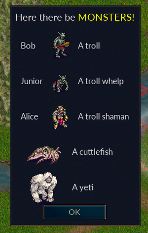
We have expanded our list of monsters to include three types of trolls. We have also given each troll a name. This is of course a rather simplistic example, we could have simply given each monster that is not a troll an empty name, but it as presented here our approach serves the purpose of demonstrating how we deal with multiple data types. Our new tree view contains a node for each type of data we will present. In preshow, we explicitly define each element in our list using add_item_of_type(), and populate the item accordingly. [Note: in our listbox example, we could have used add_item() to add items to the listbox, but chose not to since that section was already introducing a number of new concepts. But here, since we have multiple types of items we need to be able to specify the type of the item when we add one, hence we need to use add_item_of_type()]. You may also note the addition of a few linked_group lines. We'll cover linked groups in more detail later, but as used here they instruct the GUI that each column using the same node type needs to be aligned with the others. For example, all of our trolls line up nicely. Building a Tree
  1local function building_a_tree()
  2    local tree_view = wml.tag.tree_view {
  3        id = "monsters_tv",
  4        wml.tag.node {
  5            id = "race_node",
  6            wml.tag.node_definition {
  7                wml.tag.row {
  8                    wml.tag.column {
  9                        wml.tag.toggle_button {
 10                            id = "race_button",
 11                        }
 12                    },
 13                    wml.tag.column {
 14                        wml.tag.label {
 15                            id = "race_label",
 16                        }
 17                    }
 18                }
 19            }
 20        },
 21        wml.tag.node {
 22            id = "details_node",
 23            wml.tag.node_definition {
 24                wml.tag.row {
 25                    wml.tag.column {
 26                        wml.tag.label {
 27                            id = "monster_type",
 28                        }
 29                    }
 30                }
 31            }
 32        }
 33    }
 34    local dialogDefinition = {
 35        wml.tag.tooltip { id = "tooltip_large" },
 36        wml.tag.helptip { id = "tooltip_large" },
 37        wml.tag.grid {
 38            wml.tag.row {  -- A header
 39                wml.tag.column {
 40                    border = "bottom",
 41                    border_size = 10,
 42                    wml.tag.label {
 43                        use_markup = true,
 44                        label = "<span size='large'>" .. _"Show me the " ..
 45                        "<span color='yellow'>" ..
 46                        _"MONSTERS!" .. "</span></span>"
 47                    }
 48                }
 49            },
 50            wml.tag.row {  -- The body of our GUI
 51                wml.tag.column {
 52                    tree_view
 53                }
 54            },
 55            wml.tag.row {
 56                wml.tag.column {  -- An "OK" button
 57                    wml.tag.button {
 58                        id = "ok",
 59                        label = _"OK"
 60                    },
 61                }
 62            }
 63        }
 64    }
 65    local function preshow(dialog)  -- Prepare the GUI before display
 66        -- You can refer to an object by its position
 67
 68        -- dialog.monsters_tv:add_item_of_type("race_node")
 69        -- dialog.monsters_tv[1].race_label.label = "Trolls"
 70        -- dialog.monsters_tv[1].race_button.on_modified =
 71        --    function()dialog.monsters_tv[1].unfolded =
 72        -- dialog.monsters_tv[1].race_button.selected end
 73
 74        -- dialog.monsters_tv[1]:add_item_of_type("details_node")
 75        -- dialog.monsters_tv[1][1].monster_type.label = "Whelp"
 76        -- dialog.monsters_tv[1]:add_item_of_type("details_node")
 77        -- dialog.monsters_tv[1][2].monster_type.label = "Shaman"
 78        -- dialog.monsters_tv[1]:add_item_of_type("details_node")
 79        -- dialog.monsters_tv[1][3].monster_type.label = "Troll"
 80
 81        -- dialog.monsters_tv:add_item_of_type("race_node")
 82        -- dialog.monsters_tv[2].race_label.label = "Other scary things"
 83        -- dialog.monsters_tv[2].race_button.visible = "hidden"
 84
 85        -- ... or you can refer to that object using the return value
 86        --    from add_item_of_type
 87        local troll_node = dialog.monsters_tv:add_item_of_type("race_node")
 88        troll_node.race_label.label = "Trolls"
 89        troll_node.race_button.on_modified =
 90            function()
 91                troll_node.unfolded = troll_node.race_button.selected
 92            end
 93        local item = troll_node:add_item_of_type("details_node")
 94        item.monster_type.label = "Whelp"
 95        item = troll_node:add_item_of_type("details_node")
 96        item.monster_type.label = "Shaman"
 97        item = troll_node:add_item_of_type("details_node")
 98        item.monster_type.label = "Troll"
 99
100        local not_troll_node =
101            dialog.monsters_tv:add_item_of_type("race_node")
102        not_troll_node.race_label.label = "Other scary things"
103        not_troll_node.race_button.visible = "hidden"
104
105    end
106    gui.show_dialog(dialogDefinition,preshow)
107end
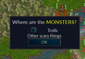
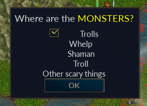
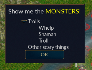
We define two nodes in our tree, a race_node for the top level, and a details_node for the children of a race_node. The rest of the interesting bits are in preshow(). We demonstrate two different ways of creating and accessing items, the first (commented out) just using the order in which they are created, while in the second we capture the result of add_item_of_type() in a variable we can use to refer to the newly defined object. The first method is shown primarily to demonstrate the structure of the resulting objects. The second method is perhaps easier to follow, and is almost necessary when you start doing things like dynamically deleting nodes, so it is in most cases a better practice (of course, you probably won't want to use the same variable for each node like we did, and perhaps not one local to the preview function). We add a node, label it "Trolls", and add a callback to the button such that the children of the node will be visible (the node is "unfolded", a boolean value which defaults to false) when the button is checked (selected == true). Then we add three "details_node" nodes as children of this node. Our second node, "Other scary things" will remain empty for now, so we'll set the visible attribute on its button to "hidden" (which is like false, but with hidden the widget still takes up space).
|
||||||||||||||||||||||||||||||
