Difference between revisions of "Sandbox/GUI/Getting Started"
m (→A More Useful Multi_page) |
m (→Buttons) |
||
| Line 942: | Line 942: | ||
local function basic_return_value() | local function basic_return_value() | ||
| − | + | local dialogDefinition = { | |
| − | + | wml.tag.tooltip { id = "tooltip_large" }, | |
| − | + | wml.tag.helptip { id = "tooltip_large" }, | |
| − | + | wml.tag.linked_group { | |
| − | + | id = "leader_lg", | |
| − | + | fixed_height = true, | |
| − | + | }, | |
| − | + | wml.tag.grid { | |
| − | + | wml.tag.row { -- A header | |
| − | + | wml.tag.column { | |
| − | + | border = "bottom", | |
| − | + | border_size = 10, | |
| − | + | wml.tag.label { | |
| − | + | use_markup = true, | |
| − | + | label = "<span size='large'>" .. | |
| + | _"Which unit shall lead your army?" .. "</span>" | ||
| + | } | ||
| + | } | ||
| + | }, | ||
| + | wml.tag.row { -- The body of our GUI | ||
| + | wml.tag.column { | ||
| + | wml.tag.grid { | ||
| + | wml.tag.row { | ||
| + | wml.tag.column { | ||
| + | wml.tag.grid { | ||
| + | wml.tag.row { | ||
| + | wml.tag.column { | ||
| + | wml.tag.label { label = "Alice" } | ||
| + | } | ||
| + | }, | ||
| + | wml.tag.row { | ||
| + | wml.tag.column { | ||
| + | wml.tag.image { | ||
| + | linked_group = "leader_lg", | ||
| + | label = "units/elves-wood/sylph.png" | ||
| + | } | ||
| + | } | ||
| + | }, | ||
| + | wml.tag.row { | ||
| + | wml.tag.column { | ||
| + | wml.tag.button { | ||
| + | label = "Select", | ||
| + | return_value = 1 | ||
| + | } | ||
} | } | ||
| + | }, | ||
} | } | ||
| − | + | }, | |
| − | + | wml.tag.column { | |
| − | + | wml.tag.spacer { width = 20 } | |
| − | + | }, | |
| − | + | wml.tag.column { | |
| − | + | wml.tag.grid { | |
| − | + | wml.tag.row { | |
| − | + | wml.tag.column { | |
| − | + | wml.tag.label { label = "Bob" } | |
| − | |||
| − | |||
| − | |||
| − | |||
| − | |||
| − | |||
| − | |||
| − | |||
| − | |||
| − | |||
| − | |||
| − | |||
| − | |||
| − | |||
| − | |||
| − | |||
| − | |||
| − | |||
| − | |||
| − | |||
| − | |||
| − | |||
| − | |||
| − | |||
| − | |||
| − | |||
| − | |||
| − | |||
| − | |||
| − | |||
| − | |||
| − | |||
| − | |||
| − | |||
| − | |||
| − | |||
| − | |||
| − | |||
| − | |||
| − | |||
| − | |||
| − | |||
| − | |||
| − | |||
| − | |||
| − | |||
| − | |||
| − | |||
| − | |||
| − | |||
} | } | ||
| + | }, | ||
| + | wml.tag.row { | ||
| + | wml.tag.column { | ||
| + | wml.tag.image { | ||
| + | linked_group = "leader_lg", | ||
| + | label = "units/human-loyalists/marshal.png" | ||
| + | } | ||
| + | } | ||
| + | }, | ||
| + | wml.tag.row { | ||
| + | wml.tag.column { | ||
| + | wml.tag.button { | ||
| + | label = "Select", | ||
| + | return_value = 2 | ||
| + | } | ||
| + | } | ||
| + | } | ||
} | } | ||
| + | } | ||
} | } | ||
| + | } | ||
} | } | ||
| + | } | ||
} | } | ||
| − | + | } | |
| − | + | local user_chose = gui.show_dialog(dialogDefinition) | |
| − | + | local leader | |
| − | + | if user_chose == -1 then -- User closed the dialog by hitting the Enter key | |
| − | + | leader = nil | |
| − | + | end | |
| − | + | if user_chose == -2 then -- User closed the dialog by hitting the Escape key | |
| − | + | leader = nil | |
| − | + | end | |
| − | |||
| − | + | if user_chose == 1 then | |
| − | + | leader = "Alice" | |
| − | + | end | |
| − | + | if user_chose == 2 then | |
| − | + | leader = "Bob" | |
| − | + | end | |
| − | + | local confirmed_leader_choice | |
| − | + | if leader ~= nil then | |
| − | + | local query = _"You want " .. leader .. _" as your leader?" | |
| − | + | confirmed_leader_choice = gui.confirm(query) | |
| − | + | end | |
| − | + | if confirmed_leader_choice then | |
| − | + | wesnoth.message("Great!") | |
| − | + | else | |
| − | + | wesnoth.message("Fine, lead them yourself!") | |
| − | + | end | |
end | end | ||
</syntaxhighlight> | </syntaxhighlight> | ||
Revision as of 02:14, 9 August 2024
So, it looks like I can't exclude this page/section from the search engine as I had hoped. I wanted to put this in a sandbox so that it wouldn't be published without some proper review.
Contents
Introduction
This guide is designed to help you get a simple Wesnoth GUI, implemented in lua, up and running while describing the basic building blocks along the way.
Some would find creating a GUI in part or in full using WML simpler to follow, and those alternatives are available, for example LuaAPI/gui/example, but we're using lua here. If you find WML easier to follow, you can always convert the lua tables that define the GUIs to WML using wml.tostring, for example:
print(wml.tostring(dialogDefinition))
gui.show_lua_console()
In some examples, instead of defining the entire gui at once, we'll break out some parts into separate variables. If you try to view one in WML and get an error from wml.tostring() about expecting a WML table and not a table, try passing your variable(/table) inside a table:
print(wml.tostring({listboxItem}))
gui.show_lua_console()
One distinct advantage of using WML to define your GUI layout is that you get better (any) validation. Invalid keys, and sometimes values, are often flagged in the log, unlike with lua where they are silently ignored.
Getting Started
For example purposes, we'll create a directory in our campaign directory called lua containing a file called gui_tutorial.lua, and add a command in the prestart event for a scenario which will create a right-click menu option to invoke our new GUI. Of course there are other methods to invoke lua from WML, but this one will get us started. After all, we really just want to get something up on the screen ASAP, right?
A most basic GUI
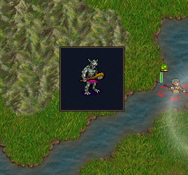
In our prestart event, we create a simple menu item, which executes a single line of lua which calls the lua function most_basic_gui() which is found in gui_tutorial.lua:
[set_menu_item]
   id=most_basic_gui
   description="Our first GUI"
   [command]
       [lua]
           code=<<
                   wesnoth.require("~add-ons/<OUR_CAMPAIGN>/lua/gui_tutorial.lua").most_basic_gui()
                >>
       [/lua]
    [/command]
[/set_menu_item]
And create gui_tutorial.lua:
| The WML equivalent of dialogDefinition | |
|---|---|
local function most_basic_gui()
    local dialogDefinition = {
        --click_dismiss = true, -- allow user to close dialog with click of a button
        wml.tag.tooltip { id = "tooltip_large" },  -- required
        wml.tag.helptip { id = "tooltip_large" },  -- required
        wml.tag.grid {   -- our most basic gui
            wml.tag.row {  -- a grid must include at least one row
                wml.tag.column {  -- a row needs a column
                    wml.tag.image {  -- we can put stuff in a column
                        label = "units/trolls/grunt.png"
                    }
                }
            }
        }
    }

    local function preshow(dialog)
        print(wml.tostring(dialogDefinition))
            gui.show_lua_console()
        end
        gui.show_dialog(dialogDefinition,preshow)

        -- Or, if you want to define the gui in WML, something like:
        -- local dialog_wml = wml.load "~add-ons/GUI_Tutorial/most_basic_gui.cfg"
        -- gui.show_dialog(wml.get_child(dialog_wml, 'resolution'))
end
return { most_basic_gui = most_basic_gui}
|
[tooltip]
    id="tooltip_large"
[/tooltip]
[helptip]
    id="tooltip_large"
[/helptip]
[grid]
    [row]
        [column]
            [image]
                label="units/trolls/grunt.png"
            [/image]
        [/column]
    [/row]
[/grid]
|
In the above file, we have just the single function to create our GUI, followed by a return command which makes our function most_basic_gui() available to the wesnoth.require() function as most_basic_gui().
Our function creates a table containing the definition of a "dialog", and then passes that to gui.show_dialog(). It should be noted that gui.show_dialog does not provide synchronization, so if your GUI makes changes to the game state, you'll need to jump through some hoops or you'll break replays and multiplayer, but that's not something we need to care about at this point, so just be aware that you may need to deal with it in the future.
Our dialog definition at this point includes three parts. The first two are a tooltip and a helptip, which are required and define how tooltips (use id = "tooltip_large" or id = "tooltip" or id = "tooltip_transparent"), and helptips (rarely used, but must be included here, and yes their definitions are "tooltip" not "helptip") will look. The third part is a grid, which is basically a table, like in HTML or MySQL, with rows and columns. A grid always contains at least one row. A row contains at least one column (note that a column does NOT span rows, it is completely contained within a row). Inside a column is exactly one item, a cell which contains a widget, in this case we'll use an image (later we'll see what else we can put in a cell). Note that we don't actually define a cell in our code, it's just a term used to refer to the contents of a column.
The preshow function is optional. If included in the call to gui.show_dialog(), it is run before the GUI is displayed. In this case, we include it to display the dialog we created with lua in WML format. Near the end, in comments, we show how you would call gui.show_dialog() if you chose to define your dialog using WML. Note that what is shown here is the WML equivalent of our lua dialogDefinition, and not the complete WML you would need to use if you were to configure your GUI layout in WML.
Note: if you should try out the above, you'll have to hit escape or enter to close the GUI. Uncomment the "click_dismiss" line, and the user will be able to close the GUI with a mouse click.
Adding a little flavor
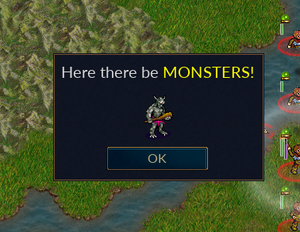
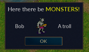
You may have noticed our GUI is missing a header and a way to close it when we're done admiring our work. Here we add a new first row to our grid, while demonstrating a couple formatting options: a border to put some distance between our grid cell and its neighbor, and the "use_markup = true" option to enable Pango support in our text.
Our third row adds an OK button at the bottom. You can associate actions with buttons to do all kinds of things, but here we just exploit the default behaviour to close the GUI.
Of course, we'll also have to modify our return to support the new function, and update our menu item(s) accordingly.
local function most_basic_gui2()
    local dialogDefinition = {
        wml.tag.tooltip { id = "tooltip_large" },
        wml.tag.helptip { id = "helptip_large" },
        wml.tag.grid {
            wml.tag.row {  -- A header
                wml.tag.column {
                    border = "bottom",
                    border_size = 10,
                    wml.tag.label {
                        use_markup = true,
                        label = "<span size='large'>" .. _"Here there be " ..
                        "<span color='yellow'>" ..
                        _"MONSTERS!" .. "</span></span>"
                    }
                }
            },
            wml.tag.row {  -- The body of our GUI
                wml.tag.column {
                    wml.tag.image {
                        label = "units/trolls/grunt.png"
                    }
                }
            },
            wml.tag.row {
                wml.tag.column {  -- An "OK" button, with no action assigned for now,
                                  -- but it will close the gui
                    wml.tag.button {
                        id = "ok",
                        label = _"OK"
                    },
                }
            }
        }
    }
    gui.show_dialog(dialogDefinition)
end
return { most_basic_gui = most_basic_gui, most_basic_gui2 = most_basic_gui2 }
And a bit more
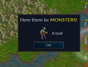
And now a minor, but important change. We want to add a new text field next to the image in the body of our GUI. Obviously, we want to add a new column, but this is more difficult than when we added new rows in the previous example. The problem is that all rows (at a given level) in a grid must contain the same number of columns. We can't have two columns in the row that constitutes the body of our GUI, but only one in the header and OK button. To solve this problem, we replace our image widget with a new grid, which can use as many columns as we like (as long as they are the same within each row of our new grid). This grid contains a row with two columns, but that is okay because the grid itself is placed in a single column, which matches our single column header and footer (ok button), keeping the rows balanced.
local function most_basic_gui3()
    local dialogDefinition = {
        wml.tag.tooltip { id = "tooltip_large" },
        wml.tag.helptip { id = "helptip_large" },
        wml.tag.grid {
            wml.tag.row {  -- A header
                wml.tag.column {
                    border = "bottom",
                    border_size = 10,
                    wml.tag.label {
                        use_markup = true,
                        label = "<span size='large'>" .. _"Here there be " ..
                        "<span color='yellow'>" ..
                        _"MONSTERS!" .. "</span></span>"
                    }
                }
            },
            wml.tag.row {  -- The body of our GUI
                wml.tag.column {  -- This is the only column in this row,
                                  -- to match the number of columns in
                                  -- the rows of our header and footer
                    wml.tag.grid {  -- A new grid, so we can use a different number of columns
                        wml.tag.row {
                            wml.tag.column {
                                wml.tag.image {
                                    label = "units/trolls/grunt.png"
                                }
                            },
                        wml.tag.column {
                            wml.tag.label {
                                label = "A troll"
                            }
                        }
                    }
                }
            }
        },
        wml.tag.row {  -- A footer
            wml.tag.column {  -- An "OK" button, with no action assigned for now,
                              -- but it will close the gui
                wml.tag.button {
                        id = "ok",
                        label = "Ok"
                    }
                }
            }
        }
    }
    gui.show_dialog(dialogDefinition)
end
Containers
Stacked Widget
TODO
Listbox
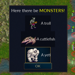
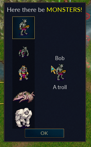
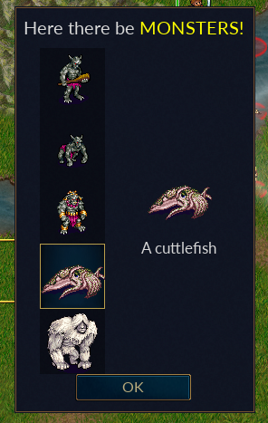
Now we'd like to add some more monsters. Obviously, we could just add more rows, but what if we won't know until runtime how many and which ones? We could break up the definition of our dialog and add new rows dynamically, it's just a table after all, but fortunately we have a widget which handles this for us, a listbox. A listbox is kind of like an array, a collection of similar objects where the number of items can vary. We will tell the GUI where we want the box, and what each entry in the box will look like, and then at runtime we can add entries to the box.
local function gui_with_listbox()
    local monsters = {
        { image = "units/trolls/grunt.png",
          string = "A troll" },
        { image = "units/monsters/cuttlefish.png",
          string = "A cuttlefish" },
        { image = "units/monsters/yeti.png",
          string = "A yeti" }
    }

    local listbox_id = "monsters"

    local listboxItem = wml.tag.grid {
        wml.tag.row {
            wml.tag.column {
                wml.tag.image {
                    id = "monster_image"
                }
            },
            wml.tag.column {
                wml.tag.label {
                    id = "monster_label"
                }
            }
        }
    }

    local listboxDefinition = wml.tag.listbox { id = listbox_id,
        wml.tag.list_definition {
            wml.tag.row {
                wml.tag.column {
                    wml.tag.toggle_panel {
                        listboxItem
                    }
                }
            }
        }
    }

    local dialogDefinition = {
        wml.tag.tooltip { id = "tooltip_large" },
        wml.tag.helptip { id = "tooltip_large" },
        wml.tag.grid {
            wml.tag.row {  -- A header
                wml.tag.column {
                    border = "bottom",
                    border_size = 10,
                        wml.tag.label {
                            use_markup = true,
                            label = "<span size='large'>" .. _"Here there be " ..
                                "<span color='yellow'>" ..
                                _"MONSTERS!" .. "</span></span>"
                        }
                    }
                },
            wml.tag.row {  -- The body of our GUI
                wml.tag.column {
                    listboxDefinition
                }
            },
            wml.tag.row {
                wml.tag.button {
                    id = "ok",
                    label = _"OK"
                }
            }
        }
    }
    local function preshow(dialog)  -- Prepare the GUI before display
        local listbox = dialog[listbox_id]
            for i, monster in ipairs(monsters) do
                listbox[i].monster_image.label = monster.image
                listbox[i].monster_label.label = monster.string
            end
    end
    gui.show_dialog(dialogDefinition,preshow)
end
We begin by creating a simple table which represents the data which will be presented in our listbox. In most cases, we probably wouldn't create that monster table here, but we need it for our example.
The variable listbox_id gives us an identifier for our listbox so we can reference it when we need to. We don't really need to use a variable here, it's just convenient.
We define the structure for the elements in our listbox, stored in listboxItem. Note that we've replaced the actual data with identifiers (e.g. 'units/trolls/grunt.png' becomes 'id = "monster_image"), since each element may have different data.
We define the listbox itself, specifying the identifier, and the definition of our listbox element (which looks a lot like a grid). The cell inside the column contains a variable which is just the listbox element definition we created above; it's not necessary to do this, we could have used one big table, but it's easier to read this way (IMO).
We replace the hardcoded data in our GUI body with our new listbox definition, again using a variable to make it easier to read.
We create a function, often called preshow(), which will be called for us as part of the drawing the GUI (see the new optional argument in gui.show_dialog() -- there's also an optional postshow(), but we don't need it here). This is where we pull the data from our example table into the listbox. We create a listbox variable associated with the listbox, identified by the listbox_id we assigned earlier, inside the dialog which gui.show_dialog() passes to preshow(). Then we iterate through our data table, using each entry from that table to populate a listbox item.
Let's look at that last action a little more closely using an example.
listbox[i].monster_image.label = monster.image
Which we can read as "In listbox element i of our listbox, for the image with identifier monster_image which we defined in our listboxItem, use the data from the corresponding index i in our example data table". If you were to step through all of the variable substitutions, you'd see that for i=1, our dialogDefinition is basically the same thing as it was in the earlier examples, just supplied from a table instead of hardcoded (note that you can hardcode entries in a listbox in your dialog definition using the [list_data] tag, aka wml.tag.list_data.
You will probably notice that our data does not line up nicely in the GUI. We will fix that later. We'll also demonstrate how the user can select and item in a listbox, and you can identify which item using selected_index.
Tree View
Simple Tree View
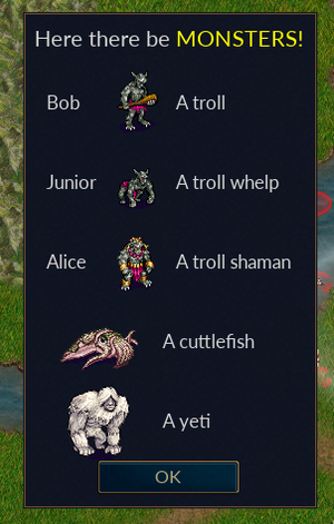
You may have noticed that clicking on a listbox item in our listbox caused it to be highlighted with a box around the contents. This is because the items in a listbox are selectable. This will be useful when we want to add actions, but it looks a bit odd if we just want to present a list of data. Also, most of the data had to be formatted the same for each item in the listbox. We could, perhaps, include custom markup in our labels, but the actual layout, like the number of columns per row, had to be the same for every item. Another way to present a list of data is the tree view. Since a tree view supports multiple data types, we may need to create multiple definitions for the elements in our list. These are known as nodes. It will also be necessary to explicitly define which node to use for each element when we populate our tree view. 1local function basic_tree_view()
2 local monsters = {
3 { image = "units/trolls/grunt.png",
4 label = "A troll", name = _"Bob",
5 type = "Trolls" },
6 { image = "units/trolls/whelp.png",
7 label = "A troll whelp", name = "Junior",
8 type = "Trolls" },
9 { image = "units/trolls/shaman.png",
10 label = "A troll shaman", name = _"Alice",
11 type = "Trolls" },
12 { image = "units/monsters/cuttlefish.png",
13 label = "A cuttlefish", type = "Seamonsters" },
14 { image = "units/monsters/yeti.png", label = "A yeti",
15 type = "Coolers" }
16 }
17
18 local tree_view = wml.tag.tree_view {
19 id = "monsters_tv",
20 wml.tag.node {
21 id = "trolls_node",
22 wml.tag.node_definition {
23 wml.tag.row {
24 wml.tag.column {
25 wml.tag.label {
26 id = "monster_name",
27 linked_group = "monster_name"
28 }
29 },
30 wml.tag.column {
31 wml.tag.image {
32 id = "monster_image",
33 linked_group = "monster_image"
34 }
35 },
36 wml.tag.column {
37 wml.tag.label {
38 id = "monster_label",
39 linked_group = "monster_label"
40 }
41 }
42 }
43 }
44 },
45 wml.tag.node {
46 id = "nottrolls_node",
47 wml.tag.node_definition {
48 wml.tag.row {
49 wml.tag.column {
50 wml.tag.image {
51 id = "monster_image",
52 linked_group = "monster_image"
53 }
54 },
55 wml.tag.column {
56 wml.tag.label {
57 id = "monster_label",
58 linked_group = "monster_label"
59 }
60 }
61 }
62 }
63 }
64 }
65
66 local dialogDefinition = {
67 wml.tag.tooltip { id = "tooltip_large" },
68 wml.tag.helptip { id = "tooltip_large" },
69 wml.tag.linked_group {
70 id = "monster_name",
71 fixed_width = true
72 },
73 wml.tag.linked_group {
74 id = "monster_image",
75 fixed_width = true
76 },
77 wml.tag.linked_group {
78 id = "monster_label",
79 fixed_width = true
80 },
81 wml.tag.grid {
82 wml.tag.row { -- A header
83 wml.tag.column {
84 border = "bottom",
85 border_size = 10,
86 wml.tag.label {
87 use_markup = true,
88 label = "<span size='large'>" .. _"Here there be " ..
89 "<span color='yellow'>" ..
90 _"MONSTERS!" .. "</span></span>"
91 }
92 }
93 },
94 wml.tag.row { -- The body of our GUI
95 wml.tag.column {
96 tree_view
97 }
98 },
99 wml.tag.row {
100 wml.tag.column {
101 wml.tag.button {
102 id = "ok",
103 label = _"OK"
104 }
105 }
106 }
107 }
108 }
109 local function preshow(dialog)
110 for i, monster in ipairs(monsters) do
111 if monster.type == "Trolls" then
112 dialog.monsters_tv:add_item_of_type("trolls_node")
113 dialog.monsters_tv[i].monster_name.label = monster.name -- only trolls have a name
114 else
115 dialog.monsters_tv:add_item_of_type("nottrolls_node")
116 end
117 -- All of our monsters have an image and a label
118 dialog.monsters_tv[i].monster_image.label = monster.image
119 dialog.monsters_tv[i].monster_label.label = monster.label
120 end
121 end
122 gui.show_dialog(dialogDefinition,preshow)
123end
We have expanded our list of monsters to include three types of trolls. We have also given each troll a name. This is of course a rather simplistic example, we could have simply given each monster that is not a troll an empty name, but it as presented here our approach serves the purpose of demonstrating how we deal with multiple data types. Our new tree view contains a node for each type of data we will present. In preshow, we explicitly define each element in our list using add_item_of_type(), and populate the item accordingly. [Note: in our listbox example, we could have used add_item() to add items to the listbox, but chose not to since that section was already introducing a number of new concepts. But here, since we have multiple types of items we need to be able to specify the type of the item when we add one, hence we need to use add_item_of_type()].
You may also note the addition of a few linked_group lines. We'll cover linked groups in more detail later, but as used here they instruct the GUI that each column using the same node type needs to be aligned with the others. For example, all of our trolls line up nicely.
Building a Tree
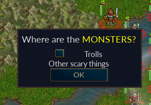
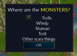
At this point, one may wonder about the name "tree view", since what he have seen doesn't look much like a tree. To make a tree-like structure, we'll demonstrate adding children to nodes. At the top level our (upside-down) tree will have two nodes, one for trolls and one for everything else. A toggle_button (a type of button which changes states when you push it) will allow us to expand the trolls node to expose its children, which are themselves nodes, though they only contain a label at this point.
  1local function basic_tree_view()
  2    local tree_view = wml.tag.tree_view {
  3        id = "monsters_tv",
  4        wml.tag.node {
  5            id = "race_node",
  6            wml.tag.node_definition {
  7                wml.tag.row {
  8                    wml.tag.column {
  9                        wml.tag.toggle_button {
 10                            id = "race_button",
 11                        }
 12                    },
 13                    wml.tag.column {
 14                        wml.tag.label {
 15                            id = "race_label",
 16                        }
 17                    }
 18                }
 19            }
 20        },
 21        wml.tag.node {
 22            id = "details_node",
 23            wml.tag.node_definition {
 24                wml.tag.row {
 25                    wml.tag.column {
 26                        wml.tag.label {
 27                            id = "monster_type",
 28                        }
 29                    }
 30                }
 31            }
 32        }
 33    }
 34    local dialogDefinition = {
 35        wml.tag.tooltip { id = "tooltip_large" },
 36        wml.tag.helptip { id = "tooltip_large" },
 37        wml.tag.grid {
 38            wml.tag.row {  -- A header
 39                wml.tag.column {
 40                    border = "bottom",
 41                    border_size = 10,
 42                    wml.tag.label {
 43                        use_markup = true,
 44                        label = "<span size='large'>" .. _"Show me the " ..
 45                        "<span color='yellow'>" ..
 46                        _"MONSTERS!" .. "</span></span>"
 47                    }
 48                }
 49            },
 50            wml.tag.row {  -- The body of our GUI
 51                wml.tag.column {
 52                    tree_view
 53                }
 54            },
 55            wml.tag.row {
 56                wml.tag.column {  -- An "OK" button
 57                    wml.tag.button {
 58                        id = "ok",
 59                        label = _"OK"
 60                    },
 61                }
 62            }
 63        }
 64    }
 65    local function preshow(dialog)  -- Prepare the GUI before display
 66        -- You can refer to an object by its position
 67        -- dialog.monsters_tv:add_item_of_type("race_node")
 68        -- dialog.monsters_tv[1].race_label.label = "Trolls"
 69        -- dialog.monsters_tv[1].race_button.on_modified = function()dialog.monsters_tv[1].unfolded =
 70        -- dialog.monsters_tv[1].race_button.selected end
 71
 72        -- dialog.monsters_tv[1]:add_item_of_type("details_node")
 73        -- dialog.monsters_tv[1][1].monster_type.label = "Whelp"
 74        -- dialog.monsters_tv[1]:add_item_of_type("details_node")
 75        -- dialog.monsters_tv[1][2].monster_type.label = "Shaman"
 76        -- dialog.monsters_tv[1]:add_item_of_type("details_node")
 77        -- dialog.monsters_tv[1][3].monster_type.label = "Troll"
 78
 79        -- dialog.monsters_tv:add_item_of_type("race_node")
 80        -- dialog.monsters_tv[2].race_label.label = "Other scary things"
 81        -- dialog.monsters_tv[2].race_button.visible = "hidden"
 82
 83        -- ... or you can refer to that object using the return value from add_item_of_type
 84        local troll_node = dialog.monsters_tv:add_item_of_type("race_node")
 85        troll_node.race_label.label = "Trolls"
 86        troll_node.race_button.on_modified =
 87            function()troll_node.unfolded = troll_node.race_button.selected end
 88        local item = troll_node:add_item_of_type("details_node")
 89        item.monster_type.label = "Whelp"
 90        item = troll_node:add_item_of_type("details_node")
 91        item.monster_type.label = "Shaman"
 92        item = troll_node:add_item_of_type("details_node")
 93        item.monster_type.label = "Troll"
 94
 95        local not_troll_node = dialog.monsters_tv:add_item_of_type("race_node")
 96        not_troll_node.race_label.label = "Other scary things"
 97        not_troll_node.race_button.visible = "hidden"
 98
 99    end
100    gui.show_dialog(dialogDefinition,preshow)
101end
We define two nodes in our tree, a race_node for the top level, and a details_node for the children of a race_node. The rest of the interesting bits are in preshow().
We demonstrate two different ways of creating and accessing items, the first (commented out) just using the order in which they are created, while in the second we capture the result of add_item_of_type() in a variable we can use to refer to the newly defined object. The first method is shown primarily to demonstrate the structure of the resulting objects. The second method is perhaps easier to follow, and is almost necessary when you start doing things like dynamically deleting nodes, so it is in most cases a better practice (of course, you probably won't want to use the same variable for each node like we did, and perhaps not one local to the preview function).
We add a node, label it "Trolls", and add a callback to the button such that when the button is checked (selected), the children of the node will be visible (the node is "unfolded", a boolean value which defaults to false). Then we add three nodes as children of this node.
Our second node, "Other scary things" will remain empty for now, so we'll set the visible attribute on its button to "hidden" (which is like false, but with hidden the widget still takes up space).
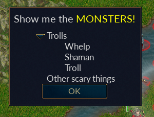
This example is rather ugly, both in the hardwired code and the appearance of the resulting GUI, but it addresses a couple important aspects of how tree views work and how we might use them. Let's clean it up a bit. We'll add an indentation_step_size to the tree view, along with a spacer and horizontal_alignment to our details node, to make the labels line up nicely, and change the button definition to replace the checkbox with something that looks like it belongs there.
local tree_view = wml.tag.tree_view {
    id = "monsters_tv",
    indentation_step_size = 20,
    wml.tag.node {
        id = "race_node",
        wml.tag.node_definition {
            wml.tag.row {
                wml.tag.column {
                    wml.tag.toggle_button {
                        id = "race_button",
                        definition = "tree_view_node"
                    }
                },
                wml.tag.column {
                    horizontal_alignment = "left",
                    grow_factor = 1,
                    wml.tag.label {
                        id = "race_label",
                    }
                }
            }
        }
    },
    wml.tag.node {
        id = "details_node",
        wml.tag.node_definition {
            wml.tag.row {
                wml.tag.column {
                    wml.tag.spacer { width = 40 }
                },
                wml.tag.column {
                    horizontal_alignment = "left",
                    grow_factor = 1,
                    wml.tag.label {
                        id = "monster_type",
                    }
                }
            }
        }
    }
}
Multi_page
Simple Multi_page
Like a tree_view, a multi_page is a heterogeneous container which is dynamically populated, however, while a multi_page contains multiple elements (pages), only one page is displayed at any one time. Its purpose is perhaps best described by a couple of examples.
local function basic_multipage()
    local monsters = {
        { image = "units/trolls/grunt.png",
            label = "A troll",
            name = _"Bob", type = "Trolls" },
        { image = "units/trolls/whelp.png",
            label = "A troll whelp",
            name = "Junior", type = "Trolls" },
        { image = "units/trolls/shaman.png",
            label = "A troll shaman",
            name = _"Alice", type = "Trolls" },
        { image = "units/monsters/cuttlefish.png",
            label = "A cuttlefish",
            type = "Seamonsters" },
        { image = "units/monsters/yeti.png",
            label = "A yeti",
            type = "Coolers" }
    }

    local multi_page = wml.tag.multi_page {
        id = "monsters_mp",
        wml.tag.page_definition {
            id = "trolls_page",
                wml.tag.row {
                    wml.tag.column {
                        wml.tag.label {
                            id = "monster_name"
                        }
                    },
                    wml.tag.column {
                         wml.tag.image {
                             id = "monster_image"
                         }
                    },
                    wml.tag.column {
                        wml.tag.label {
                        id = "monster_label"
                    }
                 }
             }
         },
         wml.tag.page_definition {
             id = "nottrolls_page",
             wml.tag.row {
                 wml.tag.column {
                     wml.tag.image {
                         id = "monster_image",
                         linked_group = "monster_image"
                     }
                 },
             wml.tag.column {
                 wml.tag.label {
                     id = "monster_label",
                     linked_group = "monster_label"
                 }
             }
          }
       }
    }

    local dialogDefinition = {
        wml.tag.tooltip { id = "tooltip_large" },
        wml.tag.helptip { id = "tooltip_large" },
        wml.tag.grid {
            wml.tag.row {  -- A header
                wml.tag.column {
                    border = "bottom",
                    border_size = 10,
                    wml.tag.label {
                        use_markup = true,
                        label = "<span size='large'>" .. _"Here there be " ..
                            "<span color='yellow'>" ..
                            _"MONSTERS!" .. "</span></span>"
                    }
                }
            },
            wml.tag.row {  -- The body of our GUI
                wml.tag.column {
                    multi_page
                }
            },
            wml.tag.row {
                wml.tag.column {  -- An "OK" button
                    wml.tag.button {
                        id = "ok",
                        label = _"OK"
                    },
                }
            }
         }
     }

     local function preshow(dialog)  -- Prepare the GUI before display
         for i, monster in ipairs(monsters) do
             if monster.type == "Trolls" then
                 dialog.monsters_mp:add_item_of_type("trolls_page")
                 dialog.monsters_mp[i].monster_name.label = monster.name
             else
                 dialog.monsters_mp:add_item_of_type("nottrolls_page")
             end
                 dialog.monsters_mp[i].monster_image.label = monster.image
                 dialog.monsters_mp[i].monster_label.label = monster.label
         end
        --dialog.monsters_mp.selected_index = 5
    end
    gui.show_dialog(dialogDefinition,preshow)
end
As you can see, the code for our basic multi_page GUI looks a lot like our basic tree_view GUI. The difference is what is displayed. While both the tree_view and the multi_page containers contain five items, with the multi_page, only the first one is displayed. More specifically, only the page associated with the selected_index attribute of the multi_page object, which defaults to 1, is displayed. If we were to uncomment the last line in preshow(), we would still see only one item, but it would be the fifth one we allocated. It's nice to know all our pages are in there somewhere, but this example is pretty useless. What we need is a way to select which page we want to see from within our GUI.
A More Useful Multi_page
To demonstrate the usefulness of a multi_page, and highlight its difference from a tree_view, we'll add a listbox to allow us to select the page to view. We'll also need to add a little action to our GUI.
local function more_useful_multi_page()
   local monsters = {
        { image = "units/trolls/grunt.png",
          label = "A troll", name = _"Bob",
          race = "Trolls", tip = "Your uncle" },
        { image = "units/trolls/whelp.png",
          label = "A troll whelp", name = "Junior",
          race = "Trolls", tip = "Your nephew" },
        { image = "units/trolls/shaman.png",
          label = "A troll shaman", name = _"Alice",
          race = "Trolls", tip = "Your auntie" },
        { image = "units/monsters/cuttlefish.png",
          label = "A cuttlefish", race = "Seamonsters",
          tip = "Not a fish" },
        { image = "units/monsters/yeti.png",
            label = "A yeti", race = "Coolers",
            tip = "<span size='large' weight='bold'>ROAR!</span>" }
    }

    local listbox_id = "monsters"

    local listboxItem = wml.tag.grid {
        wml.tag.row {
            wml.tag.column {
                wml.tag.image {
                    id = "monster_image"
                }
            }
        }
    }

   local listboxDefinition = wml.tag.listbox {
       id = listbox_id,
       wml.tag.list_definition {
           wml.tag.row {
               wml.tag.column {
                   wml.tag.toggle_panel {
                       listboxItem
                   }
               }
           }
        }
    }

    local multi_page = wml.tag.multi_page {
        id = "monsters_mp",
        wml.tag.page_definition {
            id = "trolls_page",
            wml.tag.row {
                wml.tag.column {
                    wml.tag.label {
                        id = "monster_name"
                    }
                },
            },
            wml.tag.row {
                wml.tag.column {
                    wml.tag.image {
                        id = "monster_image"
                    }
                },
            },
            wml.tag.row {
                wml.tag.column {
                    wml.tag.label {
                        id = "monster_label"
                    }
                }
            }
        },
        wml.tag.page_definition {
            id = "nottrolls_page",
            wml.tag.row {
                wml.tag.column {
                    wml.tag.image {
                        id = "monster_image"
                    }
                },
            },
            wml.tag.row {
                wml.tag.column {
                    wml.tag.label {
                        id = "monster_label"
                    }
                }
            },
        }
    }

    local dialogDefinition = {
        wml.tag.tooltip { id = "tooltip_large" },
        wml.tag.helptip { id = "tooltip_large" },
        wml.tag.grid {
            wml.tag.row {  -- A header
                wml.tag.column {
                    border = "bottom",
                    border_size = 10,
                    wml.tag.label {
                        use_markup = true,
                        label = "<span size='large'>" .. _"Here there be " ..
                            "<span color='yellow'>" ..
                            _"MONSTERS!" .. "</span></span>"
                    }
                }
            },
            wml.tag.row {  -- The body of our GUI
                wml.tag.column {
                    wml.tag.grid {
                        wml.tag.row {
                            wml.tag.column {
                                listboxDefinition
                            },
                            wml.tag.column {
                                wml.tag.spacer {
                                    width = 30
                                }
                            },
                            wml.tag.column {
                                multi_page
                            },
                        }
                    }
                }
            },
            wml.tag.row {
                wml.tag.column {  -- An "OK" button
                    wml.tag.button {
                        id = "ok",
                        label = _"OK"
                    },
                }
            }
        }
    }
   local function preshow(dialog)  -- Prepare the GUI before display
       local listbox = dialog[listbox_id]
       for i, monster in ipairs(monsters) do
            listbox[i].monster_image.label = monster.image
            listbox[i].monster_image.tooltip = monster.tip
            if monster.type == "Trolls" then
                dialog.monsters_mp:add_item_of_type("trolls_page")
                dialog.monsters_mp[i].monster_name.label = monster.name
            else
                dialog.monsters_mp:add_item_of_type("nottrolls_page")
            end
            dialog.monsters_mp[i].monster_image.label = monster.image
            dialog.monsters_mp[i].monster_image.tooltip = monster.tip
            dialog.monsters_mp[i].monster_label.label = monster.label
        end
        local function switch_page()
           dialog.monsters_mp.selected_index = listbox.selected_index
        end
        listbox.on_modified = switch_page
    end
    gui.show_dialog(dialogDefinition,preshow)
end
Most of this should look pretty familiar. We've simply taken the previous example and added a second column to our GUI using code from an earlier example to add a listbox. In addition, we altered the page layout slightly, and added a spacer column in the dialog definition to approve the appearance.
The interesting stuff is in preshow(). Again we've merged in some listbox code from an earlier example, but we've also created a new local function switch_page(), which simply sets the selected_index attribute of our multi_page to the same as that of our listbox, and then we've configured the listbox.on_modified callback to call switch_page(). Now when the user selects an item in the listbox (updating listbox.selected_index and triggering listbox.on_modified), dialog.monsters_mp.selected_index is updated accordingly and therefore the visible page changes to the one associated with the selected unit.
Also note in preshow() we've added a new child to our monster_image identifier for both the listbox and the multi_page, a tooltip. When the user hovers the mouse over the image of one of our monsters, they'll see a popup message which we've added to our monster table. Try changing wml.tag.tooltip { id = "tooltip_large" } to wml.tag.tooltip { id = "tooltip } in the dialogDefinition to see a different tooltip style.
Actions Have Consequences
So far, our GUIs have only displayed some information on the screen, but at some point we're probably going to want to use a GUI to get input from the user. In this section we will look at return values that can be assigned to a widget based upon its state, and callbacks, which are functions invoked when something happens with a widget. As we will see, a button is a good example, as it can return a value or take an action, or both, when pressed. Earlier we saw how the selected_index attribute of some widgets, such as the listbox, can also be used as a sort of return value.
Buttons
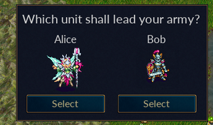
In this example, we'll create a couple buttons which provide the user a choice, and demonstrate how we get the results back where we can put them to use.
local function basic_return_value()

    local dialogDefinition = {
        wml.tag.tooltip { id = "tooltip_large" },
        wml.tag.helptip { id = "tooltip_large" },
        wml.tag.linked_group {
            id = "leader_lg",
            fixed_height = true,
        },
        wml.tag.grid {
            wml.tag.row {  -- A header
                wml.tag.column {
                    border = "bottom",
                    border_size = 10,
                    wml.tag.label {
                        use_markup = true,
                        label = "<span size='large'>" ..
                            _"Which unit shall lead your army?" ..  "</span>"
                    }
                }
            },
            wml.tag.row {  -- The body of our GUI
                wml.tag.column {
                    wml.tag.grid {
                        wml.tag.row {
                            wml.tag.column {
                                wml.tag.grid {
                                    wml.tag.row {
                                        wml.tag.column {
                                            wml.tag.label { label = "Alice" }
                                        }
                                    },
                                    wml.tag.row {
                                        wml.tag.column {
                                            wml.tag.image {
                                                linked_group = "leader_lg",
                                                label = "units/elves-wood/sylph.png"
                                            }
                                        }
                                    },
                                    wml.tag.row {
                                        wml.tag.column {
                                            wml.tag.button {
                                                label = "Select",
                                                return_value = 1
                                            }
                                        }
                                    },
                                }
                            },
                            wml.tag.column {
                                wml.tag.spacer { width = 20 }
                            },
                            wml.tag.column {
                                wml.tag.grid {
                                    wml.tag.row {
                                        wml.tag.column {
                                            wml.tag.label { label = "Bob" }
                                        }
                                    },
                                    wml.tag.row {
                                        wml.tag.column {
                                            wml.tag.image {
                                                linked_group = "leader_lg",
                                                label = "units/human-loyalists/marshal.png"
                                            }
                                        }
                                    },
                                    wml.tag.row {
                                        wml.tag.column {
                                            wml.tag.button {
                                                label = "Select",
                                                    return_value = 2
                                            }
                                        }
                                    }
                                }
                            }
                        }
                    }
                }
            }
        }
    }
    local user_chose = gui.show_dialog(dialogDefinition)
    local leader
    if user_chose == -1 then  -- User closed the dialog by hitting the Enter key
        leader = nil
    end
    if user_chose == -2 then  -- User closed the dialog by hitting the Escape key
        leader = nil
    end

    if user_chose == 1 then
         leader = "Alice"
    end
    if user_chose == 2 then
        leader = "Bob"
    end

    local confirmed_leader_choice

    if leader ~= nil then
        local query = _"You want " .. leader .. _" as your leader?"
        confirmed_leader_choice = gui.confirm(query)
    end

    if confirmed_leader_choice then
         wesnoth.message("Great!")
    else
         wesnoth.message("Fine, lead them yourself!")
    end
end
Here we've added a couple buttons, and assigned each of them a return value. When the user selects one of these buttons, the GUI is closed and the value of return_value is returned from gui.show_dialog(). We then use gui.confirm() which provides a very simple Yes/No popup and returns true or false, respectively. Other useful functions can be found on that page which provide handy alternatives to creating your own GUI for other simple user inputs.
The use of return_value is rather limited, as it only returns integers and can't be used with containers like listboxes. In more complex cases we'll need to turn to callback functions which are invoked when something happens to a widget, like clicking a button or a widget's value changing. Earlier, we saw an example of widget.on_modified(). More examples of callbacks can be found at that link.
Slider and Textbox
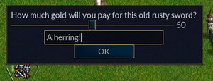
Here we see a couple methods of getting more dynamic input from the user, a slider and a textbox presented in one silly example.
function scrollbar_and_textbox()
        local dialogDefinition = {
                wml.tag.tooltip { id = "tooltip_large" },
                wml.tag.helptip { id = "tooltip_large" },
                wml.tag.grid {
                        wml.tag.row {
                                wml.tag.column {
                                        wml.tag.label { label = _"How much gold will you pay for this old rusty sword?" }
                                }
                        },
                        wml.tag.row {
                                wml.tag.column {
                                        wml.tag.slider {
                                                id = "gold_sl",
                                                minimum_value = 0,
                                                maximum_value = wesnoth.sides[wesnoth.current.side].gold,
                                                value = math.floor(wesnoth.sides[wesnoth.current.side].gold/2)
                                        }
                                }
                        },
                        wml.tag.row {
                                wml.tag.column {
                                        wml.tag.text_box {
                                                id = "gold_tb",
                                                --hint_text = _ "Enter gold here",
                                                --hint_image = "images/gold_pile.png",
                                                label = tostring(math.floor(wesnoth.sides[wesnoth.current.side].gold/2))
                                        }
                                }
                        },
                        wml.tag.row {
                                wml.tag.column {
                                        wml.tag.button {
                                                id = "ok",
                                                label = _"OK"
                                        }
                                }
                        }
                }
        }
        local function preshow(dialog)
                local function show_input()
                        wesnoth.interface.add_chat_message(_"You chose " .. dialog.gold_sl.value .. _" with the slider")
                        wesnoth.interface.add_chat_message(_"You entered " .. tostring(dialog.gold_tb.text) .. _" in the text_box")
                end
                dialog.ok.on_button_click = show_input  -- this is a button, so we use on_button_click, not on_left_click

                dialog.gold_sl.on_modified = function()dialog.gold_tb.text = tostring(dialog.gold_sl.value)end
        end
        gui.show_dialog(dialogDefinition,preshow)
end
We create a slider, with a range from 0 to the amount of gold possessed by the current side and an initial value in the middle, and a text box with the same initial value. We assign a function to our OK button which simply reports on the values provided by the user. For no reason whatsoever, we add a callback such that when the user adjusts the slider the value in the textbox is update to match the slider.
Note that the textbox returns text, even though it looks like we're expecting the user to input a natural number. Remember to validate those inputs.
You can use text_hint to place a caption in the box that will help the user understand what to enter in the box, and possibly an image as well. For example, in the search box in the recall menu uses hint_text = _ "Search", hint_image = "icons/action/zoomdefault_25.png~FL(horiz)". Of course, you can't have a hint and a label in the same text_box at the same time, so in our example we've only included them as comments.
There is also a widget called a spinner, which is kind of like the combination of a text_box and a slider. As of the release of 1.18, it appears to be unfinished so the strange syntax needed to make it work is probably not the best thing to document, and we will omit it for now.
Appearance
This section needs help
Borders
Alignment
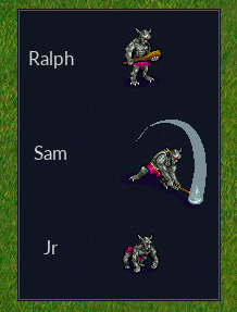
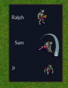
By default, the GUI will usually center widgets in their cells, which is not always what we want. In this example, we use horizontal_alignment to move widgets around a little.
In more complex cases, it may be useful to add spacers to help force alignment, or use linked_groups to force consistent alignment for objects within a grid.
local function basic_alignment()
                local dialogDefinition = {
                wml.tag.tooltip { id = "tooltip_large" },
                wml.tag.helptip { id = "tooltip_large" },
                wml.tag.grid {
                        wml.tag.row {
                                wml.tag.column {
                                        wml.tag.label {
                                                label = "Ralph"
                                        }
                                },
                                wml.tag.column {
                                        wml.tag.image {
                                                label = "units/trolls/grunt.png"  -- 72x72
                                        }
                                }
                        },
                        wml.tag.row {
                                wml.tag.column {
                                        horizontal_alignment = "right",
                                        wml.tag.label {
                                                label = "Sam"
                                        }
                                },
                                wml.tag.column {
                                        wml.tag.image {
                                                label = "units/trolls/troll-hero-attack-se-4.png"  -- 122x102
                                        }
                                }
                        },
                        wml.tag.row {
                                wml.tag.column {
                                        horizontal_alignment = "left",
                                        wml.tag.label {
                                                label = "Jr"
                                        }
                                },
                                wml.tag.column {
                                        horizontal_alignment = "right",
                                        wml.tag.image {
                                                label = "units/trolls/whelp.png"  -- 72x72
                                        }
                                }
                        },
                }
        }
        gui.show_dialog(dialogDefinition)
end
The screenshots show the output of this example with and without the horizontal_alignment lines included above.
TODO: address text_alignment, with comparison to horizontal alignment and location (inside wml.tag.label)
TODO: horizontal_grow = true, make column stretch to fit. Not compatible with horizontal_alignment. Figure out vertical_grow.:w
Growth
https://wiki.wesnoth.org/GUILayout
Mention --log-debug=gui/layout if you want/need to dig through a ton to find out what's going on with (re-)sizing stuff
Definitions
Many widgets can be configured to have to a different appearance, for example in our tree_view example we changed the definition of a toggle_button from the default of a checkbox by setting definition = "tree_view_node". This option was found by looking at the id of a toggle_button_definition in .../data/gui/widget/toggle_button_tree_view_node.cfg:
#textdomain wesnoth-lib
###
### Definition of a toggle button to be used in a tree view as node fold/unfold indicator
###
[toggle_button_definition]
        id = "tree_view_node"   # <--- we can use 'definition = "tree_view_node"' in a [toggle_button] to select this definition
        description = "Fold/unfold status indicator of a tree view node."
There are many other definitions for buttons and other widget types in that directory. It would be nice to have a list (linked here), but for now you'll just have to look around.
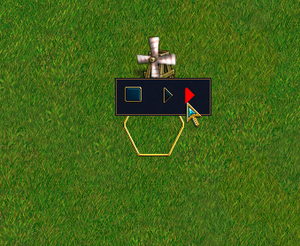
We can even create our own custom definitions using gui.add_widget_definition(). In this example, we copy from .../data/gui/widget/toggle_button_tree_view_node.cfg with a slight change so that our button turns red when focused.
In this example, we will use wesnoth.wml_actions to create the WML [current_test_gui].
function wesnoth.wml_actions.add_widget_def_demo()
        local definition = {
                id = "tree_view_node_custom",
                description = "Fold/unfold status indicator of a tree view node (MODIFIED).",
                wml.tag.resolution {
                        min_width = 25,
                        min_height = 19,
                        default_width = 25,
                        default_height = 19,
                        max_width = 25,
                        max_height = 19,
                        -- Unselected
                        wml.tag.state {
                                wml.tag.enabled {
                                        wml.tag.draw {
                                                wml.tag.image { name = "buttons/fold-arrow.png" }
                                        }
                                },
                                wml.tag.disabled {
                                        wml.tag.draw {
                                                wml.tag.image { name = "buttons/fold-arrow.png~GS()" }
                                        }
                                },
                                wml.tag.focused {
                                        wml.tag.draw {
                                                wml.tag.image { name = "buttons/fold-arrow.png~BLEND(255,0,0,1)" }
                                        }
                                }
                        },
                        -- Selected
                        wml.tag.state {
                                wml.tag.enabled {
                                        wml.tag.draw {
                                                wml.tag.image { name = "buttons/unfold-arrow.png" }
                                        }
                                },
                                wml.tag.disabled {
                                        wml.tag.draw {
                                                wml.tag.image { name = "buttons/unfold-arrow.png~GS()" }
                                        }
                                },
                                wml.tag.focused {
                                        wml.tag.draw {
                                                wml.tag.image { name = "buttons/unfold-arrow.png~BLEND(255,0,0,1)" }
                                        }
                                }
                        },
                }
        }
        gui.add_widget_definition("toggle_button", "tree_view_node_custom", definition)

        local dialogDefinition = {
                wml.tag.tooltip { id = "tooltip_large" },
                wml.tag.helptip { id = "tooltip_large" },
                wml.tag.grid {
                        wml.tag.row {
                                wml.tag.column {
                                        wml.tag.toggle_button {
                                                definition = "default"
                                        }
                                },
                                wml.tag.column {
                                        wml.tag.toggle_button {
                                                definition = "tree_view_node"
                                        }
                                },
                                wml.tag.column {
                                        wml.tag.toggle_button {
                                                definition = "tree_view_node_custom"
                                        }
                                }
                        }
                }
        }
        gui.show_dialog(dialogDefinition)
end
[TODO: You can give the whole dialog a definition, like definition = "tooltip_large"]
Panels
Canvases
Part of panels? Sort of?
A canvas is a surface you can draw on. A dialog has them, as does a panel, and for these canvas 1 refers to the background, while canvas 2 refers to the foreground. Other widgets may have canvases that may have other meanings, or no canvases at all. See more at LuaAPI/gui/widget#set_canvas.
Here's a fun little trick. Set your dialog background to be transparent:
local function preshow(dialog)
    dialog:set_canvas(1, { } )
end
Or, if you want an opaque GUI background with the screen behind it blurred like what you see behind the text of a [message], you can set your window definition to "message":
...
wml.tag.tooltip { id = "tooltip_large" },
wml.tag.helptip { id = "tooltip_large" },
definition = "message",
...
Here we take our progress bar, and add a text overlay.
Note: either using text on a canvas is rather limited, or I just couldn't figure it out. For example, I could not get the text size any smaller, and any attempts to do so simply resulted in very blocky text. And the spaces were necessary so that the text wasn't stretched out. I also find it surprising that the progress bar does not have this feature inherently. So it's not a great example, but it should be enough to get you started using canvases. Be sure to visit the link mentioned above for more options.
function wesnoth.wml_actions.progress_bar_with_overlay()
        local dialogDefinition = {
                wml.tag.tooltip { id = "tooltip_large" },
                wml.tag.helptip { id = "tooltip_large" },
                wml.tag.grid { wml.tag.row { wml.tag.column { wml.tag.panel { id = "panel",
                        wml.tag.grid {
                                wml.tag.row {
                                        wml.tag.column {
                                                wml.tag.button { id = "button",
                                                        label =_ "Press me"}
                                        },
                                 wml.tag.column {
                                                wml.tag.progress_bar { id = "progress" }
                                        },
                                        wml.tag.column {
                                                wml.tag.button { id = "ok",
                                                        label = _"Done"
                                                }
                                        }
                                }
                        }
                } } } }
        }
        local function preshow(dialog)
                dialog.ok.enabled = false
                dialog.button.on_button_click = function()
                        dialog.progress.percentage = dialog.progress.percentage + 10
                        dialog.panel:set_canvas(2, { wml.tag.text { text_alignment = "center", font_size = 48, text_markup = true,
                                text = "<span color='yellow'>                            " .. dialog.progress.percentage .. "%                            </span>" } } )
                        if dialog.progress.percentage > 99 then
                                dialog.button.enabled = false
                                dialog.ok.enabled = true
                        end
                end
        end
        gui.show_dialog(dialogDefinition,preshow)
end
You may notice we added a panel and placed our text on the foreground canvas(2) on it, since the progress_bar does not support canvases.
Placement
such as horizontal_placement = "left" https://wiki.wesnoth.org/LuaAPI/gui/example or automatic_placement = false, x =, y= maximum_height =, width = gamemap_width, etc
Miscellaneous
Progress Bar
A progress_bar is a graphical representation of a percent. In this example, we present the user with a puzzle. They must hit the button repeatedly before they can close the gui. A progress_bar displays their current progress toward completion.
function wesnoth.wml_actions.progress_bar()
                local dialogDefinition = {
                wml.tag.tooltip { id = "tooltip_large" },
                wml.tag.helptip { id = "tooltip_large" },
                wml.tag.grid {
                        wml.tag.row {
                                wml.tag.column {
                                        wml.tag.button { id = "button",
                                                label =_ "Press me"}
                                },
                                wml.tag.column {
                                        wml.tag.progress_bar { id = "progress" }
                                },
                                wml.tag.column {
                                        wml.tag.button { id = "ok",
                                                label = _"Done"
                                        }
                                }
                        }
                }
        }
        local function preshow(dialog)
                dialog.ok.enabled = false
                dialog.button.on_button_click = function()
                        dialog.progress.percentage = dialog.progress.percentage + 10
                        if dialog.progress.percentage > 99 then
                                dialog.button.enabled = false
                                dialog.ok.enabled = true
                        end
                end
        end
        gui.show_dialog(dialogDefinition,preshow)
end
Unit Preview Pane
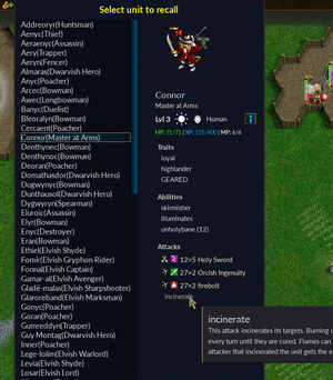
A unit_preview_pane takes a unit (or a unit type), and presents a graphical representation of the unit and its more important attributes, along with tooltips for additional details, in the same way that the recall menu does. Here we see an example of a unit which has picked up some items, including a weapon, which are affecting its stats.
local T = wml.tag

function wesnoth.wml_actions.recall_from_variable(cfg)
        local from_array = cfg.from or wml.error("[recall_from_variable]: missing required from= ")
        local to_var = cfg.to or wml.error("[recall_from_variable]: missing required to= ")
        local unit_list = wml.array_access.get(from_array) or wml.error(string.format("[recall_from_variable]: failed to fetch wml array %s",from_array))

        local listboxItem = T.grid {
                T.row {
                        T.column {
                                T.label { id = "available_unit",
                                        linked_group = "available_unit"
                                }
                        }
                }
        }

        local listbox_id = "available_units"
        local listboxDefinition = T.listbox { id = listbox_id,
                T.list_definition {
                        T.row {
                                T.column {
                                        T.toggle_panel { listboxItem }
                                }
                        }
                }
        }
        local dialogDefinition = {
                T.tooltip { id = "tooltip" },
                T.helptip { id = "tooltip" },
                T.linked_group { id = "available_unit", fixed_width = true },
                T.grid {
                        T.row {  -- header
                                T.column {
                                        T.grid {
                                                T.row {
                                                        T.column {
                                                                border = "bottom",
                                                                border_size = 10,
                                                                T.label {
                                                                        use_markup = true,
                                                                        label = "<span size='large' color='yellow' weight='bold'>"
                                                                                .. _"Select unit to recall" .. "</span>"
                                                                        }
                                                        }
                                                }
                                        }
                                }
                        },
                        T.row {  -- Body
                                T.column {
                                        T.grid {
                                                T.row {
                                                        T.column {
                                                                border = "right",
                                                                border_size = 40,
                                                                listboxDefinition
                                                        },
                                                        T.column {
                                                                T.unit_preview_pane { id = "unit_preview" }
                                                        }
                                                }
                                        }
                                }
                        },
                        T.row {  -- Footer
                                T.column {
                                        T.grid {
                                                T.row {
                                                        T.column {
                                                                T.spacer { width = 400 }
                                                        },
                                                        T.column {
                                                                border = "top,right",
                                                                border_size = 10,
                                                                T.button { id = "ok",
                                                                        label = _"OK"
                                                                }
                                                        }
                                                }
                                        }
                                }
                        }
                }
        }

        local picked = 1

        local function preshow(dialog)
                local listbox = dialog[listbox_id]
                for i,unit in ipairs(unit_list) do
                        listbox[i].available_unit.label = unit.name .. "(" .. unit.language_name .. ")"
                end
                local function draw_unit()
                        wesnoth.units.to_recall(unit_list[listbox.selected_index])
                        local tmp = wesnoth.units.find_on_recall{ id = unit_list[listbox.selected_index].id }[1]
                        dialog.unit_preview.unit = tmp
                        wesnoth.units.extract(tmp)
                        picked = listbox.selected_index
                end
                draw_unit()
                listbox.on_modified = draw_unit
        end

        gui.show_dialog(dialogDefinition,preshow)

        wml.variables[to_var] = picked - 1
end
This should all be pretty self evident by now. We are provided with an array of stored units (from [store_unit] in WML). We create a listbox populated with units and we use the selected_index to determine which element in the table to send to unit_preview_pane. Since our input is an array of unit data, not actual units, we use wesnoth.units.to_recall to take the definition of one from our array and place it on the recall list (turning it into an actual unit), wesnoth.units.find_on_recall to fetch that unit in a form that the unit_preview_panel understands, and finally wesnoth.units.extract to remove the unit from the recall list when we are done with it.
And of course we subtract one from the selected_index when we return our choice to WML, since lua arrays count from 1 and WML from 0.
The unit_preview_pane will also accept a unit_type instead of a specific unit.
Appendix
Explore Your Options
We've seen a lot of options that can be set to modify the behaviour of our dialogs, some on columns, some on image widgets, etc. These are in the process of being documented here, but if you would like to go straight to the source, the data Wesnoth uses to validate your configuration can be found in data/schema/gui under your install directory.
Let's look at a scroll_label, for example. A scroll_label is a widget, so we look in widget_instances.cfg and find the following. Here we can see five parameters we can provide to our scroll_label (in addition to the ones available to all widgets, like id and definition), along with their types and default values. For example, we could set "link_aware = true", and if we do not we can assume that link_aware will be false. While this does not explain what these parameters do, the information provided in the schema directory is often helpful nonetheless.
    [tag]
        name="scroll_label"
        min="0"
        max="infinite"
        super="$generic/widget_instance"
        {DEFAULT_KEY "horizontal_scrollbar_mode" scrollbar_mode initial_auto}
        {DEFAULT_KEY "vertical_scrollbar_mode" scrollbar_mode initial_auto}
        {DEFAULT_KEY "wrap" bool true}
        {DEFAULT_KEY "text_alignment" f_h_align "left"}
        {DEFAULT_KEY "link_aware" bool false}
    [/tag]
We see that our scrollbars are of type scrollbar_mode. It would probably help if we knew what values are available to the scrollbar_mode. In data/schema/types/gui.cfg we find this:
[type]
    name=scrollbar_mode
    value="always|never|auto|initial_auto"
[/type]
Useful Links
LuaAPI/gui - Mostly about opening windows
LuaAPI/types/widget - Widget attributes and callbacks
GUI_WML_Reference
.../data/schema/gui/*.cfg - Lists of valid options for various GUI objects
Credits
The basic framework that composes the initial examples was lifted from LotI. It's a great place to find well written examples, but some of it is complex enough to be a little overwhelming when getting started.
Many examples, particularly tree view and multipage, are heavily derived from the World Conquest multiplayer campaign.
