Difference between revisions of "GUIToolkit"
(→GUILayoutGuide: Sentence restructuring) |
(Add example dialog image) |
||
| Line 1: | Line 1: | ||
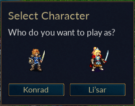
| + | [[File:Character selection dialog.png|frame|right|An Example of a Dialog, created using Wesnoth's new GUI toolkit, GUI2]] | ||
| + | |||
== Introduction to GUI2 == | == Introduction to GUI2 == | ||
This is a new toolkit aiming to make it possible to make the look of Wesnoth fully skinnable. As such, it separates the actual appearance of the user interface (defined using WML) and the control logic (such as event handling, done using C++ or Lua). | This is a new toolkit aiming to make it possible to make the look of Wesnoth fully skinnable. As such, it separates the actual appearance of the user interface (defined using WML) and the control logic (such as event handling, done using C++ or Lua). | ||
Revision as of 07:11, 29 April 2024
Contents
Introduction to GUI2
This is a new toolkit aiming to make it possible to make the look of Wesnoth fully skinnable. As such, it separates the actual appearance of the user interface (defined using WML) and the control logic (such as event handling, done using C++ or Lua). This will be used in Wesnoth the make it easier to optimize for different screen resolutions. Initially released with Wesnoth 1.6, it is now the default and being used for the majority of dialogs as of Wesnoth 1.18.
The engine has two parts:
- Widget definition, which defines how a widget looks. (Reference)
- Window definition, which defines how a certain window looks and it uses the widget definitions. (Reference)
GUI Layout Guide
Wesnoth's UI toolkit, GUI2, has a rather simple layout system. Instead of allowing dialogs to specify exact coordinates, it only deals with relative sizes and locations.
The UI is constructed from various UI widgets. Some of them can contain other widgets, such as window or grid, so we will call them Container-type widgets or just Containers for short, and we will use Widget to refer to the rest of them, which cannot contain other widgets inside themselves.
There are 5 keys relevant to positioning widgets in a GUI2 container:
- grow_factor
- horizontal_grow
- horizontal_alignment
- vertical_grow
- vertical_alignment
Where these keys can be used are detailed below.
It is to be kept in mind that GUI2 functions on a grid system. Each grid is made up of rows, and every row must have the same number of columns. The columns may contain either other grids or widgets, such as buttons.
Now, let's talk about each of the above keys:
grow_factor
This key can be present in either rows or cells, as so:
[row] grow_factor = 1
Or
[column] grow_factor = 1
Growth factors control the relative growth size of the row or column. It's important to remember that the grow_factor of a row controls vertically growth, while the grow_factor of a column controls horizontal growth.
For example, if two columns were positioned next to each other, the first with a growth factor of 0 and the second with 1, the second column would grow at a regular rate, while the first would not grow at all. This holds true for rows, and it is important to get grow_factor values right. An easy way to remember how to use this key is to assign it a value of 0 if you want that row or column to grow much less relative to another.
Keep in mind, this key only controls the growth of the rows and columns themselves. Control over the widgets' sizes is dictated by the remaining keys.
horizontal_grow and vertical_grow
Boolean keys that decide whether the contained widgets grow or not. Mutually exclusive with horizontal_alignment and vertical_alignment.
horizontal_alignment and vertical_alignment
String keys that set the alignment of the contained widget. Possible values :
horizontal_alignment : "left", "center", "right"
vertical_alignment : "top", "center", "bottom"
Links
- GUIWidgetInstanceWML - Reference for the various widgets and the keys that can be used with them.
- GUIVariable - Documents the types of GUI2 variables available.
- GUILayout - Describes how to place widgets in a window.
- GUIWindowDefinitionWML - Describes the windows available and which widgets the engine 'knows' about.
- GUIToolkitWML - Describes the basics of the engine.
- GUICanvasWML - Describes how the drawing system works. Useful if you want to use the [drawing] widget to show some custom drawing or if you're building a new widget definition (aka a new theme for a widget.)
Todo list
Here's a(n incomplete) list of items which still need to be done.
- The layout engine can still have problems with not finding a solution and stop.
- Make sure labels buttons etc can shrink and show ellipses to shrink small enough
- Optimize the shrink algorithm
- The code for the events is not entirely to my liking and I want to look at using signals instead, events are there bug not yet used everywhere.
- EasyCoding#GUI2_related_features
- Improve the markup for the text
- Convert more dialogs
