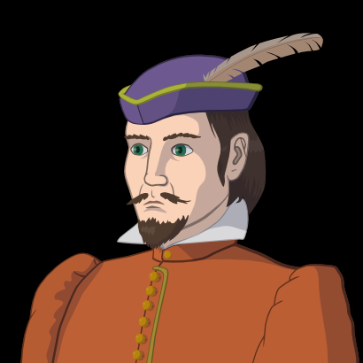
Making portrait art in vector
NOTE: The style discribed here is no longer used in Wesnoth mainline portraits.
This is a tutorial for making unit portraits for the Battle for Wesnoth in vector graphics. The Wesnoth portraits are made in what is called "the Lutesian style" after the comic artist Jason Lutes, who has donated many of the Loyalist portraits. The main reason for stylistic restrictions is to achieve aesthetic consistency.
The technical aspects of the Lutesian style can be summarised as follows:
- The colouring is made in "cell shading," that is, colours are applied in constant colour areas, known as "flats." Changes in tone (such as shadows and highlights) are also made the same way, instead of brush strokes or gradients.
- All the linework, instead of being black or having another colour of their own, is made in darker (or sometimes lighter) shade of the colour of the flat it is on top of.
- Adjacent flats don't need to be separated by outlines.
In addition to this, the final format of the portrait file should be a 205x205 pixel PNG with a fully black background.
Vector graphics programs can be easily used to produced this kind of images, because the flats can be easily crated and edited as paths filled with a solid colour. The linework, shadows and outlines are most conveniently made as semitransparent dark or light areas on top of the flats, because then they always follow the colour of the flats, if it is changed.
In this tutorial we use Inkscape as the program, but any vector drawing program worth its salt should have the same functionality. As a prequisite, you should be familiar with the basic concepts of vector drawing, how to make, edit and stroke paths, the fill rules (how to make transparent "holes" in paths), etc. Basically, reading the Inkscape manual and playing around with it for half an hour should be enough. You should also be able to draw and scan a pencil sketch four your portrait, or have other people's sketches available (remember to ask for permission).
Here's our example sketch, a young burgher:
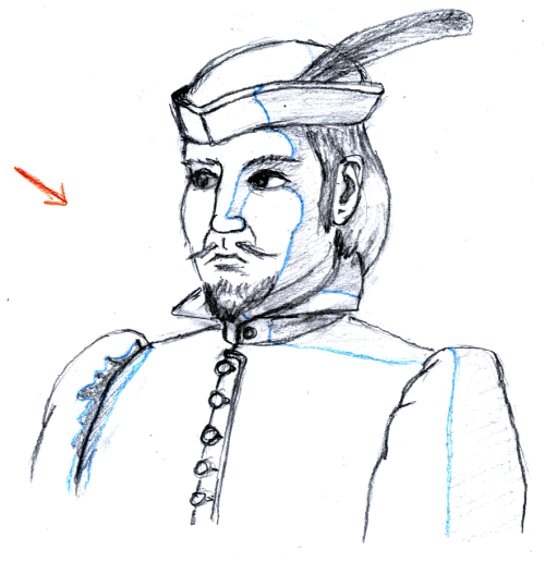
The blue lines show the edges of the shadows. It is convenient to make the shadow edges visible, because it is then easier to trace them (and scanners easily lose the lighter shades of pencilwork anyway), and by using a colour pencil, you make them separable from the actual linework. You can do the same thing with highlights, but use different colour than for shadows. The red arrow indicates the general direction of lighting.
The first thing to do is to trace out the flats and make outlines for those that are going to have them. As stated above, we are going to make the outlines as a separate, semitransparent path on top of the flat path, so that it gets its colour from it. Because lines differentiating two flats of different colours should have the colour of one or the other, but not both, it follows that the outer edge of the outline path must align exactly with the edge of the flat path. We will learn shortly how to accomplish this, but first read this tutorial about the z-order and the path tools.
Then it's time to get work on the image. First thing to do is to prepare the sketch. Since we must keep the sketch as the topmost object to see it as we draw, but also see the work beneath it, the background colour of the skecth must be changed into transparency. This can be done in GIMP, where the necessary tool can be found in "Layers -> Transparency -> Color to alpha." Once this is done, save it as PNG and import it into Inkscape. It will initially have some random X and Y values, so change them to 0, in the top toolbar. Open the document preferences and set the page size to match the selection. Rename the current layer to "sketch" and lock it, so that you don't accidentally move the sketch image, and it will be easier to select the objects under it. Create a new layer under the sketch layer and name it "flat." Now you are ready to trace the flats.
There are to ways to trace, with the freehand tool, where you move the cursor along the line and nodes are created on the fly, or the bezier tool, where you set the nodes explicitly. If you have a tablet and a very steady hand, you can manage with the freehand tool, but otherwise the bezier is better. The good thing about the bezier tool is that you end up with relatively few nodes, which keeps the file size smaller and makes later editing of the paths easier. Beginners usually make the beziers by first making an approximating polygon, and then coming back to round the corners. This is too inefficient, a faster and equally easy (after a bit of practice) way is the "tangential sweep." Follow the line and whenever there is a sharp corner, click on it without dragging. In between, click and drag tangentially to the line in few points along the curving line. You learn by practice where to place the sweep points. If there is a straight line between to corners, you don't need to put any nodes there.
The flats are best traced in back to front order, so that flats that are going to be the on the bottom are drawn first. It's usually good to base the z-order of the flats to the natural order of the real-life objects they represent, so that flats representing the foreground objects are on top of the flats representing background objects. There are times when you must break this order, but following it as a general rule helps to keep the drawing organised in your head.
In our image, we start with the sleeve at left. It's one of the "bottom objects," it's being covered by the torso, but doesn't itself cover anything. In the image below we see the sleeve traced with the bezier tool. Note that this is not the only, and not probably even the best, way to place the nodes. There actually isn't a "right" way to trace a shape, the only places where you must put a node are the sharp corners. You should try to get away with as few nodes as possible, though. You will also notice tha we didn't trace the line separating the sleeve and the torso. We will do it when we trace the flat for the torso, which comes on top of this one.
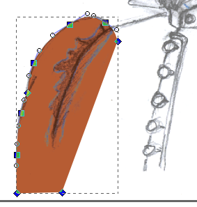
If we want the flat to have an outline, this is the time to do it, because it will then be directly on top of the flat it follows, and has the same relative z-placement as the flat.
The outline could be made with the calligraphy tool, but then we would be tracing the same lines twice. The flat could also be stroked, which would produce the outline automatically, but there are two problems. First, the stroke is always half outside and half inside the path, but we want the outer edge of our outline to follow the path exactly. Second, the stroke is always constant width, and this tends to result in dull and formalistic look, better suited to diagrams and such than artistic drawings. Even though strokes are not good as themselves, there is a handy tool "stroke to path," which makes a path out of a stroke so that the path follows the edges of the stroke, and we can use this to turn a stroke into a proper outline.
The "stroke to path" tool makes the original path disappear, so we will first do "Edit -> Copy" and "Edit -> Paste in place" for our flat. Then select the copy and disable fill and enable stroke. Set the stroke colour to black with 50% opacity (you might want to adjust this later, but these are good working settings at this point).
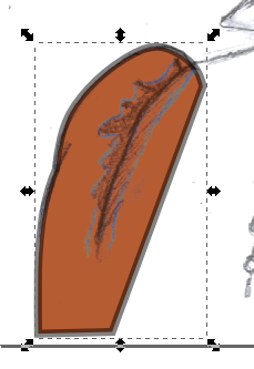
The width of the stroke should be about twice the intended mid-width of the outline. Then do "Path -> Stroke to path." Half of the outline still lies outside the path, and we will cut it away with a clip path, but wirst we will have to make the outline variable width. This is done easily by moving the outline path slightly, only so much that the edges of the underlying flat stay within it. Moving the outline makes the part that is inside the flat, that will remain after the intersection operation, to become thinner in some parts and thicker in other. As a general rule, the outline should be thinner on the lighted side of the object and thicker on the shadow side, so you should move the outline towards the light source.
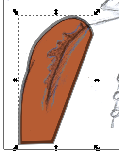
When the inside part of the outline is the way you like, select the flat path and do "Edit -> Clone -> Clone". Select the clone and the outline path and do "Object -> Clip -> Set". What we did was using the clone of the flat as a clip path on the outline path, making the parts that are outside the path invisible. Because we use a clone, if we edit the nodes of the flat, the changes will automatically change the (visible) shape of the outline path correspondingly.
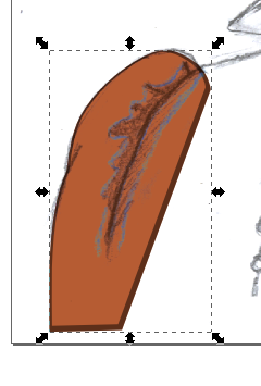
Since this method decides the outline width only by the angle of the outline, it doesn't always produce the desired outcome in all the places, but you can easily adjust the line width by moving the appropriate nodes of the inner edge of the outline path, inwards to thicken the line, outwards to thin it (the "sclupting" mode can become handy for this).
Proceed by this method for the flats in back-to-front order. Having the flats traced and outlined, my picture would look like this:
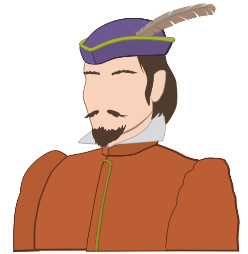
Note that not all flats need an outline. Outlining usually adds a sense of weight and substance to objects, so thin, light and fluffy objects, such as hair, beard, moustache and the quill in my image, generally look better without.
Later it will be useful to have the silhouette of the whole figure in one path. Create a new layer titled "silhouette," select all the flat paths and do "Edit -> Copy." Switch to the "silhouette" layer and do "Edit -> Paste in place," followed by "Path -> Union." This will fuse all the paths into one, creating a silhouette. Turn the visibility of this layer off and lock it.
At this point it might be a good time to handle some special features, such as eyes. We could make them as flats on top of the face flat, but the pupils usually require adjustements to make them look just right, it's more convenient to make the eyes as holes in the face, and put the pupils behind it. If you make the pupils as whole ovals, only part of them is visible, but when you move them, the part always shows which should.
There are two ways to make a hole in a path. One is to make a path the shape of the hole on top of it and doing "Path -> Difference," but if you select a path and press shift while starting to make a new one, the new one will become a subpath to the selected one, and if it's inside it, it will appear as a hole (provided the fill rule for the path is even-odd, the default).
If you want the holes to have outlines as well, it will require a bit of trickery. Select the face flat and do "Edit -> Copy" and "Edit -> Paste in place." Then do "Path -> Break apart," which will make each of the subpaths into separate paths. Select the outermost path and delete it. What you are left with are paths that excactly cover the holes. Follow the outline making procedure, except in the end, instead of "Path -> Intersection," do "Path -> Difference" to clip away the inner half of the outline path.
For the eyes, you need white for the eyeballs (the white you see is the background colour). So make a eyeball colour flat (not usually pure white) that covers both of the eye holes, and drop it below the face flat. Then use the ellipse tool to make the iris and the pupil, group them, and drop the group below the face flat, but above the eyeball flat. When you have made one iris/pupil combo, you can copy it to get the other be exactly alike.
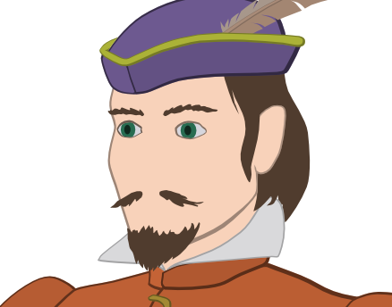
Now would be a good time to make the rest of the linework, that is the lines not outlining any flats. These lines are also to be made dark with partial transparency, so that they become a darker shade of the colour of the flat they are covering. There are several ways to make the linework. With short lines extending from the outlines, like the ones on the sleeves in my picture, can be made by making new nodes in appropriate places on the outline path and dragging them out. Thick lines can me treated as the flats by tracing the edges of the lines with the bezier tool. If you have a tablet, the calligraphy tool might be useful, but it takes some practice to use well. If the calligraphy lines overlap, you have to fuse them together by doing "Path -> Union" on them, or the partial transparency will produce darker shades on the overlapping parts.
Sometimes tracing linework is done more easily on a raster program, because you can use the eraser tool to trim the lines and correct mistakes immediately (especially with a tablet, when you can use the other end of the stylus as the eraser). The prosedure is as follows: Open the original sketch bitmap on a raster program. Create a new transparent layer on top and do the linework on this with black. Save only this layer as a PNG and import it into Inkscape. Set the X and Y properties of the bitmap to zeroes to make it align with the rest of the image. Select the bitmap and do "Path -> Trace bitmap" (the default options work well most of the time). Delete the bitmap and what you are left with is the linework done in paths. They are fully black so decrease the opacity and edit them further with the usual tools, if necessary.
Whatever method you use to make the linework, it's good to keep things organised and put it on its own layer.
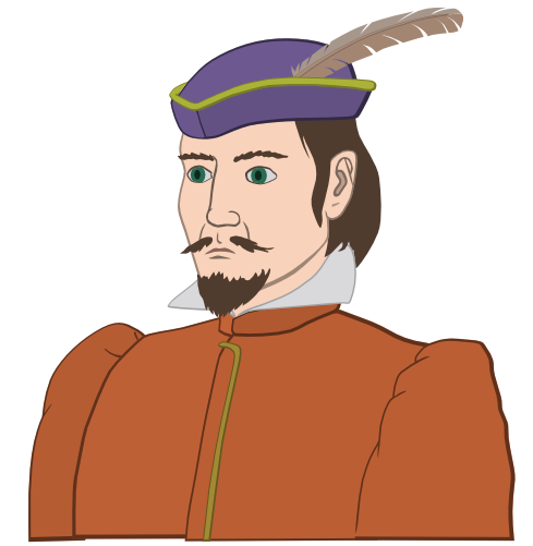
After the linework we can do the shadows. Create a new layer titled "shadow" on top of the others, and start tracing the shadow edges like you did with flats, but obviously, the shadows don't need outlines. You can make the shadow paths extend beyond the outlines of the figure, and cut them off in the end using the silhouette path you created earlier, using "Path -> Intersection." The shadows will also be partially transparent to show through the colour of the flat, but their own colour can well be something else than black. In my image I have used dark blue for the shadows, as in outdoors the light coming to the shadow parts comes from the sky and is bluer than the sunlight. You can try different colours for your shadows to see how it affects the general mood if the image.
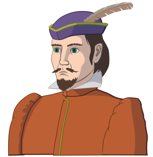
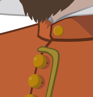
We still have some details to do, like the buttons on the jacket. Here I made the buttons with the ellipse too, using the same ellipse to create the shadow (by now you should be able to figure out how to make the crescent shape). If you need identical objects, you can always make copies of one, but if you make clones instead, and decide to change something about the design of the object later, you only need to change the original and the clones change as well.
To complete the image, some final touches are needed, like the specular spots in the eyes and some texture and highlights for the beard and hair (all done with semitransparent dark and light paths). Then the standard black background and some cropping and we're all done (I'll leave it as the exercise of the reader to figure out how to do the cropping).
