Smooth shading in vector
Note: This tutorial was written for Inkscape, but should be applicable for other vector drawing programs with similar functionality.
In this tutorial we are going to learn few methods for making smooth shading in vector graphics. Shading is very important in bringing out the three-dimensional shape of objects, and combining Gaussian blur with clipping and masking brings much more power to accomplish it than mere gradients.
The important part with blurring to keep in mind is that the colour transition function is different than in gradients. Gradients have a linear transition (between any two stops), while in blurred objects it is S-shaped. What the difference means in practice is that even if a gradient goes all the way down to full transparency/background colour, it will still produce a distinct egde (top left in the image below). The blurred object, on the other hand, will have truly fuzzy edge (top right). It also makes a difference whether an object that is both blurred and transformed is first blurred or transformed. Bottom left is a square that has first been blurred and then scaled vertically down 50%. Bottom left is the same square, but it is first scaled and then blurred.

The order is different when an object is both blurred and clipped/masked. In that case the blurring is always done first, and for that reason you can use clipping/masking to create objects with some edges sharp and some blurred. If you want the object to be blurred after clipping/masking, you have to put it in a group, and clip/mask the group (in Inkscape, you can't group single object, so you have to create a dummy object, group it with the real object, CRTL-select the dummy and remove it).
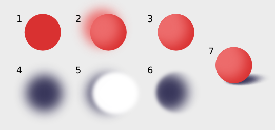
Let's start with a very simple example, a sphere. You probably already know how to do a shaded sphere with radial gradient, so here's another kind of method: First make a circle and fill it with the colour of the shadow side (1). Make a copy of it in the lighted side colour (lighter and more saturated version of the shadow colour), move it toward the light source (here up and to the left) and blur it (2). Make another copy of the original circle and use it as a clip path on the blurred circle. You'll see that the clipping cut off all the "leaking" blurriness, and the rest will make a nice smooth shading on the sphere. Let's make a shadow for the sphere too, while we're at it: First make a circle of the shadow colour and blur it (4) (it's most often a good idea to make the shadow as it looks from the above, and use transformations to bring it into right perspective). Real live shadows have the quirky property that their blurriness depends on the distance from the object casting them. The blur radius of gaussian blur filter is the same everywhere, but we can fake the effect with a mask. Make another circle, somewhat bigger than the shadow, white in fill colour and blur it, but less than you blurred the shadow (5). Use this as a mask on the shadow and you get nice variably blurred shape (6). With little scaling and rotating it looks good to go under the sphere (7).
For a sphere you could have made a decent shading with radial gradient as well, but this approach works with other kind of shapes too. Sometimes you can also use the blurred path to make the shadow side, like in the image below.

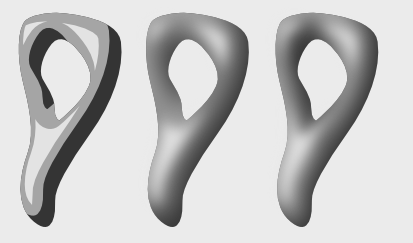
You can also use several blurred paths for shading, like below. The middle lightness (clipped) path was made by copying the original path, and the lightest one by making a linked offset (left). When both are blurred (with different blur radius) they result in a bit glossier surface than in the sphere example (middle). The technique works pretty well even for such odd shape, but it's not perfect. That's OK, there's nothing stopping you from editing the blurred paths, like has been done with the rightmost image (you will have to do "Path -> Object to Path" for the linked offset in order to node edit it). If you use a clone of the base path for clipping, you can still easily edit the base path after shading, because the clip path updates automatically.
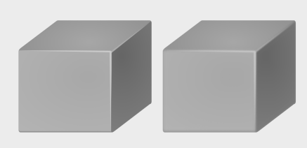
The above approach works best with smooth, organig shapes, but blurring can come handy when doing edgy shapes with flat shading. In the image below the edges are made smoother and more real life-like by a bit of blurring.
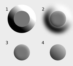
Usually clipping/masking is uset to get rid of the "leaking" blurriness outside the path, but the "leaking" can also be used to one's advantage. In the image below there is a circle with a bigger one around it, a hole being cut in it's middle the size of the smaller circle. The bigger circle has been filled with a gradient (1). When the bigger circle is blurred, the blur will leak over the smaller one (2). When a copy of the small circle is used as a clip path on the bigger one, only the leak is left visible, creating a shading on the small circle (3). When a bigger blur radius is used, the shape changes from flat, button type one, to rounder one (4).
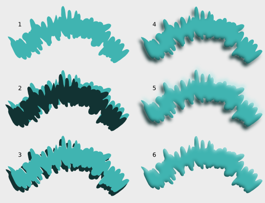
Here's one more variation of these techniques, to produce a flat, paint splash type shape. First make the base path (1). Make a copy of it in darker, less saturated colour and move toward the shadow side (1). use a copy of the base bath to cut off ("Path -> Difference") parts of the shadow path and move back a bit (3). Blur the shadow path (4). Following the same procedure, create the highlight path (lighter more saturated, on the opposite side) (5). Clip both the blurred paths with a clone of the base path (6).
External links
Here's some links to similar tutorials:
- More blur shading from Nicu (her other tutorials are also worth checking out)
- Awesome "interactive" 3-d rope, demonstrating the power of clones
- Fairly complex "chrome" text effect, where the text can be changed and the effect updates
- Realistic metal shading made with multi-stop gradients