Vector Inking
In art, the term "inking" refers to making a clearly defined lineart from a sketch. The term derives from the ink pens used for this purpose in dead-tree drawing, and the term has transitioned into digital art as well.
Usually the inked lineart is wanted as solid and sharp-edged, and for this vector programs suit well. The added bonus of lineart in vector is that they are freely scalable to any size without loss of resolution. Vector linart can be combined with colouring and shading done in raster by rendering the lineart into raster in desired resolution.
In this tutorial the free vector drawing program Inkscape is used, though many other programs have similar functionality. The tutorial also presumes the version 0.46, the latest stable one, for some specific tools. Basic knowledge of Inkscape's functionality and user interface is expected. Several alternative approaches will be discussed, some of them requiring a tablet, some not.
For all methods you first need the sketch image imported into Inkscape. Put it in its own layer and set the blend mode of the layer to "Multiply" and then lock the layer. This way, when you draw everything else on a layer under the sketch layer, the white parts of the sketch appear transparent and the lines are not covered by what you draw. Toggling the visibility of the sketch layer allows you to check how the drawing is coming along.
Contents
Calligraphy
The most obvious and intuitive way to ink is by using the calligraphy tool. Generally you'll want to set the thinning fixation to 0 so that the line width is determined by the tablet pressure alone. The "mass" property allows you to set the "inertia" of the pen, stabilising the stroke. The calligraphy tool produces paths with lots of nodes, but the node count can usually reduced greatly by simplifying the paths with CTRL-L ("Path -> Simplify") without changing the shape too much (you can set the simplifying treshold in the preferences menu if it simplifies too strongly). As a general rule, you should always simplify paths produced with such tools as calligraphy and tracing, because the lower node count means smaller file and better UI responsiveness, but also makes tweaking by node editing much easier. You can simplify all the strokes at once simply by selecting them all and hitting CTRL-L, and the operation will be done for each path separately. If you intend to fuse the strokes together into one path with "Path -> Union", you should do the simplifying first to avoid the rounding of the sharp corners in the stroke intersections.
Bezier tracing with the mouse
The problem with calligraphy tool is that in practice it is only useful when used with a tablet (in theory you can change the line width with arrow keys while drawing with mouse, but this is very cumbersome). If you only have a mouse, you can trace the lines with the bezier tool, set the stroke width to the desired average for each line, do "Path -> Stroke to Path" and then tweak the line widths by node editing or the new Tweak tool.
There are to ways to trace with the mouse, with the freehand tool, where you move the cursor along the line and nodes are created on the fly, or the bezier tool, where you set the nodes explicitly. If you have a tablet and a very steady hand, you can manage with the freehand tool, but otherwise the bezier is better. The good thing about the bezier tool is that you end up with relatively few nodes, which keeps the file size smaller and makes later editing of the paths easier. Beginners usually make the beziers by first making an approximating polygon, and then coming back to round the corners. This is most inefficient, a faster and equally easy (after a bit of practice) way is the "tangential sweep." Follow the line and whenever there is a sharp corner, click on it without dragging. In between, click and drag tangentially to the line in few points along the curving line. You learn by practice where to place the sweep points. If there is a straight line between to corners, you don't need to put any nodes there.
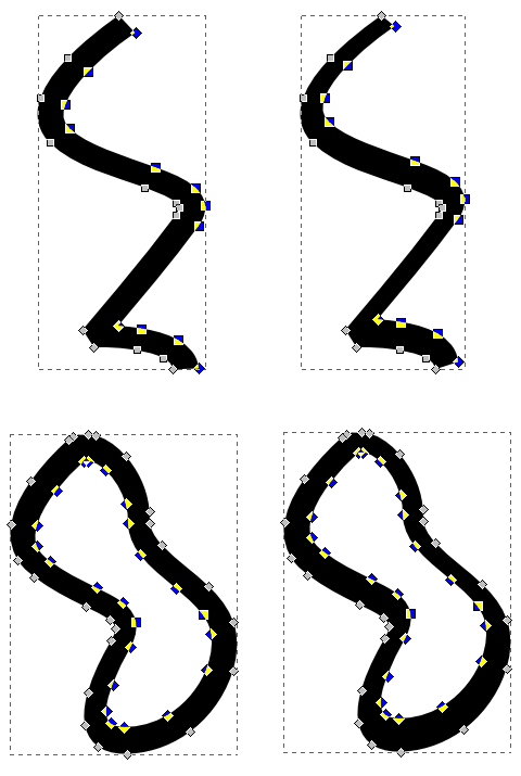
Once you have the paths in place and the "Stroke to Path" applied, you must tweak the line widths to give them a more lively look. Before you go for the tweak tool, there is a quick and dirty method worth trying. By selecting all the nodes on one side of the line (or inner/outer subpath of a closed line) and then moving them a bit it's possible to create line width variation for the whole line. The image below illustrates this, on both examples the selected nodes have been moved slightly upwards (to select the nodes on one side of the line, hover the mouse over a node in the middle of the would-be selection, press down Control and use the mouse wheel (or PgUp and PgDown) to increase/decrease the selection. To select all the nodes of a subpath, select one of them and press Ctrl-A). This method often doesn't make the line widths exactly like you want them, but often it's a handy way to do the bulk of the work, completed by little tweaking here and there.

The first thing you probably want to do with the tweak tool is to make the free ends of lines sharply tapering instead of round or square. The weak tool does this nicely, but it will also shorten the line a bit. You can lengthen the line back by node editing, or you can just anticipate this effect and always put the ends of the lines a bit further that what they are supposed to be when you are doing the tracing.
One thing to know about the tweak tool is that it will operate on all the nodes of the path, not only the ones under the cursor, and if the path is complex, the tool may become poorly responsive. Simplifying the path will help, as will cutting the subpaths into separate paths (you can keep several paths editable by the tweak tool simultaneously by selecting them all). Also, if you intend to combine several strokes into one path by the Union path operation, you should do all the tweaking first.
Inkless inking
If you have done digital inking before for images that are also coloured, you may have run into the problem that you are forced to trace much of the linework twice — once for the lines and second time for the colour flats. The new Paint bucket tool of the 0.46 version of Inkscape will help a lot, but there is another way to skip the double work. You simply trace the colour flats and leave gaps in between them. With a dark background the gaps will look like lines.
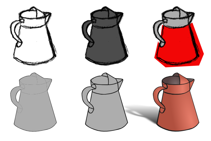
I know what you are thinking: If you have flats with gaps in between, don't you still need to trace the lines twice, once for each side of the gap? Not if you make a silhouette of the whole object first, then trace the flats, cut them off the silhouette with "Path -> Division" and in the end shrink all the flats with "Path -> Inset." The procedure is illustrated in the image below. On top left is a sketch of a pitcher. On top middle the outer edge has been traced with path set to dark grey. On top right a copy of the outline path has been created (light gray) and one of the flats has bee traced, filled with red. Notice that the outer edge has been traced already, so the red path needs to siply surround these lines. Both the red and the light grey paths are selected and "Path -> Division" is applied. This will cut the grey path into two pieces, following the red path's edge.
On bottom left the tracing and division has been done to all the flats (the edges of the flats actually align perfectly, the lines you see are rendering artifacts). On bottom middle "Path -> Inset" has been applied to all the flats. The dark lines are the gaps between the flats, showing the dark outline path underneath. These gaps can be tweaked as any paths, but notice that the thinning operation will thicken them and the thickening will thin, since you are operating on the surrounding paths, not the gaps themselves! In the final picture the gaps have been tweaked to create width variation and to correct some flaws, the flats have been shaded with gradients and a shadow has been made from a copy of the outline path by skewing and blurring.

Automatic tracing
If you already have a raster version of your linart you can trace it into vector form automatically. If you have Potrace installed on your system, you can use them directly from Inkscape ("Path -> Trace Bitmap"). Scanned drawings often need some preprocessing in a raster program for a better result, such as increasing contrast, removing spots, smudges and other defects, etc. You can also do the tracing in the raster program — for example in GIMP you can save paths, which are essentially bezier curves, in SVG format. Create the path by creating a selection, with the Magic wand or Select by Color tool, which contains all the pixels you consider to be within the lines, do "Select -> To Path" and after this, in the Paths dialog, choose "Export Path." The result is a SVG file that you can open in Inkscape.
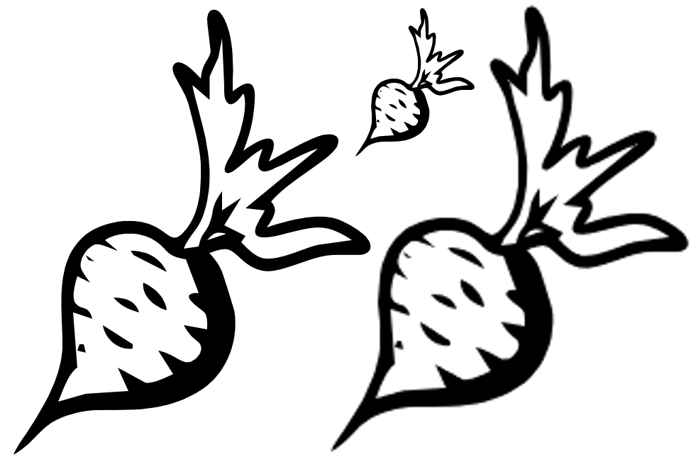
As mentioned in the beginning, having lineart in vector format means that you can scale it up without loss of resolution. In the picture below the small image on top has been rendered from a path. The bottom right image is the same scaled up 300%. Even with cubic interpolation the pixellation of the original image is visible, and the edges have become fuzzy. The bottom left image has been scaled up as a path, and rendered after the scaling. It's edges are every bit as smooth and sharp as the original's.

Even rerendering in same scale often has an enhancing effect. In the picture below, the top left image has been drawn with a sharp-edged brush without anti-aliasing, resulting in ugly jagginess. The image left is the same, traced into vector and rerendered in same scale. The result is smooth and properly antialiased. The bottom left image has been drawn with a fuzzy brush and the result is also fuzzy. Rerendering has sharpened the image and also cleared some line unstability.

Combining vector and raster
While vector grapichs are good for lineart, many shading styles, especially more painting-oriented ones, work better in raster. Once you have the lineart in vector, you can render it in raster at the definition you are going to make the shading with and import it into the raster program as a layer. Inkscape even lets you save the files directly in GIMP's XCF format. Everything is rendered into raster and the layer structure of the Inkscape file is transferred into GIMP layers. On the other hand, you can also import SVG files into GIMP as paths and render them there by changing the path into a selection and bucket-filling it. This approach has the benefit that the lineart remains as a path in the GIMP file, and if you decide to scale the image up later, you can use the path to rerender the lineart and thus keep it sharp (the colour layers, not depending on sharp transitions between colours, handle scaling up much better than lineart).
The stroked skeleton
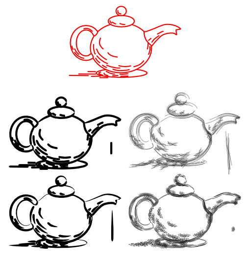
One more interesting and potentially expressive way to do the inking is by first creating a "skeleton" of the linework and then applying a stroking on it by using the "Pattern along Path" Effect or Life Path Effect (the same tool exist in both menus, with some minor differences). The skeleton consists of a set of paths (or subpaths) each indicating the shape and direction of one brushstroke. A path (or more complex object) is then used as a "brush" and applied to the skeleton paths. In the picture below the top (red) object is the skeleton and the rest are different renderings of it with different brushes (the brush used is next to each version). You can see how the shape of the brush results in very different looks: the middle left looks like it was drawn with a felt-tip pen, the middle right looks like a pencil sketch, bottom left was painted with a solid, wet brush and the bottom right with a coarse, dry one.

Automated tools like this rarely result in a perfect image, but with a little practice you should able to most of the work with it and complete the image by hand editing. Also, this method lets you easily make different versions of the same image for different purposes. Once you have the skeleton in place trying out different brushes in very easy (if you are using it from the LPE menu, any changes in the brush are updated in the rendered image immediately!) From the above image you can see that the strokes of different length can have a very different look, due to the stretching. One step to improve the method would be to divide the subpaths on the skeleton into groups by length (and possibly by role, that is whether they are part of the outlines or the shading) and use different brushes on them.
More automated methods
If your linework is supposed to include aspects of shading, made by hatching or stippling, there are further tools to create them automatically by applying multiple copies of patterns or brushes in a controlled manner. Complex hatching can be created by the Stitch subpaths LPE or the Interpolate Effect, further edited by the tweak tool. As a new feature in the 0.46 version, the calligraphy tool can be used with a guide path, meaking drawing parallel lines much easier. Also, the trace background feature can be use to make the hatching line thickness follow a preset shading pattern. For stippling, the Tile clones tool with its trace background feature may be the most useful.