Difference between revisions of "AssetLocalization"
Caslav.ilic (talk | contribs) (Subsection on dealing with fuzzy images.) |
(Some updates – note that the system also works for sounds, remove some obsolete info) |
||
| (37 intermediate revisions by 14 users not shown) | |||
| Line 1: | Line 1: | ||
| − | Being a game, Wesnoth's graphics data carries higher significance than it would in utilitarian software. An image containing English text in an otherwise native language environment, may bite at user's immersion. For example, a mismatch between geographical names in translated text and on maps (like "Blackwater Port", "Ford of Abez", etc.) will certainly not improve user's feeling of completeness of localization effort. | + | Being a game, Wesnoth's graphics data carries higher significance than it would in utilitarian software. An image or sound containing English text in an otherwise native language environment, may bite at user's immersion. For example, a mismatch between geographical names in translated text and on maps (like "Blackwater Port", "Ford of Abez", etc.) will certainly not improve user's feeling of completeness of localization effort. |
| − | To offset this, a willing translator can also localize images into the world of Wesnoth. | + | To offset this, a willing translator can also localize images and sounds into the world of Wesnoth. |
== How Does It Work? == | == How Does It Work? == | ||
| − | Quite | + | Quite unlike with text. Most text appearing in Wesnoth is up for translation, but given language's translators may leave some untranslated -- either deliberately (i.e. just copying English original), or because they didn't get to it yet. Likewise with the images and sounds: any can be localized, but none needs be; if there is no localized version of a given image or sound, the user is presented with the original one. The only difference is that, unlike text, very few images and sounds possibly need to be localized. |
| − | Once the localized image is made, putting it to work is simple. If the path of the original image in the source tree is: | + | Once the localized image or sound is made, putting it to work is simple. If the path of the original image or sound in the source tree is: |
foo/bar/baz/image.png | foo/bar/baz/image.png | ||
| − | then the localized image should be put in: | + | then the localized image or sound should be put in: |
foo/bar/baz/l10n/ll/image.png | foo/bar/baz/l10n/ll/image.png | ||
| Line 17: | Line 17: | ||
where <tt>ll</tt> is the given language's code, like that used for names of PO files (e.g. <tt>de</tt>, <tt>pt_BR</tt>, etc.) That's it. | where <tt>ll</tt> is the given language's code, like that used for names of PO files (e.g. <tt>de</tt>, <tt>pt_BR</tt>, etc.) That's it. | ||
| − | Before trying to test any localized images at runtime, it is also necessary that the following message in <tt>wesnoth-lib</tt> catalog is properly translated: | + | Before trying to test any localized images or sounds at runtime, it is also necessary that the following message in <tt>wesnoth-lib</tt> catalog is properly translated: |
#. TRANSLATORS: This is the language code [...] | #. TRANSLATORS: This is the language code [...] | ||
| Line 25: | Line 25: | ||
msgstr "" | msgstr "" | ||
| − | The translation should basically be the same language code as used in paths of localized images (<tt>ll</tt> from the example above), but read the longer explanation in comments of this message for other possibilities | + | The translation should basically be the same language code as used in paths of localized images and sounds (<tt>ll</tt> from the example above), but read the longer explanation in comments of this message for other possibilities. |
| − | |||
| − | |||
| − | |||
| − | |||
| − | |||
| − | |||
| − | |||
| − | |||
| − | |||
| − | |||
| − | |||
| − | |||
| − | |||
| − | |||
| − | |||
| − | |||
| − | |||
| − | |||
| − | |||
| − | |||
| − | |||
| − | |||
=== Overlay Images === | === Overlay Images === | ||
| Line 59: | Line 37: | ||
=== Resolving Fuzzy Images === | === Resolving Fuzzy Images === | ||
| − | When a localized image got fuzzy due to changes to the original, it is necessary to ascertain what is it exactly that had been changed, between the point when the localized image was made and current state. | + | When a localized image got fuzzy due to changes to the original, it is necessary to ascertain what is it exactly that had been changed, between the point when the localized image was made and current state. This has to be done by manually comparing it, which is probably easiest to do with Gimp's support for layers. |
| − | |||
| − | |||
| − | |||
| − | |||
| − | |||
| − | |||
| − | |||
| − | |||
| − | |||
| − | |||
| − | |||
| − | |||
| − | |||
| − | |||
| − | |||
| − | |||
| − | |||
| − | |||
| − | |||
| − | |||
== List of Images for Localization == | == List of Images for Localization == | ||
| Line 102: | Line 60: | ||
data/campaigns/An_Orcish_Incursion/images/an-orcish-incursion-map.png | data/campaigns/An_Orcish_Incursion/images/an-orcish-incursion-map.png | ||
| + | data/campaigns/Dead_Water/images/dead-water-map.png | ||
data/campaigns/Descent_Into_Darkness/images/misc/descent-into-darkness.png | data/campaigns/Descent_Into_Darkness/images/misc/descent-into-darkness.png | ||
data/campaigns/Eastern_Invasion/images/eastern-invasion-map.png | data/campaigns/Eastern_Invasion/images/eastern-invasion-map.png | ||
| Line 133: | Line 92: | ||
doc/manual/images/top_pane.jpg | doc/manual/images/top_pane.jpg | ||
| − | + | : '''Note:''' You can find instructions to take the manual screenshots in <code>doc/manual/images/README.txt</code>. | |
| − | |||
| − | |||
| − | |||
| − | |||
| − | |||
| − | |||
| − | |||
| − | |||
| − | |||
| − | |||
| − | |||
| − | |||
If you come across an image eligible for localization and not listed here, please add it. | If you come across an image eligible for localization and not listed here, please add it. | ||
| Line 173: | Line 120: | ||
=== BfW Logo === | === BfW Logo === | ||
| − | The | + | == New Instructions == |
| + | Please see [https://github.com/wesnoth/resources/tree/master/images/logoscript here]. | ||
| + | |||
| + | == Old Instructions == | ||
| + | The sword and shield logo with "The Battle for Wesnoth" text is shown on loading screens and at the head of the main menu, thus being the foremost target for localization (for languages which have translated the game's name, of course). Here are the steps to create the localized logo with Gimp. Note: in order to make sure the logo fits properly in the title screen it shall not be larger than 550x250. | ||
| + | |||
| + | Fetch the template logo from here: | ||
| + | |||
| + | <https://github.com/wesnoth/resources/blob/master/image-localization/templates/bfw-logo/bfw-logo.xcf> | ||
| + | |||
| + | There is just one layer in the file, <tt>shield</tt>, with the sworded shield on a transparent background and without any text. Rename the file to e.g. <tt>bfw-logo-LANG.xcf</tt>, to work on it and keep it as "source" of your localized logo. | ||
| + | |||
| + | Pick a font in which you would like to write the logo text. The English logo uses "Oldania Adf Std" font, easily found by Google for free download, as the starting point. This font, however, contains only English letters (not even Western European), so some creativity may be needed to make use of it. One could, for example, manually add any diacritics (copied over from suitable letters of another font). Another option is to simply use another font, which both has the glyphs of required characters, and is somewhat fantasy-looking. | ||
| + | |||
| + | The hardest part of localizing the logo is that of producing a single-color version of the text of translated game name. This may seem surprising at first — why not just use the text tool to write out the text in proper size, and be done with it? The problem with this is that, as a rule rather than exception, the letters will not be mutually spaced in visually pleasing manner. For each font size, the spacing between any two paired letters needs to be manually adjusted, a process which is called ''kerning''. Only high quality fonts have kerning instructions built in, and then usually only for small font sizes. Therefore we have to perform kerning manually. | ||
| + | |||
| + | Create a layer named <tt>text-temporary</tt> with transparent background (menu '''Layer→New Layer...''', type the name, and make sure '''Transparency''' is selected as '''Layer Fill Type'''). Switch to this layer, select text tool ('''Tools→Text'''), make sure that options '''Hinting''', '''Force auto-hinter''', and '''Antialiasing''' are all selected, and set color to black and font size to 42 (this size is appropriate for Celtic Garamond font mentioned above; the appropriate size may be different for another font). Write out the text with ''a space between each two letters'', i.e. like "B a t t l e ...". At this point, do not bother about text being centered over the shield; in fact, it is best to make the shield layer invisible (visibility of layers is controlled through the leftmost column in layer view). | ||
| + | |||
| + | If the name starts with a definite article (''The'', ''La'', etc.), put the article above the main text, as in the English logo — of course, only if such splitting is permitted by title style in your language. This means once more applying the text tool to write out the article, also with a space between each two letters, and with font size 32. | ||
| + | |||
| + | Text written out with the text tool will appear as another, special layer. Convert it to ordinary layer using '''Layer→Discard Text Information'''. Make sure this new layer is positioned just above <tt>text-temporary</tt> (layer order is shown in the layer view, and can be changed with up/down arrows at the bottom), that the new layer is selected, and execute '''Layer→Merge Down'''. The new layer will disappear and the text will become part of <tt>text-temporary</tt> layer. (In case there was another piece of text for the definite article, repeat the same procedure for it.) If Celtic Garamond font was used, to finally get to letter size quite near to the English logo, resize <tt>text-temporary</tt> layer ('''Layer→Scale Layer...''') to 80% of its width and 120% of its height. | ||
| + | |||
| + | At this point, for example, the image with translated name "Boj za Vesnot" will look like this: | ||
| + | |||
| + | <center>https://raw.githubusercontent.com/wesnoth/resources/master/image-localization/tutorial/text-temporary.png</center> | ||
| − | + | (The <tt>shield</tt> layer has been dimmed by setting it's opacity to 50%, using the top slider in layer view. This is useful whenever a layer is not the focus of current operations, but may be needed for orientation.) | |
| − | + | In preparation for kerning, each letter needs to be put on its own layer. To do this for a given letter, make <tt>text-temporary</tt> current layer, use rectangle selection tool ('''Tools→Selection Tools→Rectangle Select''', or just press '''R''' on keyboard), select the letter with generous empty space around it (this should be easy, since letters are widely spaced), and cut and paste the selection; this will create a floating selection layer, which can be turned into a normal layer by double-clicking on its name in layer view and renaming it to the letter itself (possibly with a suffix like <tt>-2</tt> for letters appearing more than once). Repeat this until all letters are on their own layers. It is best to start from the last letter in the name and go backwards, because then the letter layers are going to end up nicely ordered in the layer view (but they can always be ordered manually afterwards). When doing the cut-and-paste step, it is critical that all the pasted letters appear at the same vertical position on the image (for this, fix the rectangle height on the preferences and position each rectangle at a fixed chosen vertical position before cutting). The <tt>text-temporary</tt> layer will become empty after all letters have been processed, so delete it ('''Layer→Delete Layer'''). | |
| − | + | Letters should now be moved horizontally to obtain visually pleasing spacing. Since each letter is on its own layer, moving single letters is easy. To move more than one letter together, you can link the corresponding layers (by clicking in the second left-most column in layer view, next to visibility column, producing a chain-like icon). A layer is moved by the general move tool ('''Tools→Transform Tools→Move''', '''M''' on the keyboard). To be sure that you are moving the layer exactly horizontally, observe the offset coordinates in the status bar; also, keeping the '''Ctrl''' key pressed will constrain a move to one of eight radial directions, which starts being helpful for moves longer than a few pixels. | |
| − | + | Here is the most difficult part: what is "visually pleasing"? How can you know when the letters and words are spaced "just right"? One way in which you ''cannot'' know this, is by measuring distances on pixel level — an objective measure here is of no use, as the goal is to achieve visual balance. So, unfortunately, this is a matter of instinct, not reason. (See the note at the end of this section for how you should confirm that you have done this, as well as the overall process, acceptably well.) | |
| − | + | When the letters have been positioned, turn on the <tt>shield</tt> layer, link all letter layers, and move them such that they are centered over the shield. For proper vertical centering, follow the English logo. | |
| − | + | Outer portions of the image should now be cut off such that the image is only as wide as the centered text, plus about one to two letter widths of empty space on each side. This is done by executing ''''Image→Canvas Size...''. In the dialog, make sure '''Width:''' and '''Height:''' are not linked ("break" the chain icon to the left), and enter the appropriate new width. Click on '''Center''' button to make all layers centered with respect to new image width. In '''Resize layers:''' listbox, select '''Image-sized layers'''. Click '''Resize''' to exit the dialog and resize the image. If you left too much or too little empty space on the sides, you can undo and repeat the operation using a corrected guess for the width. | |
| − | + | After the blank text has been created and positioned, the remaining steps to create the final logo are fairly automatic. | |
| − | < | + | The only layers in the image should now be letter layers and <tt>shield</tt>. Make the <tt>shield</tt> layer invisible and all letter layers visible, and execute '''Layer→New from Visible'''. This will create a new layer containing all the letters; rename it to <tt>text-base</tt>. Do not delete letter layers, as they may be needed later for corrections in spacing, but make them all invisible. Here is how the image should look at this point: |
| − | + | <center>https://raw.githubusercontent.com/wesnoth/resources/master/image-localization/tutorial/text-base-final.png</center> | |
| − | + | As an example of why manual kerning is necessary, observe the first word above, "Boj". If you try to write it out directly in the text tool, in Celtic Garamond font, you will see that the letter "o" is stuck to "B" while "j" is visibly separated from "o", resulting in it being quite ungainly. | |
| − | + | Duplicate the <tt>text-base</tt> layer four times ('''Layer→Duplicate Layer'''), and name the copies as follows, going upwards from <tt>text-base</tt>: <tt>text-map</tt>, <tt>text-outline</tt>, <tt>text-shadow</tt>, <tt>text-final</tt>. Now we'll play a bit with these four layers. Note that for the following steps it is easier to always have only the currently selected text layer visible, while other layers should be hidden. | |
| − | + | Switch to <tt>text-map</tt> layer and start Gaussian blur filter ('''Filters→Blur→Gaussian Blur...'''). In there, set both the horizontal and vertical blur radii to 5 pixels. The preview pane should show that the text got quite blurry; click '''Ok''' to apply the blur. Repeat this filter operation for <tt>text-outline</tt> and <tt>text-shadow</tt> layers (you can just switch to each of them and use '''Filter→Repeat Last'''). | |
| − | + | Some layers should now be given colors other than black. Switch to <tt>text-final</tt> (the topmost layer, which wasn't blurred), and start '''Colors→Colorize...'''. In the dialog, set hue to 50, saturation to 40, and lightness to 60. As you do this, the text in the image should reflect the modifications, and in the end it should have a pale sand-like color. Click '''Ok''' to apply colorization. Change to <tt>text-map</tt> layer (one of the blurred layers), also use '''Colors→Colorize...''', but this time only set lightness to 100. This should make the blurred text white. (Gimp 2.10: Hue/Saturation/Lightness sliders now range from 0.0 to 1.0, adjust accordingly so you get the same color as mentioned here.) | |
| − | + | Switch to <tt>text-final</tt> and start '''Filters→Map→Bump Map...'''. From the '''Bump map:''' drop-down list in the top right corner of the dialog, select the <tt>text-map</tt> layer (the layer name may be somewhat strange and possibly shrunken, so look for the small icon to the left for the white pattern produced by the white text on that layer). Check '''Compensate for darkening''' (if necessary; it should be checked by default), then set the sliders: azimuth 135, elevation 40, depth 10 (rest should be all zero). | |
| + | (Gimp 2.10: In '''Filters→Map→Bump Map...''', make sure '''Aux Input''' is checked, should be checked by default, then click the button just beside it. From the dialog that opened, click on the image name, then select the correct layer as above.) | ||
| − | + | In the preview pane to the left you should now see the final beveled text: | |
| − | + | <center>https://raw.githubusercontent.com/wesnoth/resources/master/image-localization/tutorial/text-bump-map.png</center> | |
| − | + | (By this point, the colors may have drifted from the original, due to differences between Gimp releases. E.g. it was reported that, in a 2.4.x release, the colors were too dark, and that additionally executing '''Colors→Brightness-Contrast''', with values 90 and 70 respectively, yielded a better result.) | |
| − | < | + | To complete the composition, make sure only the following layers are visible: <tt>shield</tt> (put its opacity back to 100% if it was dimmed), <tt>text-outline</tt>, <tt>text-shadow</tt>, <tt>text-final</tt>. Layers <tt>text-outline</tt> and <tt>text-shadow</tt> provide some dark shade behind the letters, to make them stand out better on the shield. Move both of these layers by a single pixel downward; when moving, check '''Move the active layer''' in the move tool options, as otherwise it will be hard to grab the desired layer. The final result should look like this (note the ordering and visibility of layers): |
| − | + | <center>https://raw.githubusercontent.com/wesnoth/resources/master/image-localization/tutorial/shield-w-text-final.png</center> | |
| − | + | The logo should now be exported as a PNG image, named <tt>logo.png</tt>, using '''File→Save a Copy...''' (choose '''Merge Visible Layers''' when asked, default PNG export options are okay). But do keep around the original Gimp XCF image, so that changing it later is easier. | |
| − | + | '''Note: Having a well done localized logo is very important for the first impression of the game. Therefore, you must post it to the Art Contributions forum for others to inspect and critique.''' | |
| − | The logo should | + | === TRoW Logo === |
| + | |||
| + | The logo with the "The Rise of Wesnoth" text is displayed on one of the story screens of the first scenario of ''The Rise of Wesnoth''. It is only seen once and is fairly easy to make. | ||
| + | |||
| + | First, fetch the logo template here: | ||
| + | |||
| + | <https://github.com/wesnoth/resources/blob/master/image-localization/templates/trow-logo/trow-logo.xcf> | ||
| + | |||
| + | As with the main logo, the TRoW logo uses "Celtic Garamond the 2nd". | ||
| + | |||
| + | As with the process of creating the main logo, switch to the text tool and enable the following options: '''hinting''', '''force-autohinting''', and '''antialiasing'''. Set the font size to seventy. | ||
| + | |||
| + | As the font size is so large, the text tool should get the spacing right, unlike the smaller text for the logos, so just write out the text one two or three lines (you should only use three lines if the text uses things such as prepositions). | ||
| + | |||
| + | If the text tool did not get the spacing right, then cut up the the letters into different layers and move as necessary. | ||
| + | |||
| + | After writing out the text, align the letters against the letters in <tt>original</tt>, then center the text against the image... like the text in <tt>original</tt>. | ||
| + | |||
| + | After you properly aligned and centered the text, merge all of the layers with the translated text (if there is more than one) and name the layer with all of the translated text <tt>text-base</tt>. | ||
| + | |||
| + | Duplicate <tt>text-base</tt> four times. The order (in ascending order) and names of the layers (including <tt>text-base</tt>) should be like this: <tt>text-base</tt> <tt>text-map</tt>, <tt>text-outline</tt>, <tt>text-shadow</tt>, <tt>text-final</tt>. | ||
| + | |||
| + | Switch to <tt>text-map</tt>; use the '''Colorize''' tool to make the layer all white (set the lighting to one hundred in the colorize dialog). | ||
| + | |||
| + | Now, apply an eight-radius Gaussian blur to <tt>text-map</tt>. Afterwards, apply a five-radius Gaussian blur to <tt>text-outline</tt> and <tt>text-shadow</tt>. | ||
| + | |||
| + | Switch to <tt>text-final</tt>; summon the '''Colorize''' tool; set hue to fifty, saturation to forty, and lightness to sixty; apply the effect. Afterwards, duplicate <tt>text-final</tt>; put this duplicate above <tt>text-final</tt> and call it <tt>text-final lighting</tt>. | ||
| + | |||
| + | Switch to <tt>text-final lighting</tt>; summon the '''Hue-Saturation''' tool; set hue to −165; apply the effect. Afterwards, set the layer mode of <tt>text-final lighting</tt> to "Lighten Only" and set its opacity to thirty percent. | ||
| + | |||
| + | Switch to <tt>text-final</tt>; summon the '''Bump Map''' dialog. Set the map to be bumped (Bump map) to <tt>text-map</tt>; set azimuth to 135, elevation to forty, depth to twenty, and the rest to zero. Make sure that "Compensate for darkening" is checked. Afterwards, apply the effect. | ||
| + | |||
| + | Switch to <tt>text-final lighting</tt>; summon the bump map dialog; keep the same settings we used last time, but check "Invert bumpmap"; apply the effect. | ||
| + | |||
| + | Drag down <tt>text-outline</tt> and <tt>text-shadow</tt> by one pixel. | ||
| + | |||
| + | Now, make sure that only the following layers are visible: <tt>text-outline</tt>, <tt>text-shadow</tt>, <tt>text-final</tt>, and <tt>text-final lighting</tt>. | ||
| + | |||
| + | After doing so, you should have a beautiful logo. | ||
| + | |||
| + | '''Note: Like for the main logo, TRoW logo has to be cleared by the community (see the ending note in main logo section).''' | ||
=== Maps === | === Maps === | ||
| + | |||
| + | See [[MapLocalization]] for the up-to-date localization instructions. | ||
Each campaign comes with a map, where locations of events are highlighted as the scenarios progress. Since these locations are frequently mentioned in narration and character conversations, it may be more than merely a "nice touch" to match the map labels to in-game texts. In particular, the main map of Wesnoth, which is used by several campaigns, also figures as the background of the main menu. | Each campaign comes with a map, where locations of events are highlighted as the scenarios progress. Since these locations are frequently mentioned in narration and character conversations, it may be more than merely a "nice touch" to match the map labels to in-game texts. In particular, the main map of Wesnoth, which is used by several campaigns, also figures as the background of the main menu. | ||
| − | Luckily, most maps derive from the single source within the | + | Luckily, most maps derive from the single source within the resource repository: |
| − | + | https://raw.githubusercontent.com/wesnoth/resources/master/cartography-tools/great-continent.xcf | |
This Gimp source contains all topography features, as well as, most importantly, textual labels as separate layers. The procedure of localizing a map is thus this: export a PNG image with all the topography of required map, but without any text label, and then add translated labels to it. Here we'll work on the main menu map (<tt>data/core/images/maps/wesnoth.png</tt>) as the example. | This Gimp source contains all topography features, as well as, most importantly, textual labels as separate layers. The procedure of localizing a map is thus this: export a PNG image with all the topography of required map, but without any text label, and then add translated labels to it. Here we'll work on the main menu map (<tt>data/core/images/maps/wesnoth.png</tt>) as the example. | ||
| Line 237: | Line 251: | ||
The result so far should look like this: | The result so far should look like this: | ||
| − | <center> | + | <center>https://raw.githubusercontent.com/wesnoth/resources/master/image-localization/tutorial/topo-w-orig-labels.jpg</center> |
Now we are ready to start placing translated labels. For all labels, keep in mind to place them such that they are approximately covering the original label, as indicated by the dimmed <tt>>original-labels</tt> layer. | Now we are ready to start placing translated labels. For all labels, keep in mind to place them such that they are approximately covering the original label, as indicated by the dimmed <tt>>original-labels</tt> layer. | ||
| Line 255: | Line 269: | ||
Here's a view of one label made like this: | Here's a view of one label made like this: | ||
| − | <center> | + | <center>https://raw.githubusercontent.com/wesnoth/resources/master/image-localization/tutorial/map-label-plain.jpg</center> |
Note the special text layer "''Glinova šuma''" ("Glyn's Forest") on the right, and how the transparent original label from the <tt>original-labels</tt> layer is showing below the translated one. To have a clear view of the new text, you can switch <tt>original-labels</tt> on and off by cliking on in the left column in layer list. | Note the special text layer "''Glinova šuma''" ("Glyn's Forest") on the right, and how the transparent original label from the <tt>original-labels</tt> layer is showing below the translated one. To have a clear view of the new text, you can switch <tt>original-labels</tt> on and off by cliking on in the left column in layer list. | ||
| Line 265: | Line 279: | ||
Unfortunately, Gimp cannot currently rotate text layers, so you first need to convert the text to ordinary layer ('''Layer→Discard Text Information'''). Then, to rotate the layer, open '''Layer→Transform→Arbitrary Rotation...''' dialog. Make sure that '''Interpolation:''' field in the tool view (outside of the dialog) is set to '''Cubic'''. In the dialog, move the slider around and observe the image, until the rotation is approximately the same as that of the transparent original label beneath, and click '''Rotate'''. To finally properly position the label, just move its layer to match the original label. | Unfortunately, Gimp cannot currently rotate text layers, so you first need to convert the text to ordinary layer ('''Layer→Discard Text Information'''). Then, to rotate the layer, open '''Layer→Transform→Arbitrary Rotation...''' dialog. Make sure that '''Interpolation:''' field in the tool view (outside of the dialog) is set to '''Cubic'''. In the dialog, move the slider around and observe the image, until the rotation is approximately the same as that of the transparent original label beneath, and click '''Rotate'''. To finally properly position the label, just move its layer to match the original label. | ||
| − | <center> | + | <center>https://raw.githubusercontent.com/wesnoth/resources/master/image-localization/tutorial/map-label-plainrot.jpg</center> |
The image above shows the translated "Bay of Pearls" ("''Biserni zaliv''") label, where the rotated label layer is seen to be an ordinary layer, instead of special text layer (with editable text) such as the one for plain labels. | The image above shows the translated "Bay of Pearls" ("''Biserni zaliv''") label, where the rotated label layer is seen to be an ordinary layer, instead of special text layer (with editable text) such as the one for plain labels. | ||
| Line 273: | Line 287: | ||
Labels covering forests, mountains, and other features with uneven background, are put on what appears to be a rectangular piece of parchment. Fortunatelly, the source Gimp image for original maps (the one you used to export initial topography), also contains assortment of various labeling parchments, on the <tt>Label Workshop</tt> layer: | Labels covering forests, mountains, and other features with uneven background, are put on what appears to be a rectangular piece of parchment. Fortunatelly, the source Gimp image for original maps (the one you used to export initial topography), also contains assortment of various labeling parchments, on the <tt>Label Workshop</tt> layer: | ||
| − | <center> | + | <center>https://raw.githubusercontent.com/wesnoth/resources/master/image-localization/tutorial/map-parchments.jpg</center> |
The idea then is to copy the appropriate parchment from this layer to the localized image, and then put a plain label above it. The difficulty is that copied parchments cannot be used as-is, but should be cut to the length of text. | The idea then is to copy the appropriate parchment from this layer to the localized image, and then put a plain label above it. The difficulty is that copied parchments cannot be used as-is, but should be cut to the length of text. | ||
| − | First create | + | First create two layers ('''Layer→New Layer...''') which will contain all the parchments, named <tt>label-parchments</tt> and <tt>label-parchments-woods</tt>, and make them transparent. Place these layers just above the <tt>original-labels</tt> layer, below all text label layers. You will then always copy parchments from the <tt>Label Workshop</tt> layer of the original image, to one of these two layers in the localized image. If a parchment is fully or partly over woods terrain, it is placed on <tt>label-parchments-woods</tt>, and otherwise to <tt>label-parchments</tt>. Set opacity of <tt>label-parchments</tt> to 75% and of <tt>label-parchments-woods</tt> to 90%, to have slightly transparent parchments as in the original. |
To produce a parchment label, first write out a plain label over the map feature which should get the parchment background. This will serve to know how to position the parchment, and, more importantly, how to cut the parchment to the appropriate length. A parchment may need to be either extended or shrinked by cutting. | To produce a parchment label, first write out a plain label over the map feature which should get the parchment background. This will serve to know how to position the parchment, and, more importantly, how to cut the parchment to the appropriate length. A parchment may need to be either extended or shrinked by cutting. | ||
| Line 283: | Line 297: | ||
To extend a parchment, cut away right portion of it, and paste it such as to nicely fit around the right end of the text. Then cut the remaining left portion and paste it to fit around left end of the text. There will now be a gap in the parchment, which you should fill out by copying and pasting a mid-portion of the same parchment from the <tt>Label Workshop</tt> layer of the original image. To shrink a parchment, do the similar, only there will be no gap to fill after parts are cut and pasted. To decide where exactly to cut the parchment, check that when image is zoomed to 100%, there are no obvious joining artifacts (no repeating patterns, which brain easily notices). | To extend a parchment, cut away right portion of it, and paste it such as to nicely fit around the right end of the text. Then cut the remaining left portion and paste it to fit around left end of the text. There will now be a gap in the parchment, which you should fill out by copying and pasting a mid-portion of the same parchment from the <tt>Label Workshop</tt> layer of the original image. To shrink a parchment, do the similar, only there will be no gap to fill after parts are cut and pasted. To decide where exactly to cut the parchment, check that when image is zoomed to 100%, there are no obvious joining artifacts (no repeating patterns, which brain easily notices). | ||
| − | Here is the translated version of "Grey Woods" label ("''Sivošumlje''"), with one text layer like for a plain label, and the length-cut parchment on the newly created <tt>label-parchments</tt> layer: | + | Here is the translated version of "Grey Woods" label ("''Sivošumlje''"), with one text layer like for a plain label, and the length-cut parchment on the newly created <tt>label-parchments-woods</tt> layer: |
| − | <center> | + | <center>https://raw.githubusercontent.com/wesnoth/resources/master/image-localization/tutorial/map-label-parchment.jpg</center> |
| − | Once all labels have been translated, make <tt>original-labels</tt> layer invisible, and all other layers visible | + | Once all labels have been translated, make <tt>original-labels</tt> layer invisible, and all other layers visible. Export the final PNG image using '''File→Save a Copy...'''. The name should be the same as the original PNG image, which is <tt>wesnoth.png</tt> for the main map. |
=== Overlay Cuts === | === Overlay Cuts === | ||
| Line 295: | Line 309: | ||
We'll use the main menu map as the example for producing an overlay cut. Open the localized XCF image of the map, and add one more layer to it, <tt>overlay-mask</tt>, also transparent. Place this layer on the top, and reduce its opacity to 50%. On it, we will draw a plain white rectangle over each translated label, such that it encompasses both the translated label ''and'' the original label (which is visible through semi-transparent <tt>original-labels</tt> layer). To draw a rectangle, use rectangle selection tool ('''Tools→Selection Tools→Rectangle Selection'''), just like when about to copy-paste stuff. But, instead of copying/cutting anything, fill the selection with foreground color (which you should have set to white), using '''Edit→Fill with FG Color'''. This is the result: | We'll use the main menu map as the example for producing an overlay cut. Open the localized XCF image of the map, and add one more layer to it, <tt>overlay-mask</tt>, also transparent. Place this layer on the top, and reduce its opacity to 50%. On it, we will draw a plain white rectangle over each translated label, such that it encompasses both the translated label ''and'' the original label (which is visible through semi-transparent <tt>original-labels</tt> layer). To draw a rectangle, use rectangle selection tool ('''Tools→Selection Tools→Rectangle Selection'''), just like when about to copy-paste stuff. But, instead of copying/cutting anything, fill the selection with foreground color (which you should have set to white), using '''Edit→Fill with FG Color'''. This is the result: | ||
| − | <center> | + | <center>https://raw.githubusercontent.com/wesnoth/resources/master/image-localization/tutorial/overlay-mask.jpg</center> |
Note that the selection rectangle has enveloped both the original label, "The Great Ocean", and the translated label, ''Veliki okean''. This is necessary in order that when the translated label is smaller than the original, such as in this case, outer sections of the original label do not show through when the localized overlay is composed with the original image. | Note that the selection rectangle has enveloped both the original label, "The Great Ocean", and the translated label, ''Veliki okean''. This is necessary in order that when the translated label is smaller than the original, such as in this case, outer sections of the original label do not show through when the localized overlay is composed with the original image. | ||
| Line 305: | Line 319: | ||
Select the <tt>overlay-mask</tt> layer just copied into the PNG (in fact, it will be named <tt>overlay-mask copy</tt>, and the only other layer should be <tt>Background</tt>) and execute '''Layer→Transparency→Alpha to Selection'''. This will create a selection out of the overlay layer: | Select the <tt>overlay-mask</tt> layer just copied into the PNG (in fact, it will be named <tt>overlay-mask copy</tt>, and the only other layer should be <tt>Background</tt>) and execute '''Layer→Transparency→Alpha to Selection'''. This will create a selection out of the overlay layer: | ||
| − | <center> | + | <center>https://raw.githubusercontent.com/wesnoth/resources/master/image-localization/tutorial/overlay-layer-to-mask.jpg</center> |
What remains to be done is straightforward. Without removing the selection, make <tt>overlay-mask</tt> layer invisible, switch to the <tt>Background</tt> layer, execute '''Select→Invert''', execute '''Edit→Delete''', and the overlay cut is complete: | What remains to be done is straightforward. Without removing the selection, make <tt>overlay-mask</tt> layer invisible, switch to the <tt>Background</tt> layer, execute '''Select→Invert''', execute '''Edit→Delete''', and the overlay cut is complete: | ||
| − | <center> | + | <center>https://raw.githubusercontent.com/wesnoth/resources/master/image-localization/tutorial/overlay-final.jpg</center> |
| + | |||
| + | Save it as <tt>wesnoth--overlay.png</tt>, where <tt>--overlay</tt> ending is needed for the game to recognize that the image is not standalone, but an overlay. Remember to uncheck "Save color values from transparent pixels" option when exporting PNG, in order to create smaller overlay map. | ||
| − | + | You should save the XCF image with <tt>overlay-mask</tt> layer, rather than discarding it, so that at a later point you can modify the mask and repeat the few steps above to create the overlay cut (e.g. when translation of a label is changed). | |
== Gimp For Translators == | == Gimp For Translators == | ||
| Line 317: | Line 333: | ||
Being a general-purpose bitmap-editing tool, beginners' tutorials on Gimp usually assume that the reader wants to go from the basics towards becoming a proficient Gimp user one day. This, however, provides too much breadth for the limited scope of retouching images for localization, as we are doing in this article. Of course, if you indeed would like to learn about bitmap editing in general, by all means do go through such tutorials (there are books too) in detail, and then return to this article to apply the obtained knowledge. | Being a general-purpose bitmap-editing tool, beginners' tutorials on Gimp usually assume that the reader wants to go from the basics towards becoming a proficient Gimp user one day. This, however, provides too much breadth for the limited scope of retouching images for localization, as we are doing in this article. Of course, if you indeed would like to learn about bitmap editing in general, by all means do go through such tutorials (there are books too) in detail, and then return to this article to apply the obtained knowledge. | ||
| − | If, on the other hand, you'd rather "just get the job done" (such as, for the most part, the initial author of this article), the following subsections | + | If, on the other hand, you'd rather "just get the job done" (such as, for the most part, the initial author of this article), the following subsections concisely explain some crucial elements of Gimp needed to follow the instructions on [[#Creating Localized Images|creating localized images]]. You can also consider them a guideline about what to pay special attention to, if the next thing you do is look for a more in-depth tutorial text. |
=== Orientation === | === Orientation === | ||
| Line 323: | Line 339: | ||
Here is a downscaled screenshot of what ''may'' pop up when Gimp 2.6 is started (Gimp's layout is highly configurable, so you may see something somewhat different), with most important areas marked with numbered red dots: | Here is a downscaled screenshot of what ''may'' pop up when Gimp 2.6 is started (Gimp's layout is highly configurable, so you may see something somewhat different), with most important areas marked with numbered red dots: | ||
| − | <center> | + | <center>https://raw.githubusercontent.com/wesnoth/resources/master/image-localization/tutorial/gimp-windows.png</center> |
Gimp uses ''single-document interface'', giving its elements as separate windows, such that they can be manipulated by the mechanisms of the desktop environment on which Gimp is run. For example, under typical Unix desktop environments (KDE, Gnome, etc.), user may want to work with Gimp on a virtual desktop dedicated to it. | Gimp uses ''single-document interface'', giving its elements as separate windows, such that they can be manipulated by the mechanisms of the desktop environment on which Gimp is run. For example, under typical Unix desktop environments (KDE, Gnome, etc.), user may want to work with Gimp on a virtual desktop dedicated to it. | ||
| Line 333: | Line 349: | ||
To paint something on the empty image, select the pencil tool (click on pencil icon in toolbox, select '''Tools→Paint Tools→Pencil''' from the menu, or simply press N on keyboard). In tool options, click right of '''Brush:''' and select a bigger circle from the different brushes. Now simply start painting over the image, by holding left mouse button. Change the foreground color (by clicking on its rectangle in toolbox) to something else, then paint some more. Here's a possible result of this highly precise action we just undertook: | To paint something on the empty image, select the pencil tool (click on pencil icon in toolbox, select '''Tools→Paint Tools→Pencil''' from the menu, or simply press N on keyboard). In tool options, click right of '''Brush:''' and select a bigger circle from the different brushes. Now simply start painting over the image, by holding left mouse button. Change the foreground color (by clicking on its rectangle in toolbox) to something else, then paint some more. Here's a possible result of this highly precise action we just undertook: | ||
| − | <center> | + | <center>https://raw.githubusercontent.com/wesnoth/resources/master/image-localization/tutorial/gimp-nibblets.png</center> |
Of note are the options to the pencil tool on the lower left (e.g. "Circle (19)" selected as brush), and the layers view which shows the single <tt>Background</tt> layer. What's this with layers, anyway? | Of note are the options to the pencil tool on the lower left (e.g. "Circle (19)" selected as brush), and the layers view which shows the single <tt>Background</tt> layer. What's this with layers, anyway? | ||
| Line 343: | Line 359: | ||
Repeat fooling around with pencil tool, while making sure that <tt>Doodle</tt> layer is highlighted in the layer view: | Repeat fooling around with pencil tool, while making sure that <tt>Doodle</tt> layer is highlighted in the layer view: | ||
| − | <center> | + | <center>https://raw.githubusercontent.com/wesnoth/resources/master/image-localization/tutorial/gimp-nibblets-twolay.png</center> |
Note the icons left of layer names in layer view: they reflect the layer content, and it appears that the black and blue lines are on <tt>Background</tt>, while red and white are on <tt>Doodle</tt> layer. This is precisely what had happened, because <tt>Background</tt> layer was the active one (highlighted in layer view) while painting the first time, and the <tt>Doodle</tt> layer while painting the second time. | Note the icons left of layer names in layer view: they reflect the layer content, and it appears that the black and blue lines are on <tt>Background</tt>, while red and white are on <tt>Doodle</tt> layer. This is precisely what had happened, because <tt>Background</tt> layer was the active one (highlighted in layer view) while painting the first time, and the <tt>Doodle</tt> layer while painting the second time. | ||
| Line 361: | Line 377: | ||
Now copy the selection to clipboard, by pressing the usual Ctrl+C, or selecting '''Edit→Copy''' from the menu. Copying itself will not yield any visual effect. The important bits start to occur when you paste the copied selection, by Ctrl+V or '''Edit→Paste'''. Pasted selection will appear at the same place where the original was. There are several things to observe now: | Now copy the selection to clipboard, by pressing the usual Ctrl+C, or selecting '''Edit→Copy''' from the menu. Copying itself will not yield any visual effect. The important bits start to occur when you paste the copied selection, by Ctrl+V or '''Edit→Paste'''. Pasted selection will appear at the same place where the original was. There are several things to observe now: | ||
| − | <center> | + | <center>https://raw.githubusercontent.com/wesnoth/resources/master/image-localization/tutorial/gimp-selection-copy-paste.png</center> |
* The selection contour will be slightly changed to show exactly what was copied, omitting any transparent regions in the original selection. | * The selection contour will be slightly changed to show exactly what was copied, omitting any transparent regions in the original selection. | ||
| Line 379: | Line 395: | ||
Of the many painting tools, a particularly important one for localizing images will be, naturally, the text tool. It is activated by pressing the big A icon in the toolbox, '''Tools→Text''' menu item, or T on keyboard. Activate the text tool, and click somewhere on the image (to unclutter the view, make the <tt>Background</tt> and <tt>Doodle</tt> layers invisible). Click somewhere on the image, and a text input dialog will pop up. After typing something, we may obtain: | Of the many painting tools, a particularly important one for localizing images will be, naturally, the text tool. It is activated by pressing the big A icon in the toolbox, '''Tools→Text''' menu item, or T on keyboard. Activate the text tool, and click somewhere on the image (to unclutter the view, make the <tt>Background</tt> and <tt>Doodle</tt> layers invisible). Click somewhere on the image, and a text input dialog will pop up. After typing something, we may obtain: | ||
| − | <center> | + | <center>https://raw.githubusercontent.com/wesnoth/resources/master/image-localization/tutorial/gimp-text-tool.png</center> |
Almost every part of this screenshots presents some important points. | Almost every part of this screenshots presents some important points. | ||
Latest revision as of 21:32, 11 January 2025
Being a game, Wesnoth's graphics data carries higher significance than it would in utilitarian software. An image or sound containing English text in an otherwise native language environment, may bite at user's immersion. For example, a mismatch between geographical names in translated text and on maps (like "Blackwater Port", "Ford of Abez", etc.) will certainly not improve user's feeling of completeness of localization effort.
To offset this, a willing translator can also localize images and sounds into the world of Wesnoth.
Contents
How Does It Work?
Quite unlike with text. Most text appearing in Wesnoth is up for translation, but given language's translators may leave some untranslated -- either deliberately (i.e. just copying English original), or because they didn't get to it yet. Likewise with the images and sounds: any can be localized, but none needs be; if there is no localized version of a given image or sound, the user is presented with the original one. The only difference is that, unlike text, very few images and sounds possibly need to be localized.
Once the localized image or sound is made, putting it to work is simple. If the path of the original image or sound in the source tree is:
foo/bar/baz/image.png
then the localized image or sound should be put in:
foo/bar/baz/l10n/ll/image.png
where ll is the given language's code, like that used for names of PO files (e.g. de, pt_BR, etc.) That's it.
Before trying to test any localized images or sounds at runtime, it is also necessary that the following message in wesnoth-lib catalog is properly translated:
#. TRANSLATORS: This is the language code [...]
#: src/image.cpp:342
msgctxt "language code for localized resources"
msgid "en_US"
msgstr ""
The translation should basically be the same language code as used in paths of localized images and sounds (ll from the example above), but read the longer explanation in comments of this message for other possibilities.
Overlay Images
A special kind of localized image is an overlay image -- one which does not simply replace the original, but is combined with it at runtime, overlaying the original content. Of course, the overlay image should have some transparent regions, through which the original content will show up. The overlay image is indicated by adding --overlay suffix to its original name:
foo/bar/baz/l10n/ll/image--overlay.png
Overlay images are used purely to avoid needlesly growing the size of Wesnoth packages, in cases when the full image is rather large and only small parts of it need localization. This is typical of maps.
Resolving Fuzzy Images
When a localized image got fuzzy due to changes to the original, it is necessary to ascertain what is it exactly that had been changed, between the point when the localized image was made and current state. This has to be done by manually comparing it, which is probably easiest to do with Gimp's support for layers.
List of Images for Localization
An up-to-date list of images possibly needing localization is given here, and updated as people spot any new such image. Here, "possible" means judged such by at least one translator. Those are typically images containing some English text, but depending on the particular text, many languages may also like to keep it as in English (e.g. "Weldyn").
- In-game images:
images/misc/logo.png
data/core/images/misc/logo.png
  -- The BfW logo, visible in the main menu, loading screens,
     and elsewhere (both files are same)
data/core/images/maps/wesnoth.png
  -- Wesnoth's main map, in the background of the main menu
     and as the main map in some campaigns
data/core/images/help/hpxp.png
data/core/images/help/recruit.png
data/core/images/help/tooltip.png
  -- screenshots in the help sections
data/campaigns/An_Orcish_Incursion/images/an-orcish-incursion-map.png
data/campaigns/Dead_Water/images/dead-water-map.png
data/campaigns/Descent_Into_Darkness/images/misc/descent-into-darkness.png
data/campaigns/Eastern_Invasion/images/eastern-invasion-map.png
data/campaigns/Legend_of_Wesmere/images/legend-of-wesmere-map.png
data/campaigns/Liberty/images/maps/liberty-map.png
data/campaigns/Son_Of_The_Black_Eye/images/farnorth.png
  -- main maps of respective campaigns
data/campaigns/The_Rise_Of_Wesnoth/images/story/trow-logo.png
data/campaigns/The_Rise_Of_Wesnoth/images/story/east.png
data/campaigns/The_Rise_Of_Wesnoth/images/story/west.png
data/campaigns/The_Rise_Of_Wesnoth/images/story/tgi-blackmore.png
data/campaigns/The_Rise_Of_Wesnoth/images/story/tgi-clearwater.png
data/campaigns/The_Rise_Of_Wesnoth/images/story/tgi-jevyan.png
data/campaigns/The_Rise_Of_Wesnoth/images/story/tgi-southbay.png
data/campaigns/The_Rise_Of_Wesnoth/images/story/tgi-stormvale.png
data/campaigns/The_Rise_Of_Wesnoth/images/story/tgi-thegreenisle.png
  -- text overlays in the TRoW campaign
data/core/images/lobby/sort-az.png
data/core/images/lobby/sort-az-off.png
  -- sorting icons in multiplayer lobby (with "A-Z" on them)
- Images in the manual:
doc/manual/images/game-screen.jpg
doc/manual/images/main-menu.jpg
doc/manual/images/multiplayer.jpg
doc/manual/images/recruit.jpg
doc/manual/images/right_pane.jpg
doc/manual/images/top_pane.jpg
- Note: You can find instructions to take the manual screenshots in
doc/manual/images/README.txt.
If you come across an image eligible for localization and not listed here, please add it.
Creating Localized Images
This section gives brief, but hopefully sufficient instructions on how to produce localized images, by each distinct type. Note that there is a balance between simplicity of instructions and quality of final images -- whenever you can do better than describe here, do not hesitate.
Most of the time it will be necessary to edit an image template using a general image manipulation app, and the instructions here will be presented with Gimp, a popular and free tool for this purpose. There is also a section of this article describing some of the Gimp's features frequently used in present context.
Screenshots
Screenshots in the game are found on the help pages. Instead of full game screens, they are usually only smaller portions of screens. Making localized versions of these images is naturally easy, one just needs to grab some screenshots from the localized version of the game. Just a few points:
- Screenshots should be captured from the game running at 1024×768 resolution.
- To grab a screenshot, it's probably easiest to run the game in window instead of full screen, and use whatever screenshot capture utility available. (Gimp too can be used, menu File→Create→Screenshot.)
- The screenshot should be saved in PNG format (the capture utility will probably provide various formats).
- If the capture utility didn't provide option to select part of the screen to capture, to reduce the screenshot to the required small portion of the screen Gimp's cropping tool can be used (Tools→Transform Tools→Crop).
- It is not necessary for the dimensions of localized screenshot to be exactly the same as the original screenshot, but should be near.
((to be done: screenshots in the manual; describe the explicit image-x.y.z.jpg versioning system))
BfW Logo
New Instructions
Please see here.
Old Instructions
The sword and shield logo with "The Battle for Wesnoth" text is shown on loading screens and at the head of the main menu, thus being the foremost target for localization (for languages which have translated the game's name, of course). Here are the steps to create the localized logo with Gimp. Note: in order to make sure the logo fits properly in the title screen it shall not be larger than 550x250.
Fetch the template logo from here:
<https://github.com/wesnoth/resources/blob/master/image-localization/templates/bfw-logo/bfw-logo.xcf>
There is just one layer in the file, shield, with the sworded shield on a transparent background and without any text. Rename the file to e.g. bfw-logo-LANG.xcf, to work on it and keep it as "source" of your localized logo.
Pick a font in which you would like to write the logo text. The English logo uses "Oldania Adf Std" font, easily found by Google for free download, as the starting point. This font, however, contains only English letters (not even Western European), so some creativity may be needed to make use of it. One could, for example, manually add any diacritics (copied over from suitable letters of another font). Another option is to simply use another font, which both has the glyphs of required characters, and is somewhat fantasy-looking.
The hardest part of localizing the logo is that of producing a single-color version of the text of translated game name. This may seem surprising at first — why not just use the text tool to write out the text in proper size, and be done with it? The problem with this is that, as a rule rather than exception, the letters will not be mutually spaced in visually pleasing manner. For each font size, the spacing between any two paired letters needs to be manually adjusted, a process which is called kerning. Only high quality fonts have kerning instructions built in, and then usually only for small font sizes. Therefore we have to perform kerning manually.
Create a layer named text-temporary with transparent background (menu Layer→New Layer..., type the name, and make sure Transparency is selected as Layer Fill Type). Switch to this layer, select text tool (Tools→Text), make sure that options Hinting, Force auto-hinter, and Antialiasing are all selected, and set color to black and font size to 42 (this size is appropriate for Celtic Garamond font mentioned above; the appropriate size may be different for another font). Write out the text with a space between each two letters, i.e. like "B a t t l e ...". At this point, do not bother about text being centered over the shield; in fact, it is best to make the shield layer invisible (visibility of layers is controlled through the leftmost column in layer view).
If the name starts with a definite article (The, La, etc.), put the article above the main text, as in the English logo — of course, only if such splitting is permitted by title style in your language. This means once more applying the text tool to write out the article, also with a space between each two letters, and with font size 32.
Text written out with the text tool will appear as another, special layer. Convert it to ordinary layer using Layer→Discard Text Information. Make sure this new layer is positioned just above text-temporary (layer order is shown in the layer view, and can be changed with up/down arrows at the bottom), that the new layer is selected, and execute Layer→Merge Down. The new layer will disappear and the text will become part of text-temporary layer. (In case there was another piece of text for the definite article, repeat the same procedure for it.) If Celtic Garamond font was used, to finally get to letter size quite near to the English logo, resize text-temporary layer (Layer→Scale Layer...) to 80% of its width and 120% of its height.
At this point, for example, the image with translated name "Boj za Vesnot" will look like this:
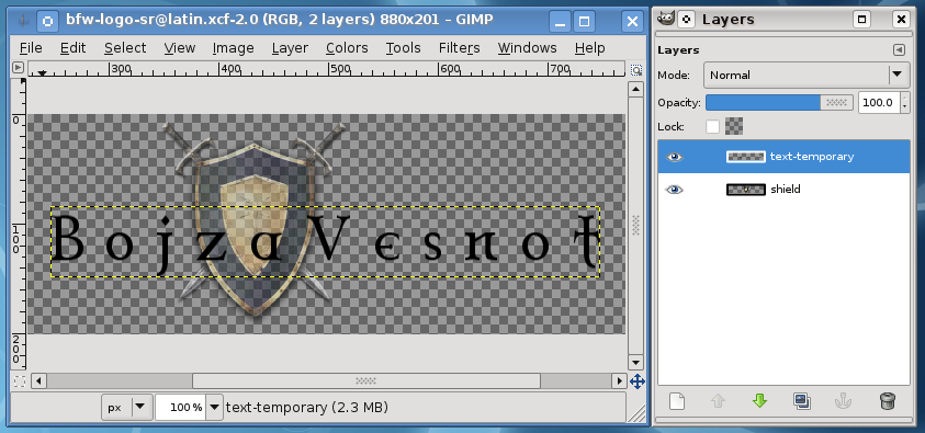
(The shield layer has been dimmed by setting it's opacity to 50%, using the top slider in layer view. This is useful whenever a layer is not the focus of current operations, but may be needed for orientation.)
In preparation for kerning, each letter needs to be put on its own layer. To do this for a given letter, make text-temporary current layer, use rectangle selection tool (Tools→Selection Tools→Rectangle Select, or just press R on keyboard), select the letter with generous empty space around it (this should be easy, since letters are widely spaced), and cut and paste the selection; this will create a floating selection layer, which can be turned into a normal layer by double-clicking on its name in layer view and renaming it to the letter itself (possibly with a suffix like -2 for letters appearing more than once). Repeat this until all letters are on their own layers. It is best to start from the last letter in the name and go backwards, because then the letter layers are going to end up nicely ordered in the layer view (but they can always be ordered manually afterwards). When doing the cut-and-paste step, it is critical that all the pasted letters appear at the same vertical position on the image (for this, fix the rectangle height on the preferences and position each rectangle at a fixed chosen vertical position before cutting). The text-temporary layer will become empty after all letters have been processed, so delete it (Layer→Delete Layer).
Letters should now be moved horizontally to obtain visually pleasing spacing. Since each letter is on its own layer, moving single letters is easy. To move more than one letter together, you can link the corresponding layers (by clicking in the second left-most column in layer view, next to visibility column, producing a chain-like icon). A layer is moved by the general move tool (Tools→Transform Tools→Move, M on the keyboard). To be sure that you are moving the layer exactly horizontally, observe the offset coordinates in the status bar; also, keeping the Ctrl key pressed will constrain a move to one of eight radial directions, which starts being helpful for moves longer than a few pixels.
Here is the most difficult part: what is "visually pleasing"? How can you know when the letters and words are spaced "just right"? One way in which you cannot know this, is by measuring distances on pixel level — an objective measure here is of no use, as the goal is to achieve visual balance. So, unfortunately, this is a matter of instinct, not reason. (See the note at the end of this section for how you should confirm that you have done this, as well as the overall process, acceptably well.)
When the letters have been positioned, turn on the shield layer, link all letter layers, and move them such that they are centered over the shield. For proper vertical centering, follow the English logo.
Outer portions of the image should now be cut off such that the image is only as wide as the centered text, plus about one to two letter widths of empty space on each side. This is done by executing ''Image→Canvas Size.... In the dialog, make sure Width: and Height: are not linked ("break" the chain icon to the left), and enter the appropriate new width. Click on Center button to make all layers centered with respect to new image width. In Resize layers: listbox, select Image-sized layers. Click Resize to exit the dialog and resize the image. If you left too much or too little empty space on the sides, you can undo and repeat the operation using a corrected guess for the width.
After the blank text has been created and positioned, the remaining steps to create the final logo are fairly automatic.
The only layers in the image should now be letter layers and shield. Make the shield layer invisible and all letter layers visible, and execute Layer→New from Visible. This will create a new layer containing all the letters; rename it to text-base. Do not delete letter layers, as they may be needed later for corrections in spacing, but make them all invisible. Here is how the image should look at this point:
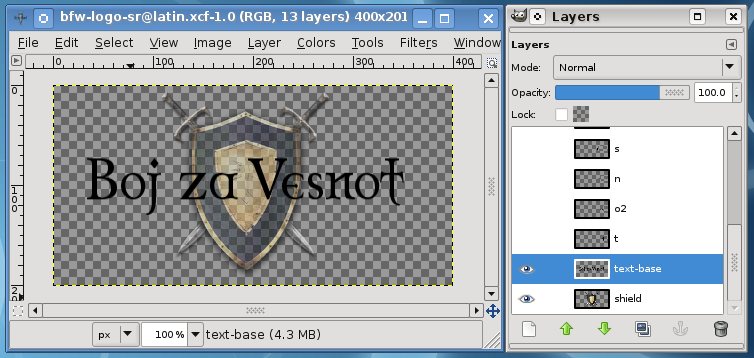
As an example of why manual kerning is necessary, observe the first word above, "Boj". If you try to write it out directly in the text tool, in Celtic Garamond font, you will see that the letter "o" is stuck to "B" while "j" is visibly separated from "o", resulting in it being quite ungainly.
Duplicate the text-base layer four times (Layer→Duplicate Layer), and name the copies as follows, going upwards from text-base: text-map, text-outline, text-shadow, text-final. Now we'll play a bit with these four layers. Note that for the following steps it is easier to always have only the currently selected text layer visible, while other layers should be hidden.
Switch to text-map layer and start Gaussian blur filter (Filters→Blur→Gaussian Blur...). In there, set both the horizontal and vertical blur radii to 5 pixels. The preview pane should show that the text got quite blurry; click Ok to apply the blur. Repeat this filter operation for text-outline and text-shadow layers (you can just switch to each of them and use Filter→Repeat Last).
Some layers should now be given colors other than black. Switch to text-final (the topmost layer, which wasn't blurred), and start Colors→Colorize.... In the dialog, set hue to 50, saturation to 40, and lightness to 60. As you do this, the text in the image should reflect the modifications, and in the end it should have a pale sand-like color. Click Ok to apply colorization. Change to text-map layer (one of the blurred layers), also use Colors→Colorize..., but this time only set lightness to 100. This should make the blurred text white. (Gimp 2.10: Hue/Saturation/Lightness sliders now range from 0.0 to 1.0, adjust accordingly so you get the same color as mentioned here.)
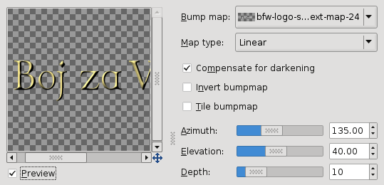
Switch to text-final and start Filters→Map→Bump Map.... From the Bump map: drop-down list in the top right corner of the dialog, select the text-map layer (the layer name may be somewhat strange and possibly shrunken, so look for the small icon to the left for the white pattern produced by the white text on that layer). Check Compensate for darkening (if necessary; it should be checked by default), then set the sliders: azimuth 135, elevation 40, depth 10 (rest should be all zero). (Gimp 2.10: In Filters→Map→Bump Map..., make sure Aux Input is checked, should be checked by default, then click the button just beside it. From the dialog that opened, click on the image name, then select the correct layer as above.)
In the preview pane to the left you should now see the final beveled text:
(By this point, the colors may have drifted from the original, due to differences between Gimp releases. E.g. it was reported that, in a 2.4.x release, the colors were too dark, and that additionally executing Colors→Brightness-Contrast, with values 90 and 70 respectively, yielded a better result.)
To complete the composition, make sure only the following layers are visible: shield (put its opacity back to 100% if it was dimmed), text-outline, text-shadow, text-final. Layers text-outline and text-shadow provide some dark shade behind the letters, to make them stand out better on the shield. Move both of these layers by a single pixel downward; when moving, check Move the active layer in the move tool options, as otherwise it will be hard to grab the desired layer. The final result should look like this (note the ordering and visibility of layers):
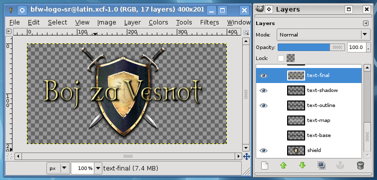
The logo should now be exported as a PNG image, named logo.png, using File→Save a Copy... (choose Merge Visible Layers when asked, default PNG export options are okay). But do keep around the original Gimp XCF image, so that changing it later is easier.
Note: Having a well done localized logo is very important for the first impression of the game. Therefore, you must post it to the Art Contributions forum for others to inspect and critique.
TRoW Logo
The logo with the "The Rise of Wesnoth" text is displayed on one of the story screens of the first scenario of The Rise of Wesnoth. It is only seen once and is fairly easy to make.
First, fetch the logo template here:
As with the main logo, the TRoW logo uses "Celtic Garamond the 2nd".
As with the process of creating the main logo, switch to the text tool and enable the following options: hinting, force-autohinting, and antialiasing. Set the font size to seventy.
As the font size is so large, the text tool should get the spacing right, unlike the smaller text for the logos, so just write out the text one two or three lines (you should only use three lines if the text uses things such as prepositions).
If the text tool did not get the spacing right, then cut up the the letters into different layers and move as necessary.
After writing out the text, align the letters against the letters in original, then center the text against the image... like the text in original.
After you properly aligned and centered the text, merge all of the layers with the translated text (if there is more than one) and name the layer with all of the translated text text-base.
Duplicate text-base four times. The order (in ascending order) and names of the layers (including text-base) should be like this: text-base text-map, text-outline, text-shadow, text-final.
Switch to text-map; use the Colorize tool to make the layer all white (set the lighting to one hundred in the colorize dialog).
Now, apply an eight-radius Gaussian blur to text-map. Afterwards, apply a five-radius Gaussian blur to text-outline and text-shadow.
Switch to text-final; summon the Colorize tool; set hue to fifty, saturation to forty, and lightness to sixty; apply the effect. Afterwards, duplicate text-final; put this duplicate above text-final and call it text-final lighting.
Switch to text-final lighting; summon the Hue-Saturation tool; set hue to −165; apply the effect. Afterwards, set the layer mode of text-final lighting to "Lighten Only" and set its opacity to thirty percent.
Switch to text-final; summon the Bump Map dialog. Set the map to be bumped (Bump map) to text-map; set azimuth to 135, elevation to forty, depth to twenty, and the rest to zero. Make sure that "Compensate for darkening" is checked. Afterwards, apply the effect.
Switch to text-final lighting; summon the bump map dialog; keep the same settings we used last time, but check "Invert bumpmap"; apply the effect.
Drag down text-outline and text-shadow by one pixel.
Now, make sure that only the following layers are visible: text-outline, text-shadow, text-final, and text-final lighting.
After doing so, you should have a beautiful logo.
Note: Like for the main logo, TRoW logo has to be cleared by the community (see the ending note in main logo section).
Maps
See MapLocalization for the up-to-date localization instructions.
Each campaign comes with a map, where locations of events are highlighted as the scenarios progress. Since these locations are frequently mentioned in narration and character conversations, it may be more than merely a "nice touch" to match the map labels to in-game texts. In particular, the main map of Wesnoth, which is used by several campaigns, also figures as the background of the main menu.
Luckily, most maps derive from the single source within the resource repository:
https://raw.githubusercontent.com/wesnoth/resources/master/cartography-tools/great-continent.xcf
This Gimp source contains all topography features, as well as, most importantly, textual labels as separate layers. The procedure of localizing a map is thus this: export a PNG image with all the topography of required map, but without any text label, and then add translated labels to it. Here we'll work on the main menu map (data/core/images/maps/wesnoth.png) as the example.
The main menu map is assembled out of the following layers, not taking labels into account: Wesnoth topography, Wesnoth Marsh, Wesnoth Forests, Wesnoth Roads, Wesnoth Towns, Border, Border BG. Make only these layers visible, then export them as PNG using File→Save a Copy... (choose Merge Visible Layers when asked, default PNG export options will do); name this PNG file wesnoth-topo.png. Then, make the topography layer invisible, and make only the label layers visible: Wesnoth Human Names, Wesnoth early labels, Wesnoth late labels, and export them too as wesnoth-labels.png.
Open the previously exported wesnoth-topo.png, and immediately save it as (File→Save As...) wesnoth-LANG.xcf, where LANG is your language code. Note the .xcf extension, which means this is now no longer a plain PNG bitmap, but a Gimp XCF image. This will be the source of your localized map, to which you will be able to return to at any later moment (e.g. if a label needs to be changed to reflect updated translation). Change the name of the only layer, Background, to topography.
Open the previously exported PNG of original labes as a layer with the current image (File→Open As Layers...). Tha labels will appear over the topography, visually resulting in composition just like the full map in the game. Change the name of the new layer to original-labels. This layer serves only as guide to position the translated labels, so set its opacity to 25%-50% (slider at the top of layer view), such that it becomes unobtrusive, yet discernable enough to indicate label positions.
The result so far should look like this:
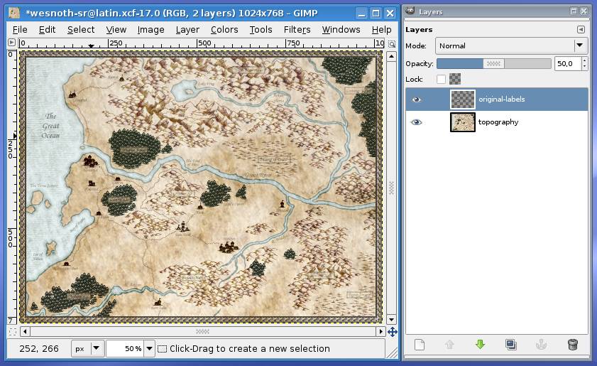
Now we are ready to start placing translated labels. For all labels, keep in mind to place them such that they are approximately covering the original label, as indicated by the dimmed >original-labels layer.
As for the font, original labels are written using Monotype Corsiva, which is easy to find for free download. If it does not contain all the glyphs needed for your language, another similar font to try is URW Chancery, which may already be installed by your distribution. If neither works, as usual try to find one that does and has a fantasy look to it.
There are three distinct types of labels on the main map, so let's cover them from easiest to hardest to make.
Plain Labels
Plain text labels are the most numerous. They are merely properly colored horizontal text, written down directly on the map. Therefore, to make one such label, just use text tool (Tools→Text), choose font size (13pt is the size for most of the original labels), check all of Hinting, Force auto-hinter, and Antialiasing, click on the place on the map where the label should be, and write out the translated name.
You don't have to hit the desired position for the label exactly at the moment of writing. The label will become a special text layer, named by the text itself, which you can move around using the move tool ('Tools→Transform Tools→Move). Note that you should not merge this text layer to any other layer, after you have finished positioning it. That way you will always be able to change the text at a later point (by double-clicking on the layer icon in layer view), rather than recreating it anew.
The only slightly tricky bit here is choosing the color for the text. Original labels are not all of same color, but depend on the darkness and tone of the map below it (e.g. whether it is sea or land). To pick a proper color for each label, the easiest is to load the original PNG image (data/core/images/maps/wesnoth.png) and use color picker (Tools→Color Picker) to collect colors from each original label in turn. Since letters are antialiased, always pick the darkest color in the label.
Here's a view of one label made like this:
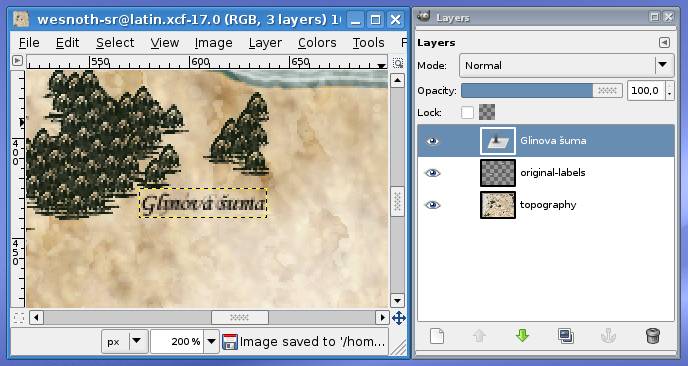
Note the special text layer "Glinova šuma" ("Glyn's Forest") on the right, and how the transparent original label from the original-labels layer is showing below the translated one. To have a clear view of the new text, you can switch original-labels on and off by cliking on in the left column in layer list.
Rotated Plain Labels
Some of the plain labels are rotated to match the topographical feature, e.g. a river direction. To make such a label, first make the plain horizontal label as usual. This label now needs to be rotated.
Unfortunately, Gimp cannot currently rotate text layers, so you first need to convert the text to ordinary layer (Layer→Discard Text Information). Then, to rotate the layer, open Layer→Transform→Arbitrary Rotation... dialog. Make sure that Interpolation: field in the tool view (outside of the dialog) is set to Cubic. In the dialog, move the slider around and observe the image, until the rotation is approximately the same as that of the transparent original label beneath, and click Rotate. To finally properly position the label, just move its layer to match the original label.
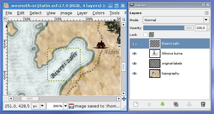
The image above shows the translated "Bay of Pearls" ("Biserni zaliv") label, where the rotated label layer is seen to be an ordinary layer, instead of special text layer (with editable text) such as the one for plain labels.
Parchment Labels
Labels covering forests, mountains, and other features with uneven background, are put on what appears to be a rectangular piece of parchment. Fortunatelly, the source Gimp image for original maps (the one you used to export initial topography), also contains assortment of various labeling parchments, on the Label Workshop layer:
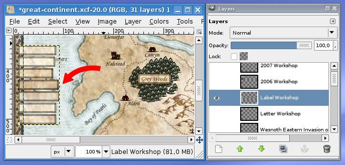
The idea then is to copy the appropriate parchment from this layer to the localized image, and then put a plain label above it. The difficulty is that copied parchments cannot be used as-is, but should be cut to the length of text.
First create two layers (Layer→New Layer...) which will contain all the parchments, named label-parchments and label-parchments-woods, and make them transparent. Place these layers just above the original-labels layer, below all text label layers. You will then always copy parchments from the Label Workshop layer of the original image, to one of these two layers in the localized image. If a parchment is fully or partly over woods terrain, it is placed on label-parchments-woods, and otherwise to label-parchments. Set opacity of label-parchments to 75% and of label-parchments-woods to 90%, to have slightly transparent parchments as in the original.
To produce a parchment label, first write out a plain label over the map feature which should get the parchment background. This will serve to know how to position the parchment, and, more importantly, how to cut the parchment to the appropriate length. A parchment may need to be either extended or shrinked by cutting.
To extend a parchment, cut away right portion of it, and paste it such as to nicely fit around the right end of the text. Then cut the remaining left portion and paste it to fit around left end of the text. There will now be a gap in the parchment, which you should fill out by copying and pasting a mid-portion of the same parchment from the Label Workshop layer of the original image. To shrink a parchment, do the similar, only there will be no gap to fill after parts are cut and pasted. To decide where exactly to cut the parchment, check that when image is zoomed to 100%, there are no obvious joining artifacts (no repeating patterns, which brain easily notices).
Here is the translated version of "Grey Woods" label ("Sivošumlje"), with one text layer like for a plain label, and the length-cut parchment on the newly created label-parchments-woods layer:
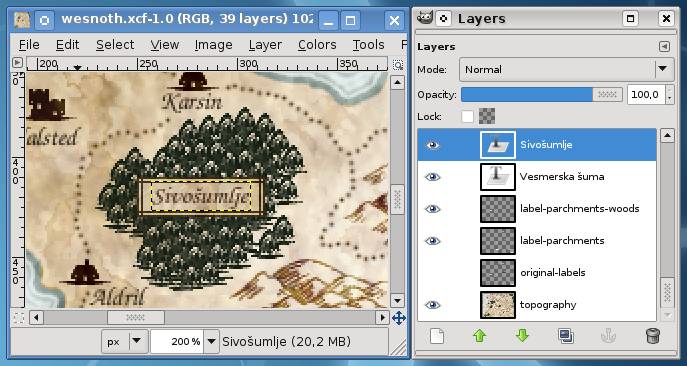
Once all labels have been translated, make original-labels layer invisible, and all other layers visible. Export the final PNG image using File→Save a Copy.... The name should be the same as the original PNG image, which is wesnoth.png for the main map.
Overlay Cuts
The original image may have quite a heavy file size, while only small portions of it need to be translated. The main menu map is the prime example, with its 1.800 kB file size; if, say, ten languages would localize it and submit as full image, this map alone would make the distributed package grow by 18 megabytes. On the other hand, an image consisting of only the translated labels (with some portion of the map below them), and otherwise mostly transparent, would have about 180 kB. As mentioned earlier, the game can overlay such transparent cuts over the original image at runtime, to produce the final localized image.
We'll use the main menu map as the example for producing an overlay cut. Open the localized XCF image of the map, and add one more layer to it, overlay-mask, also transparent. Place this layer on the top, and reduce its opacity to 50%. On it, we will draw a plain white rectangle over each translated label, such that it encompasses both the translated label and the original label (which is visible through semi-transparent original-labels layer). To draw a rectangle, use rectangle selection tool (Tools→Selection Tools→Rectangle Selection), just like when about to copy-paste stuff. But, instead of copying/cutting anything, fill the selection with foreground color (which you should have set to white), using Edit→Fill with FG Color. This is the result:
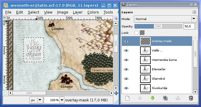
Note that the selection rectangle has enveloped both the original label, "The Great Ocean", and the translated label, Veliki okean. This is necessary in order that when the translated label is smaller than the original, such as in this case, outer sections of the original label do not show through when the localized overlay is composed with the original image.
You can of course use any of the Gimp's drawing tools to create white areas above labels. E.g. rectangle will cover more space than necessary for rotated labels, so there you may want to draw properly aligned lines using the pencil (Tools→Paint Tools→Pencil) with a very thick round brush.
Once you create masks over all translated labels, load the previously exported PNG of the localized map. Copy the overlay-mask layer from the XCF to the PNG image, by dragging it from the layer view of the XCF to the image area of the PNG. Do not save the PNG image at that point, nor during any of the following steps; it should remain the ordinary, full localized image.
Select the overlay-mask layer just copied into the PNG (in fact, it will be named overlay-mask copy, and the only other layer should be Background) and execute Layer→Transparency→Alpha to Selection. This will create a selection out of the overlay layer:
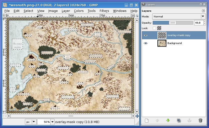
What remains to be done is straightforward. Without removing the selection, make overlay-mask layer invisible, switch to the Background layer, execute Select→Invert, execute Edit→Delete, and the overlay cut is complete:
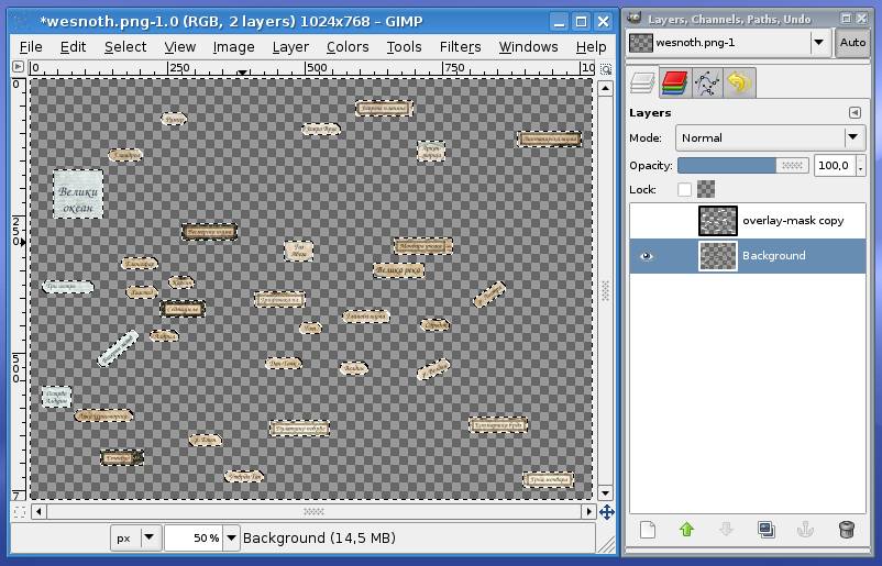
Save it as wesnoth--overlay.png, where --overlay ending is needed for the game to recognize that the image is not standalone, but an overlay. Remember to uncheck "Save color values from transparent pixels" option when exporting PNG, in order to create smaller overlay map.
You should save the XCF image with overlay-mask layer, rather than discarding it, so that at a later point you can modify the mask and repeat the few steps above to create the overlay cut (e.g. when translation of a label is changed).
Gimp For Translators
Being a general-purpose bitmap-editing tool, beginners' tutorials on Gimp usually assume that the reader wants to go from the basics towards becoming a proficient Gimp user one day. This, however, provides too much breadth for the limited scope of retouching images for localization, as we are doing in this article. Of course, if you indeed would like to learn about bitmap editing in general, by all means do go through such tutorials (there are books too) in detail, and then return to this article to apply the obtained knowledge.
If, on the other hand, you'd rather "just get the job done" (such as, for the most part, the initial author of this article), the following subsections concisely explain some crucial elements of Gimp needed to follow the instructions on creating localized images. You can also consider them a guideline about what to pay special attention to, if the next thing you do is look for a more in-depth tutorial text.
Orientation
Here is a downscaled screenshot of what may pop up when Gimp 2.6 is started (Gimp's layout is highly configurable, so you may see something somewhat different), with most important areas marked with numbered red dots:
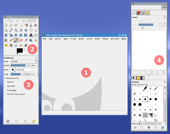
Gimp uses single-document interface, giving its elements as separate windows, such that they can be manipulated by the mechanisms of the desktop environment on which Gimp is run. For example, under typical Unix desktop environments (KDE, Gnome, etc.), user may want to work with Gimp on a virtual desktop dedicated to it.
Number (1) marks the window which will contain the image, once opened or created a new (it's empty on the screenshot). There will be as many of these windows as there are images opened. (2) is the "toolbox", the collection of icons representing Gimp's basic drawing, selection, transformation, etc. tools. All of them can also be activated from the Tools menu, and more importantly, by keyboard shortcuts. The two black/white overlapping rectangles at the bottom show the current foreground and background colors. You can select other colors by clicking on them. (3) is the tool options view, where the behavior of currently selected tool can be adjusted. (4) is the layer view, currently empty as no image is opened (more on layers later). These are just some of many elements of Gimp workspace, those most important to our present needs. If some is missing when you start Gimp on your machine, try turning it on through the Windows→Dockable Dialogs menu.
Let's now create an image, with transparent background. Go to File→New..., set width and height to something smaller (e.g. 320×256 pixels), expand Advanced Options, and under Fill with: select Transparency. In the image window you should now see a light-dark gray checkerboard pattern, and the layer view should list the Background layer.
To paint something on the empty image, select the pencil tool (click on pencil icon in toolbox, select Tools→Paint Tools→Pencil from the menu, or simply press N on keyboard). In tool options, click right of Brush: and select a bigger circle from the different brushes. Now simply start painting over the image, by holding left mouse button. Change the foreground color (by clicking on its rectangle in toolbox) to something else, then paint some more. Here's a possible result of this highly precise action we just undertook:
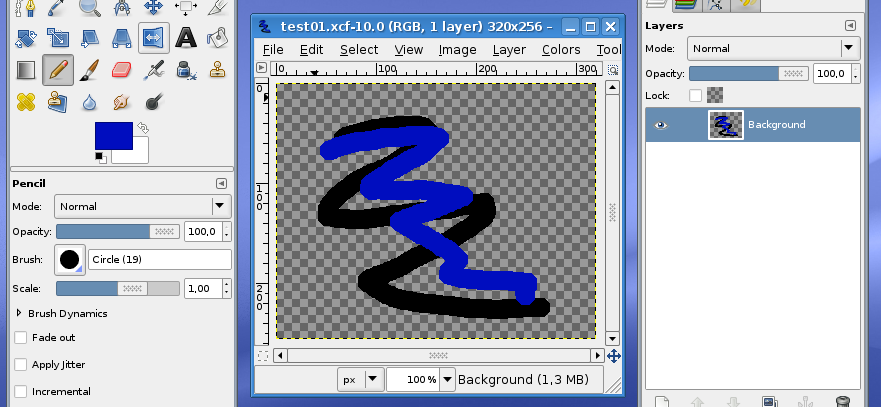
Of note are the options to the pencil tool on the lower left (e.g. "Circle (19)" selected as brush), and the layers view which shows the single Background layer. What's this with layers, anyway?
Layers
Layers are one of fundamental concepts when working with just about any kind of images and drawings, bitmap or otherwise. Rather then theorizing about it, let us immediately create another layer. Either select Layer→New Layer... from the menu, click on the blank sheet icon in lower left corner of layer view, or press Ctrl+Shift+N. In the dialog that pops up, set layer name to Doodle, make sure Transparency is selected, and click Ok. In the layer view you will now see the Doodle layer, which will be highlighted and above the Background layer.
Repeat fooling around with pencil tool, while making sure that Doodle layer is highlighted in the layer view:
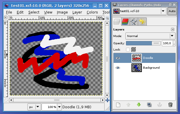
Note the icons left of layer names in layer view: they reflect the layer content, and it appears that the black and blue lines are on Background, while red and white are on Doodle layer. This is precisely what had happened, because Background layer was the active one (highlighted in layer view) while painting the first time, and the Doodle layer while painting the second time.
Yet further left of layer names are "eye" icons, which show that layers are visible. Clicking on them will make layers visible or invisible; observe how the content of respective layer disappears and appears on the image together with switching the visibility. A layer can also be made semi-transparent, rather than completely invisible. Try playing with the Opacity: slider at the top of layer view while the Doodle layer is selected.
You may immediately realize some uses of layers. For example, a text label on a drawing can be added as a separate layer, without irreparably changing the basic drawing, such that it is easy to change the text later on. Layers can also be duplicated with all the content, in order to slightly change one and try which of the two versions better fits with the complete image. And so on. Any realistic image worked on with Gimp will contain at least several layers, and there may easily be tens of them.
Always keep in mind that, same as it happened above with the pencil tool, almost all painting, transforming, colorizing and other operations influence only the currently selected layer (the one highlighted in layer view). An easy oversight to make when there are many layers is to select the wrong layer, or forget to select the desired one, prior to performing an operation. Of course, there's always Undo.
Selection
Time to start copying and pasting things around. Same as with text, a portion of image needs to be first selected, to be copied or cut, and then pasted. Unlike as with text, there are many ways in which the selection can be made: just take a look in Tools→Selection Tools. The basic of those is probably the rectangle selection; to activate it, click on dotted rectangle icon in toolbox, select Tools→Selection Tools→Rectangle Select from the menu, or press R on keyboard. Before doing anything, make sure Background layer is selected.
Left click somewhere on the image and drag the pointer. A translucent rectangle frame will spread from the point of click as you drag the pointer. After releasing the mouse button, the rectangle will become white-black dashed, with dashes moving around (the "marching ants" pattern). By this, you have made a selection (there will also be four smaller rectangles in its corners, which you can use to further adjust the selection sweep). To cancel the selection, without doing anything, just click somewhere outside of it.
Now copy the selection to clipboard, by pressing the usual Ctrl+C, or selecting Edit→Copy from the menu. Copying itself will not yield any visual effect. The important bits start to occur when you paste the copied selection, by Ctrl+V or Edit→Paste. Pasted selection will appear at the same place where the original was. There are several things to observe now:
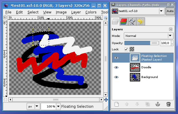
- The selection contour will be slightly changed to show exactly what was copied, omitting any transparent regions in the original selection.
- A new layer, named Floating Selection (Pasted Layer) has appeared. This is a temporary layer, which may either be made a permanent layer by selecting Layer→New Layer..., or may be merged into the previously selected layer by canceling the selection (e.g. clicking outside of it). You can move the pasted layer around by left clicking and dragging within it.
- Because you have hit copy when Background layer was selected, only the content within selection and on that layer got copied and pasted. You can even make selection while one layer is active, then switch to another, and hit copy to grab the portion of that other layer. Also, while pasting action puts copy on its own temporary layer, canceling the selection will merge it into previously selected layer.
If you turn temporary pasted layer into a permanent layer, you will notice the motionless yellow-black dashed contour. It is also visible in the screenshot above, at sections not covered with moving white-black pattern. This contour shows the layer boundaries, that is, every layer can have its own size independent of the image size. The boundary size of a layer can be adjusted using Layer→Layer Boundary Size.... Instead of changing boundaries, layer can be resized with all its content using Layer→Scale Layer....
You can now explore other ways of making selections (remember, clicking out of selection area while selection tool is active will cancel the current selection). E.g. if you choose Tools→Selection Tools→Fuzzy Select, make Background layer active, and click somewhere on the thick blue line in the screenshot above, exactly this entire line will be selected. Every selection tool has some options in the tool view, which may be tweaked to affect exactly what is selected. For the fuzzy selection, for example, one can adjust the color sensitivity (Threshold: slider) to affect how much big a color difference is used to determine boundaries of selection.
Same as most modification operations affect only the currently selected layer, in presence of selection they also usually affect only the selected area. To test, make a rectangle selection, then switch to pencil tool and try to draw on the image. The pencil will leave trace only within the area of the selection, and on the currently active layer.
Text
Of the many painting tools, a particularly important one for localizing images will be, naturally, the text tool. It is activated by pressing the big A icon in the toolbox, Tools→Text menu item, or T on keyboard. Activate the text tool, and click somewhere on the image (to unclutter the view, make the Background and Doodle layers invisible). Click somewhere on the image, and a text input dialog will pop up. After typing something, we may obtain:
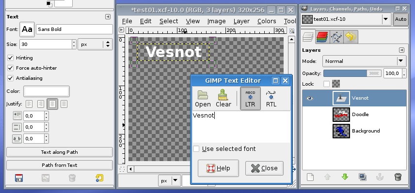
Almost every part of this screenshots presents some important points.
On the left, the tool options for the text tools are shown. Here you can select the basics (font, size, and color), but also some other important options. The three checkboxes affect how the font is rendered: antialiasing makes letters non-jagged against the transparent background, and the two hinting options improve the shape of letters. You will almost always want to have all these checked. The justification buttons allow you to left-align, center, etc. the text. The three spinboxes bellow are used to tweak the spacing between letters (you can shrink the text that looks to wide, or shrink the distance between two lines of text).
In the center you can see the rendered text in top left corner of the image, and superimposed text input dialog over the image window. There you can also load some text from file, in case of longer texts.
On the right, in layer view, notice that the entered text got its own layer (named by the text itself), similar to what happens when selection is pasted. Unlike the temporary pasted layer, the text layer is permanent, but also special in that double-clicking its icon will allow you to edit the text at a later point (that's why its icon is a generic text-like icon, instead of showing layer content). Text layers can be changed into an ordinary layers by executing Layer→Discard Text Information, but you will want to do this only if you need to do some arbitrary transformations on the text. The boundary of text layer is only as wide and high as the text, so you can move the text layer around.
Saving Images
Always save images first and formost in Gimp's native format, XCF. This will keep all the information, such as layers and selections, so that you can pick up editing the image just where you left. Consider the XCF format as your "source", on which you work and from which you "build" the final ordinary (or "flat") bitmap images.
When the image is ready for delivery, when you have made all necessary layers visible and helper or test layers invisible, you can save the image in one of flat bitmap formats. Two typical are PNG and JPEG, with the following very important difference between them. PNG is a "lossless" format, which means that every pixel in shown to the user just as it was in the source, XCF image, when the PNG was saved. JPEG is a "lossy" format, which compresses the image such that it's rather near to original, but not exactly and possibly with some ungainly visual artifacts, at the benefit of frequently considerably reducing the image size. PNG is what you will need for allmost all in-game localized images, as the originals are PNG images too. This is natural for game graphics, since it needs to be crisp, without any compression artifacts. JPEG is typically used for photographs, which would be huge if left uncompressed, and instructive screenshots which do not need crisp looks (e.g. for images in the manual).
To make a PNG image, you may as a matter of habit reach for File→Save As..., and there select PNG as output format and save; then, to get back to the XCF source, you will close the PNG, and open the XCF again. To avoid this usual routine, there is the File→Save a Copy... action, which unlike Save As... will not switch to the newly saved PNG image, but let you continue working on the original XCF after saving.