Difference between revisions of "Using the Levels Adjustment"
Sgt. Groovy (talk | contribs) m |
|||
| Line 24: | Line 24: | ||
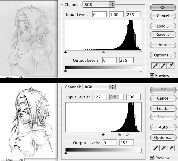
In the following image, we used only the input adjustment. The white of the paper was brightened to white, and the dark was darkened to black. This isn't exactly the best demo image, since it was badly scanned in the first place, and because it was heavily JPG compressed before I got to it. | In the following image, we used only the input adjustment. The white of the paper was brightened to white, and the dark was darkened to black. This isn't exactly the best demo image, since it was badly scanned in the first place, and because it was heavily JPG compressed before I got to it. | ||
| − | http:// | + | http://wesnoth.org/wiki-images/levels/levels_214.png |
[[Category: Art Tutorials]] | [[Category: Art Tutorials]] | ||
Latest revision as of 08:28, 8 April 2014
The "Levels Adjustment" is divided into two modifications that it applies to an image - input and output.
Input:
Input reinterprets what comes in - it is used to, for example, correct a pencil drawing that should have been black lines on white paper, but scanned in as dark grey lines on light grey paper. The levels filter can stretch the luminosity (aka brightness) levels of this drawing into being black lines on white paper.
The rightmost slider controls what color, from the source image, to treat as "jet black". If your pencil lines, which were supposed to be jet black, came out as only dark grey, then you can use this to put "where black starts" just above the darkness of the lines. This makes the lines, and everything darker than they are, jet black.
The leftmost slider does the exact same thing in reverse, it's used to make everything above a certain luminosity white. This is used most commonly to chop off all the noise and texture of the paper and make it pure white.
The middle slider is a coefficient, or a "multiplier", and this means it behaves very differently than the other two. You can use the middle slider as a very crude alternative to the "curves adjustment" (and it is in fact good training for understanding what the heck the "curves adjustment" does, which isn't exactly intuitive). Simply put, the middle slider bends all the in-between shades towards either the light or dark side of the drawing - anything above it gets made light, anything below it gets made dark, and the further these are from it, the greater the effect is. Thus, if you drag it over to the far right, all of the lines will become rather dark, and if you drag it over to the far left, everything will become very light and washed out.
This can be used to adjust the contrast of your lines - it can adjust how rapidly lines fade out.
Output:
The output is simple - the two sliders set how dark the darkest dark is in the final picture, and how bright the brightest bright is. If you leave them both at the ends, things will range from black to white. If, for example the bottom slider were moved halfways up, nothing in the final picture would ever look brighter than 50% grey.
Other than deliberately washing out pictures, this doesn't have a lot of uses for line art.
Example:
In the following image, we used only the input adjustment. The white of the paper was brightened to white, and the dark was darkened to black. This isn't exactly the best demo image, since it was badly scanned in the first place, and because it was heavily JPG compressed before I got to it.
